
Have a look and let us know if you have any questions. Note proposals are due Thursday, April 4 by 3pm. Have a great Spring Break!
Storytelling Lab: Who’s the Culprit?
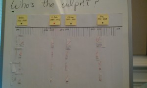
Team: Christina, Qianqian, Vimal, Kristin, Suhani
The objective of our visualization was to investigate the possible “culprit” in the changes within average income, share of income, share of federal tax revenue, and household income (before taxes) across different sectors of the United States population. When we were brainstorming, we originally thought this infographic would be great for middle-income household workers in order to educate them on who could possibly be responsible for the state of the economy now. We decided to focus on four key presidents: Ronald Reagan, George H. Bush, Bill Clinton, and George W. Bush. We split up our graphs into four key time frames that each president was in office for, and analyzed any changes that occurred specific to that president. After we picked our key demographic, we decided to pick and choose which graphs were needed and which weren’t, since we thought some weren’t relevant to the time frame and objective.
Once we were able to place all of the charts and pieces together, we discovered interesting facts about the data from each president’s time in office. While the general population stayed relatively consistent over the course of ~27 years, the data from the top 1% of the population fluctuated greatly with constant rise and falls in all categories. Based on this data, we determined that the most drastic increase in average income, share of income, and household income for the top 1% of Americans occurred during the Clinton administration; we then deemed him the “culprit” of this eventual trend.
StoryTelling Lab – “Making it to the Top”
By Julia Kosheleva-Coats , Kate Hsiao, Seongtaek Lim, Kiran Chandramohan, Shreyas
Visualization Name: “Making it to the Top”
Audience: “iSchool New Admits”
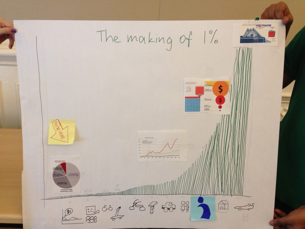
Our visualization provides a narrative about how to make it to the top 1% of the economic tier of US. Meet David, who wants to make it big and has dreams of being rich. Sure he could be a pop star or a model, but he decides to bet it all on education. David enrolls himself into a school and soon enough he has gotten a bicycle. Enter David the teenager who now can work part time jobs and can save up enough to zoom around in his cool skateboard and flashy hairstyle. Soon he graduates from high school and enters college. He works summer jobs and now he can afford a motorbike. After graduating from college he can now afford a car. Life is now steady, he now has a girlfriend but still isn’t in the top 1%. While researching on the future possibilities he finds information about the iSchool at UC Berkeley. He joins in, slogs it out and by the time he graduates he can now afford a house. But that still just takes him to the top 10%. He keep persevering and his hard work pays off. Fame, Money and a beloved Ferrari are queueing up as he is now the best data scientist in the country.
Welcome to iSchool Folks !
Storytelling Lab: Showing Unfairness Taxation for the Rich from 1965 to 2007
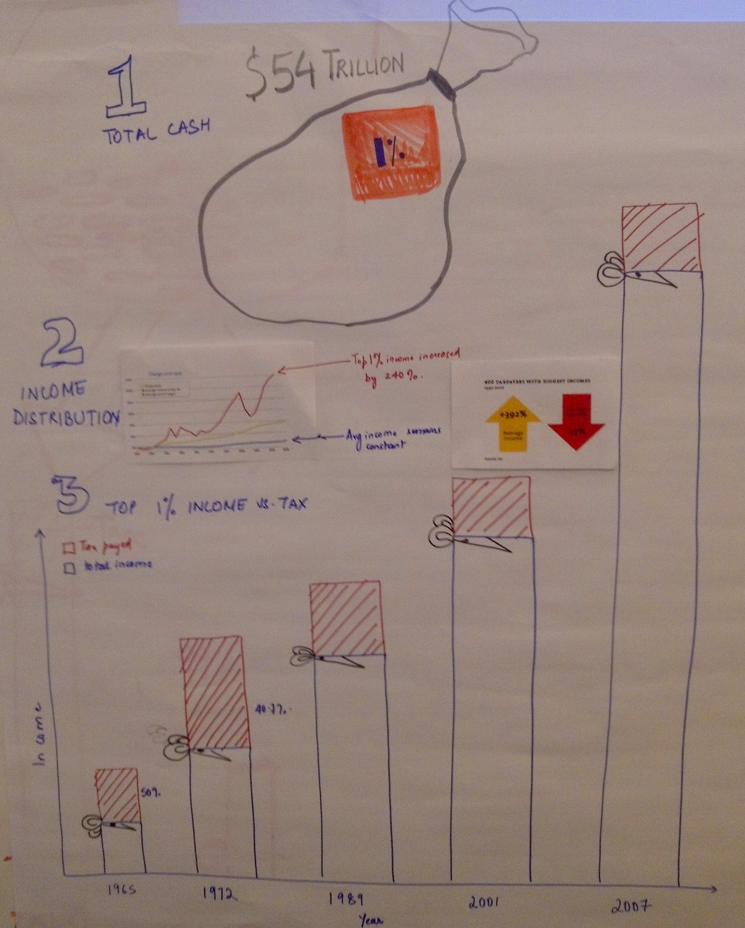
Team: Charles Wang, Sonny Vernard, Sonali Sharma, Seema Puthyapurayil
Our objective was to show the unfairness of the richest 1% in America paying decreasing amount of taxes while their income had increased by 240% from 1965 to 2007. We applied a 3-step approach in our narrative. In step 1, a cash sack was drawn to illustrate the total $54 trillion national income. The richest 1% was highlighted as our target group. In step 2, we used a line chart to show the income distribution from 1960’s to 2007. We observed dramatic increases of income for the richest 1%, whereas the average income for low-wage earners had pretty much remained constant. In step 3, we applied a unique visualization that indicates not only the wealthy had become richer over time in absolute dollars, but also captured the story of America’s richest paying a lesser share of taxes as their incomes increased. Furthermore, two arrow indicators beside the bar chart expressed the obvious opposite trends of taxes paid by the richest and the income they made. The decreasing amount of taxes paid by the 1%, our biggest concern, was emphasized with red color.
Storytelling Lab: The Divergence of Economic Fortunes
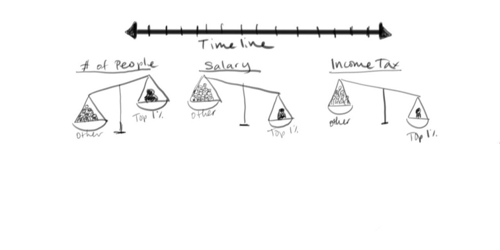
Team: Evie Phan, Aksel Olsen, Jacob Portnoff, Aude Hofleitner, Divya Anand
We toyed with several iterations on the increasing disparities in income and taxation levels during the past 30 years, but it doesn’t seem to us that the main source of rising inequality was the rising wealth of the top 1 percent per se. We liked the chart showing how average salaries since 1970 had been relatively stagnant while productivity had grown substantially. The wealth of Americans, it seemed, had become unhitched from the great successes of corporate America during the past few decades of globalization.
With this as a point of departure, we came up with the scale as a succinct metaphor for the divergence of economic fortunes. The idea is to split the population in two groups; the 99 percent (other) and the 1 percent (wealthy) and show a scale balancing different economic distributions. The first one would just compare count of people; the second the income share to each “group”, the third the share of taxes. For each variable, the scales would
balance in different ways. To be fair, we would include the share of the federal income tax which would tip the scale in the other direction, as the top 1 percent paid a full 28% of the Federal
Tax Liabilities for All Households.
We would implement this as an interactive visualization with two variable features:
(1) a time slider, allowing the user to see change over time, and
(2) an equalizer, allowing the user to see how the two groups would need to change in size to give an equal balance
On the right hand side, we would have linked decorations/charts, enhancing the main core of the story though additional and relevant details.
The target audience is the general public.
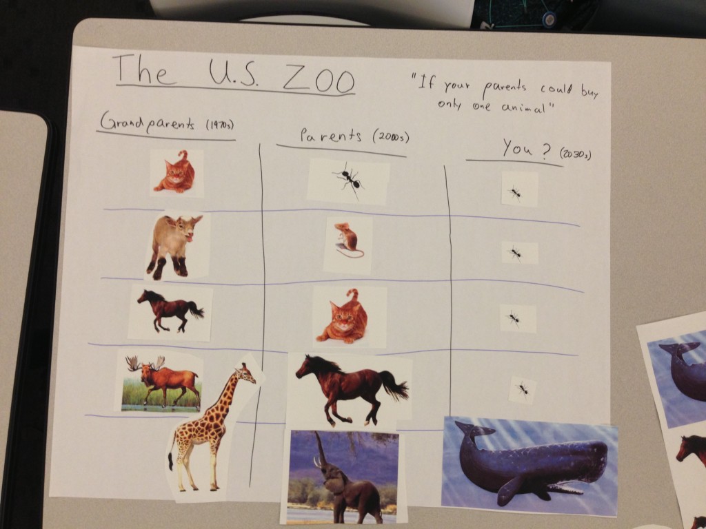
Storytelling Lab: Telling Young Kids About Wealth Inequality With Animals
 Team: Sara, Sandra, Alec, Taeil, Jen
Early on, our team decided on young children as our audience for telling the story of growing wealth inequality in the U.S. Being that charts and graphs can be difficult for even adults to understand, we spent a lot of time discussing what kind of metaphor we wanted to use, and then lastly, how that metaphor would aid our message.
The story is relatively simple: If the kind of animal you could afford was a direct correlation to how well off you were, then this is how that wealth has been changing over time. While in a child’s grandparents’ time, they were able to afford relatively decent pets in all walks of life, the disparity has greatly increased in a child’s parents time in the present day. Furthermore, when said children came of age, that difference would be even more apparent where most everybody would only be able to have an ant as a pet save the top 20% of the wealthiest people who could own a whale, which is indisputably way more awesome.
While these are not the most scientifically sound metrics, it speaks to the inequality in a way that actual numbers cannot.
In-class Visualization – America’s Wealthiest
Team Members: David, Raymon, Fred, Morgan, Priya
The Story:
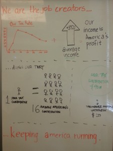
We wanted to create the visualization from the perspective of the highest income group in America; different from what was shown in the video at the beginning of class. The main purpose of this infographic is to show the general audience how the America’s wealthiest are actually contributing to its profit and growth. They are not just the highest earners but also the highest tax payers.
Visualizing Email
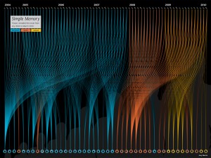
http://www.refwdemail.com/2010/05/simple-memory/
In the context of Assignment 4, this visualization looked pretty interesting.
There has been an attempt to analyze emails, in a way that reflects something beyond numbers – to me, both visualizations had a strong storyline, in terms of charting the personal relationships involved.
The creator does not seem completely convinced with the video version themselves, but I still felt the impact of people walking to and away from the frame told a powerful story of relationships.
Similarly, in the other visualization, the shift from personal to work to school contacts is pretty clear, and thus reflects the changes in their personal lives.
Personally I found both of these strong in terms of an emotional connect, and a storytelling style (though the creator believes there are better, more emotive ways to create similar narratives).
Uninformative Graphic
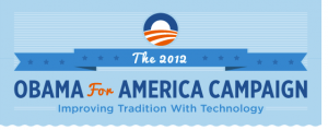
Wednesday morning’s Twitter feed brought this infographic and blog post to my attention by New Relic, titled “Improving Tradition with Technology: Obama for America Tech Team Infographic“. At first, I thought this would be an infographic showing how Obama’s “…small team capitalized on web and mobile technologies to capture massive donations, volunteers and votes.”
When I looked at the graphic by New Relic, I came away feeling confused rather than enlightened. Looking back on some of Cairo’s arguments, an infographic “…presents information, and it allows users to explore that information.” (Cairo, p. 73). The storytelling structure is author-driven, and explanatory. It presents the problem, the goal, the stakes and details to how that solution was implemented and achieved. However, New Relic shows the user all these things but doesn’t explain anything beyond the tools used. What I wanted to see was the how of things. How did the small team of 50 people use big data, SaaS tools, Agile? How did it utilize the cloud? Simply for storage or something more complex? How was all this used to capture donations, volunteers and votes?
The infographic is shallow because it lacks any deeper take-aways that drive at exactly how Obama benefited from this technology. It does nothing to clarify technology’s role in the Obama campaign. I am not even sure what exactly the tech team did. It doesn’t “…clarify [messages], highlight trends, uncover patterns, and reveal realities not visible before.” (Cairo, p. 79). “The Right Tools for the Right Job” has copy that says simply “Focus on what matters and outsource everything else” followed by a list of software. Were those the things that mattered or were those things what counted as outsourced? What was it that mattered?
Last of all the images, while cute, are redundant and do not reveal any quantitative data or insight. I believe it’s called “chartjunk” by Tufte. They are also inconsistent in representation. While Akamai is shown as being a distributing network, GitHub version control is simply the Octocat logo. What does a checkmark say about Optimizely? What exactly is A/B testing? Amazon’s icon is the most obviously tautological: it’s name and logo for web services slapped on a computer screen icon above a line that says “static site hosted on Amazon”. Great!
Perhaps, however, I am not the right audience for the infographic. I actually rather dislike it, if you couldn’t tell by now. Its process is rather simple for those who are technologically savvy, since I imagine such a group would already be aware of using these tools, and what and how they are used. I would expect a graphic targeting technologically minded people to show how these existing tools were used in an innovative and unlikely ways in the Obama campaign. I expect it to answer how technology improved tradition.
This might be the kind of thing geared towards people who are in politics and not very technologically minded. After all, not everybody gets to take classes at the I School. But then, there is not any explanation for what exactly GitHub is, or what a cloud does, how Agile/Iterative deployments are good choices for technology developments, or what Akamai CDN enables. The only thing I am able to conclude is that this infographic is more of a marketing tool for New Relic showing how they were part of the Obama campaign to some degree. Who is the audience? I am not still not sure but maybe you have a better idea…
Invisible Technology
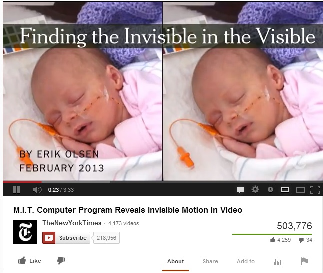
The following data visual deviates from what we have been exposed to thus far as it involves data visualization in the context of video enhancements. Notwithstanding, I found the “Invisible Technology” work being conducted at MIT in the below video link to be fascinating and relevant in that the data visual technology facilitates one’s ability to synthesize info. I think physicians will find great use with this data enhancement tool and what’s cooler is that even folks who suck at science, such as me, can discern what’s going on. Check it out! It’s approx. 3 minutes.
http://www.youtube.com/watch?v=3rWycBEHn3s&feature=player_embedded