Graph visualization for the abstractionism

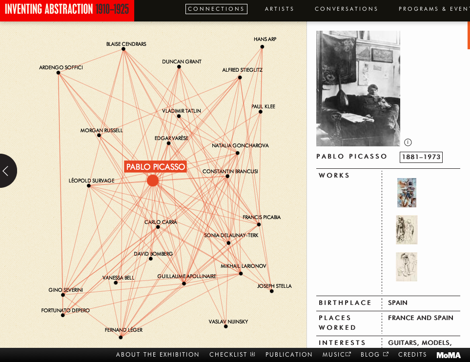
I always find me confused with all the foreign names of the artists and their artwork and mutual influence to others in their work in art. I found this interactive visualization from MoMA as tool to help people want to know more about the art.


http://www.moma.org/interactives/exhibitions/2012/inventingabstraction/?page=connections

It is an exploratory visualization of graph of the abstractionism artists and their representative artwork with brief history. An art movement can’t be understood with only one artist but with a group of artists and its historical context. In this sense, this visualization is giving a chance to expand their understanding to a larger pool of artists by comparing their style and the influence they’ve exchanged.

I personally think this visualization could be a lot more interactive and educational. If a snippet of work of the artist would pop up it must have been easier to match the his/her name and the work. Also, in the graph, if there was some weight difference to show who interact with whom more often, it would have been great and fun to compare their artwork.


Manhunt for the Boston Marathon bombing suspects

This week was one of travesty in the city of Boston. As you all are aware of, there was a bombing at the Boston Marathon. Three people died on that tragic day.

The above visual is from one of my favorite news websites, QZ.com. The visual maps out the sequence of events that unfolded on the city’s streets throughout the day. I think this is a superb visual because it clearly answers the following questions: What happened? Where did it happen? When did it happen?  From the beginning to end, there’s complete clarity in the author’s narrative.

I honestly cannot offer substantive criticisms regarding this visual (I’d make different color choices, but I don’t think that is all important here because I got the information I needed). The folks at QZ.com just have knack for developing great visuals and delivering news content in a concise manner (usually 2-4 paragraphs).

-Sonny V.

Source: http://qz.com/76298/how-the-manhunt-for-boston-marathon-bombing-suspects-unfolded/

Analysis of Pin Number

The website, DataGenetics, often displays quirky or amusing analyses for the enjoyment of viewers.  The blogposts found here are often used to communicate powerful computer science theories or problems in compelling and easily accessible mediums. One that I particularly enjoyed was about Pin Numbers and their predictability.  The visualization that you see above is a heat map of almost 3.4 million 4 digit passwords that he found by executing some SQL injection.

Heat map of commonly used 4 digit pin numbers

The heat map is one of several visualizations that he uses to analyze the problem and then educate his audience on how best to select a Pin number.  I liked the heat map the best because it displays the serious lack of balance in Pin numbers that exist.  Over 25% of all pin numbers could be guessed with only 20 combinations!

The heat map I attached shows the number of first two digit combinations on the x axis and number of second two digit combinations on the y axis.  So at the bottom left is the Pin ‘0000’ and the top right is ‘9999.’ This heat map quite ably demonstrates the lack of spread among Pin numbers, and his box around the high concentration of numbers in the bottom left shows how easy it could be for a criminal to make an educated guess at people’s Pin Numbers.

Jacob Portnoff

Word Clouds

In case you’re interested about legitimate applications of word clouds to get the gist of a document, take a look at this blog post of last year titled Using Word Clouds for Topic Modeling Results. It provides, if you will, a visual representation of TF-IDF. The author goes into some interesting details defending his use of Word Clouds despite the prevailing criticism. Make sure to also read the comments at the bottom!

Avoiding pitfalls in your final project: Story and Narrative

We’ve gotten some feedback from you that the sort of “story” we were looking for you to tell in Assignment 4 was somewhat ambiguous. Is an exploratory visualization telling a story? Or is that what an explanatory visualization does?

The answer is that both types can tell a story. The key question is, given your objective, what do you want to in a sense guarantee that your viewer will walk away with? What are you suggesting more subtly, and what do you want them to discover on their own? The point is to have these takeaways in mind, and use the elements of storytelling discussed in lecture to help guide the viewer through. Even if you decide to create an exploratory visualization, you are not exempt from applying storytelling concepts in your final project.

The biggest pitfall is probably the idea that you can plop the viewer in front of your visualization and assume they have an internal drive to explore your data on their own and draw their own conclusions. This may be the case; certainly if your job depends on it, you’re motivated. But broader audiences have more casual motivations, and you need to think hard about how to capture their attention, draw them in, and tell your story. You can leave them to play on their own—in fact, that can be the main function of your visualization. But you still have to pay attention to how you stimulate and maintain their interest.

The point is that exploring a detailed interactive visualization such as those we talk about in class requires a significant investment of cognitive resources on the part of the viewer. Think about it—you’re essentially asking your audience to learn an entirely new interface. Avoid the pitfall of assuming your audience will come already highly motivated to explore your visualization. And if the viewer has only a little bit of time or effort to spare, can they still get something out of your visualization?

OrgOrgChart from Autodesk

OrgOrg1

http://www.autodeskresearch.com/projects/orgorgchart

(Recommended watching with 1080p & fullscreen)


This is a visualization project shown by video from Autodesk Research. It visualizes the evolution of the company’s structure over time from May 2007 to June 2011 as a tree structure. It took a snapshot of the organization structure everyday, and every second in the video represented approximately one week of the time period. There are about 8000 employees shown in this graph. In the beginning of the video, it illustrates three types of interaction (connection) between every nodes and links. The link between the nodes means a hierarchy of manager and employee. An employee may join, leave the company, or change the manager.

It is astonishing to see how much a company changes over time. However, the color code confuses me. I thought it represented each independent department (tree) at first, but would make no sense if they all linked to the same CEO.

On the other hand, the project group seems to release only the video version of this visualization. It would be much more interesting if we can play with an interactive version, such as to pause at a particular timestamp, filter out some particular departments that have more than 1000 employees, or focus on a/several specific node(s) and see the changes. Nevertheless, to see the changes over time in a video seems to be a nice way to see the changing as a whole (maybe I’m just not the right audience).