Join us for our Information Visualization final project presentations! The 10 group projects represent a variety of topics and audiences and are the culminating work of the students over the semester. For more information and to preview the projects, visit our Student Showcase page.
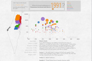
We were inspired by a recent article in the New York Times and decided to make a visualization about the Israeli-Palestine conflict. It being a particularly broad topic, we based our visualization on one aspect which we had been hearing a lot about in recent years: that of Israeli settlements in the Palestinian territories.
We gathered data from various sources like BTSelem.org, fmep.org and Wikipidea. We want to see if there is any correlation between periods of settlement expansion and those of violent conflicts.
Our initial design intuition was to visualize the population data on a map. During some of our early feedback/review sessions with potential audience we found out that geographic mapping was not really adding value to the story we wanted to tell, but would be helpful as a reference.
We decided that a bubble chart representation over a timeline would be the best design to convey our story. The historic events data and a map with outlines of the different regions within the palestinian region would provide more context to the whole visualization.
The final visualization plays automatically the first time, as a preview to user. Users can then move the slider to look at any data more closely and see the changes in population along with significant historic events during that time. We also have provided checkboxes that enables only selected regions.
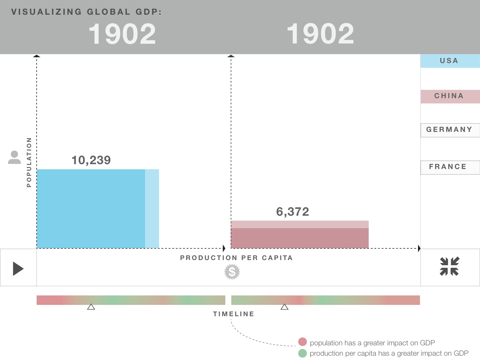
The GDP is one of the key economic indicators we use to judge the prosperity of a country. But what does GDP actually mean, and how does it grow?
Our visualization is split into two very different parts.
The first half is explanatory. We provide the viewer with an intuitive understanding of what the Gross Domestic Product is, and how it can be interpreted. We chose to visualize the production side interpretation (another common one is to interpret it as all goods consumed) as it seems most intuitive to us. Though the use of pictograms it becomes obvious that the abstract concept of GDP actually refers to tangible things produced by humans. We then abstract the individual goods by turning the pictograms into rectangles and then reshuffle all of the small rectangles to form a larger one, which represents the abstract GDP. While doing this we preserve the dimension of population count on the y-axis, and point out that the length of the x-axis can be interpreted as the average output per human, which is called GDP per capita.
Thus, we have explained the GDP and GDP per capita, while at the same time explaining the viewer our second half of our visualization. Our second half visualizes historic GDP data and estimates from the Maddison Project (http://www.ggdc.net/maddison/) for different countries. It uses the same idea of the GDP being seperable into the two factors population and GDP per capita, with the GDP being represented by the area of a rectangle.
Once the viewer has selected two countries he can hit play and watches those countries economic development throughout the years. The different sides of the rectangles grow and shrink individually from each other and the viewer gets an intuition for where which factor had more impact on the total growth for a time period of his interest.
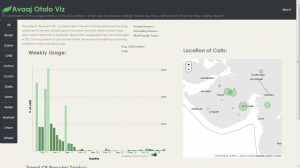
Avaaj Otalo (literally, “voice stoop”) is an interactive voice application for small-scale farmers in Gujarat, India. It provides farmers with access to relevant agricultural information and a virtual community of peers to share their knowledge with over the phone. By dialing a phone number and navigating through simple audio prompts, farmers can browse, listen to, and record agriculture-related information, as well as respond to questions.
This service was designed in 2008 as a collaboration project between the UC Berkeley School of Information, Stanford’s HCI Group, IBM India Research Laboratory, and Development Support Center – an NGO in Gujarat, India. The system has been “live” since 2010, serving the community of Gujarat farmers. Every time a farmer places a call, the system creates a record of important information about that call such as date and time, duration of the call, inquiry topic, selected forum, and crop that the call was about.
Avaaj Otalo researchers would like to have a visualization tool that can help them track and visually explore system log data. They can use this information to make improvements to the existing services and possibly expand the project scope to other regions in India. Thus, the main objective of our visualization is to allow the founders and the researchers of Avaaj Otalo to analyze and visually explore key metrics behind application usage.
Our visualization focuses on providing insight into the trends and patterns of weekly call volumes. The bar chart displays weekly number of calls to the application over the course of a year. Color intensity indicates how average duration of the calls is related to call volume (darker colors signify longer calls). The map identifies the Gujarat’s villages that these calls are coming from. The small multiples on the bottom of the page exhibit call topic trends. Since all crops have very different seasonal and agricultural cycles, the visualization is organized by individual crop.
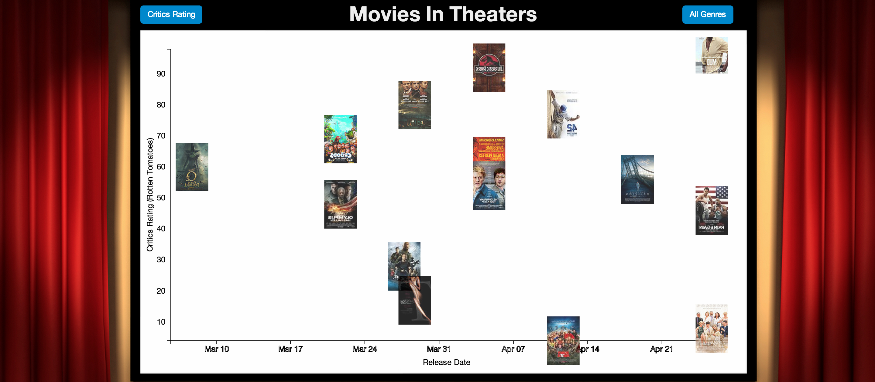
There is an abundance of movies in theaters and choosing which one to watch is a common task. There are many variables in choosing what to watch, and everyone has different needs. Some people may be more interested in critically acclaimed movies. Others might be more interested in crowd pleasers. Some may want to watch movies that are currently trending, while others who haven’t been to the theaters in a while may want to watch the most popular movie in the past month.
Movies in Theaters is an exploratory visualization thats helps people visualize movies in theaters and decide what movie to watch. You can explore movies based on various criteria such as release date, critic ratings, and audience ratings. It’s also to see the differences between criteria such as audience and critic rating, and the animations help illustrate this.
Users can dig deeper into each movie to view more information. The primary purpose here is to show information that will help the user make a decision. This includes mpaa rating, runtime, genre, directors, actors, a trailer, synopsis, ratings, and box office information.
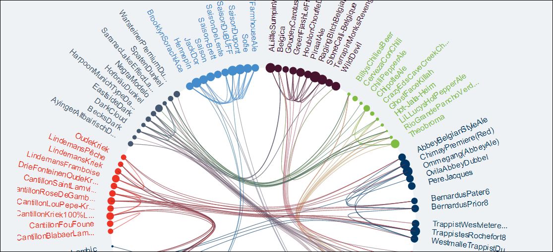
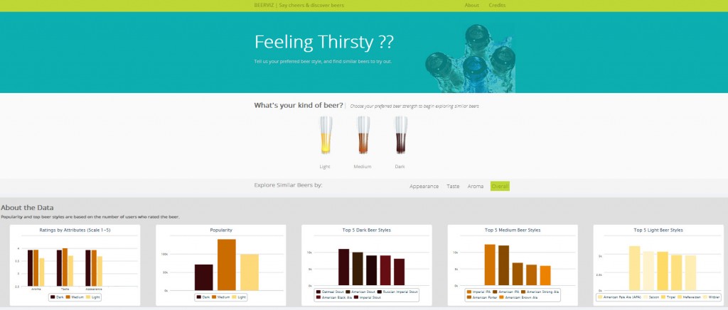
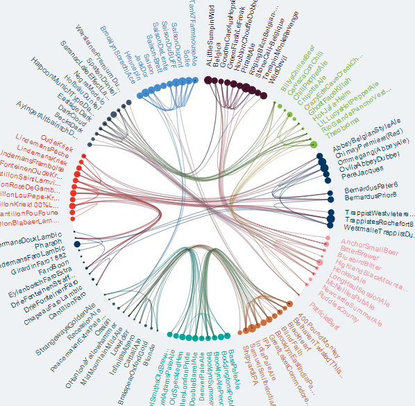
Our objective was to create a fun way for users to explore beer varieties. The data set was taken from BeerAdvocate (http://snap.stanford.edu/data/web-BeerAdvocate.html), a comprehensive collection of 10 years worth of user reviews on beer.
We wanted to ensure that the multi-dimensionality of our data was showcased through our visualization and so we opted to create a chord layout. The narrative begins by asking users to select their preferred beer strength, and uses this input to generate a chord that showcases similarities between beers based on reviewer ratings. Users can further explore similarities across the parameters of appearance, taste, aroma and overall ratings. These similarities are depicted by connected chords. Beerviz shows you the most reviewed types of beer and allows you the explore the relationships between them. Additionally, the size of the nodes represent the popularity (defined by number of user reviews) of the beer that they represent. Hovering over a node highlights the relationships. Beers are clustered based on the styles. These styles are represented with various colors.
Once a user has explored and discovered beers he wants to try, he can also look at the summary charts that provide a summary of the entire dataset. Our summary charts showcase the following key statistics:
Average ratings for each of the parameters (aroma, taste and appearance) by type of beer (depicted by the beer colors).
Popularity of the various kinds of beer based on the number of reviews
The top 5 beer styles for dark, medium and light beers
From our own explorations of the visualization we have found some interesting beers like Raging Bitch, Old Rasputin Russian Imperial Stout and Hopstoopid that we plan to try out. We hope that users enjoy using our visualization to explore and discover beer.
Team: Kristin Stephens, Kate Hsiao, Divya Karthikeyan, Kiran Chandramohanan
A Massive Open Online Course (MOOC) is an online course that can involve 100,000s of students at one time. With orders of magnitude more students commonly seen in a single classroom, instructors must find new ways to understand, use, and visualize their class’s information. Here we created a MOOC dashboard that provides instructors a view into their data, to better understand what is currently going on in the course.
Our visualization focuses on answering the most common and daily questions an instructor would have when coming to the dashboard: “Where are the students?” and “How are they doing?” These questions led us to the following graphs:
Current Student Positions: The x-axis shows the sequence of content students will go through over the course of the week. Bars are color coded based on the type of content (video, quiz, homework, other). A bar shows the number of students at that current position, or where they last visited.
Graded Items (graphs are grouped by type)
Student Status : A stacked bar graph of the number of students in each status category for a graded item. Students are split into three categories: not started, submitted, and in progress.
Student Attempts: A stacked bar graph showing the number of students that tried 1 to 10+ attempts for a given graded item.
Grade Distribution: Shows the grade distribution for each graded item using a color gradient of red for 0% to white for 50% to blue for 100%. The high grade distribution is because students are able to submit a graded item multiple times and therefore commonly submit until they get a perfect score.
Overall Active Students: Provides information on how many students are currently active in the course. We defined active student as they interacted with the course material within the last 7 days.
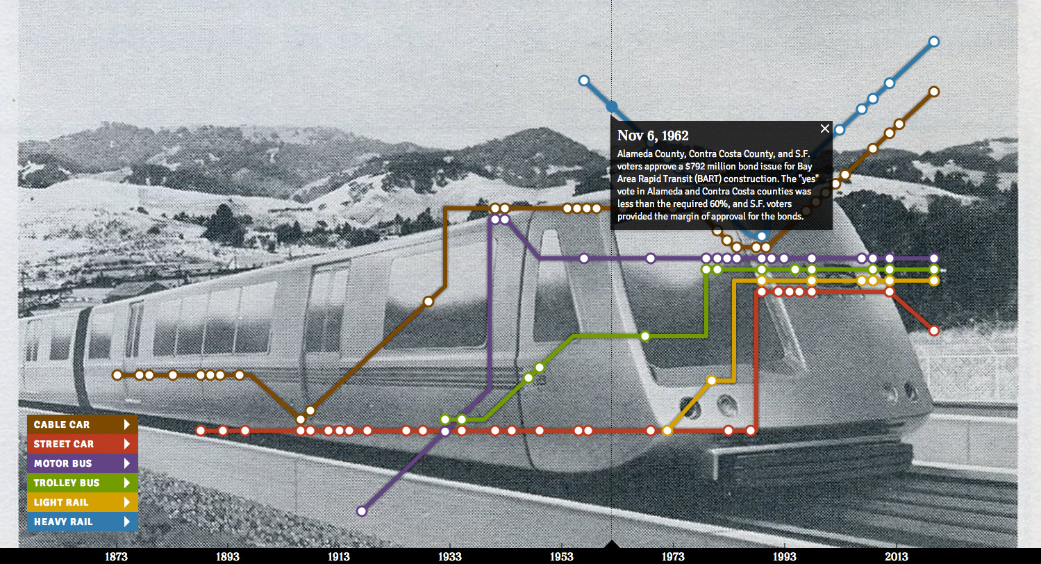
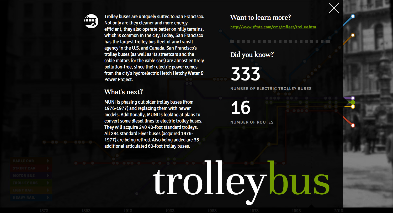
San Francisco’s iconic streetcars and cable cars help make the city one of the top tourist destinations in the world. As San Francisco Municipal Railway (MUNI) celebrated its 100th anniversary in 2012, we would like to take this opportunity to incorporate what we have learned from INFO 247 to explore the fascinating history of San Francisco transit.
One unique aspect of the system is its diversity of fleets, which is rarely found in other transit systems. In our research, however, we didn’t find a visualization that recount history from this viewpoint, which led us to create a visualization that does so.
In our design, we used a metaphor from actual transit maps (drawing examples from Ford’s London Tube map and Vignellie’s New York subway map). Each vehicle type is represented by a “route” and important events are plotted along the route accordingly, much like stations along a train line. In addition to text descriptions, historical events are illustrated with vivid photographs that complement our narrative. The user can also let the narrative unfold linearly (by using auto-play) or non-sequentially (by toggling particular vehicles/events). At the end of each “route”, the user will also see interesting statistics, current status, and future plans.
By combining stories, historic images, and eye-catching design, we hope that our visualization brings the charming history of San Francisco transit to life.
Team: Fred Chasen, Raymon Sutedjo-The, Charles Wang
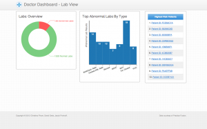
Healthcare is an important topic that is often difficult for people to understand. Considering the scope of resources being committed to Healthcare in the United States alone, improved understanding will only become more important with time. Innovations in visualizing healthcare data will prove useful to visualizing complex data sets more generally.
We decided to address this topic by building a dashboard that doctors can use to view overall health data of their patients, on a broader high-level scope to granular patient-level data. One major concern was to have all of the charts and data be simple and easy to glance through in order to make the process of understanding the data much quicker. The front page focuses on the types of abnormal lab results received by that practice. We highlight the number of abnormal lab results as well as the different kinds of abnormal labs.
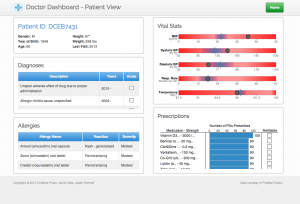
When moving forward to the patient-level data, we highlighted past Diagnoses of each patient, known allergies, vital statistics relative to the average, and prescriptions that have been assigned to them. It was important for the most essential information of each patient be exposed and well visualized for doctors to gauge the health of their patients.
We’ve received a lot of really helpful feedback that led us to making better design decisions for our product. One especially important comment was to focus on each patient from the main dashboard view. It helped us really disperse the potential information overload on the home page, and we were able to produce detailed pages for each patient in the practice. Currently our dashboard is optimized for desktop viewing, but ideally when we move forward with this project we want to customize it for tablet use. We think the data and the ability to review essential information like this would be extremely helpful for doctors who are moving from room to room and want to review patient information from any place within their office.
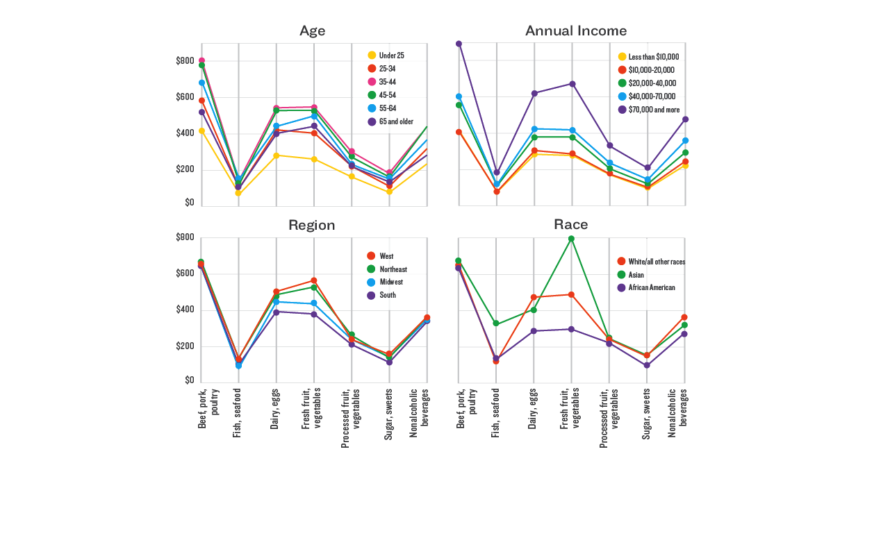
Description: Do you know how much money you spend on food per year? Can you guess how much money the average American spends on food per year?
Team: Sara Cambridge, Chris Hallas, Suhani N Mehta, Aksel Olsen
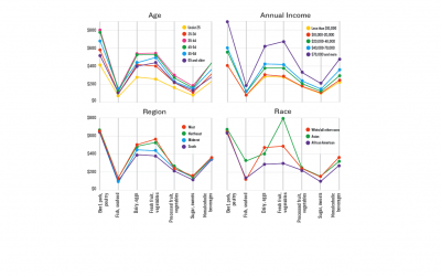
Using data from the latest national Consumer Expenditure survey, we summarize what an average American household spends on food. We then unpack this extremely rich data set further by looking at how demographic markers– age, income, region and race– reveal interesting patterns and insights about food choices.
What makes food interesting as a category is that we all have to eat, and in theory we all need the same (or similar) amount of nutrition. Yet the diversity within America suggest that preferences and culture might lead to very different consumption habits.
Would you expect those living in the South to have different items in their shopping cart than you? How about those over 50 years old? Or those who make less than $20,000 per year? The results are surprising!