Sugar Consumption Infographic

Link: http://www.yesmagazine.org/for-teachers/curriculum/curriculum-resources-sugar-consumption-infographic

A friend that works for the America Heart Association told me about a problem of explaining how much sugar is in different items because their current unit of sugar is sugar cubes which kids don’t really know of any more.

I came across this and think it is a nice alternative to sugar cubes in giving a sense of sugar consumption by the average American. I really like their use of color, font, and bases of comparison. There is only one main color, red. Everything else is black, white, or shades of gray. This choice of color, and the font as well, actually reminds you of Cocoa Cola, which is a big producer of sugary products. How they use the color is also nice. They alternate as the viewer goes down through the graph so each section is well marked without tiring the viewer with the same background and foreground colors.

They use items that are common today to demonstrate scale such as wheelbarrows and dumpsters. This is great because 130 lbs of sugar is kind of hard to imagine, but a dumpster full of sugar is possible to visualize. Another way to give a sense of scale is explaining what else could be consumed for the same sugar or calorie amount. The 10 strips of bacon instead of 500 calories of sugar is especially funny 🙂

US Gun Killings in 2010

GunKillings

Linkhttp://guns.periscopic.com/

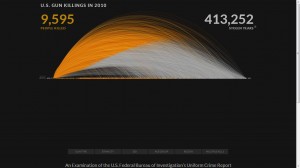
This is one of the most unique visualizations that I have ever come across and quite effectively communicates the information about gun killings in the US in 2010. The data about these killings comes from the FBI.

The intent of this visualization is to show the number of deaths caused by gun shootings in every month of the year 2010.  The larger the diameter of the curve, the higher the age of the person when they were shot.  This is not a static visualization wherein you can see the number of deaths per month in the year 2010. There are several features in this visualization with different user intents:

1. As the visualization loads, the cumulative sum of  the number of deaths keeps on increasing as the months go by.

2. Also, it is interesting to see that initially when the first couple of curves are being plotted, a symbolic bullet/gun pellet drops to the X- axis when the person reaches the age when he/she is killed.

3. Clicking on the “age” box in the bottom left corner gives you a static graph in a different format (User Intent: Encode or show a different representation)

4.  If you hover over any of the areas in the visualizations (of both kinds), it describes when, how and at what age that person was shot. (User Intent: Abstract/Elaborate)

5.  However, the most interesting part of this visualization for me is the sum of the number of stolen years from all these people killed. they assume a different life expectancy of every individual (obtained from some data).

Technologies used: Examining the source, they seemed to have used AJAX and Javascript for rendering the visualization.

Lace Charts: Knitting Visualizations

When we think of data, we normally think of values: numbers, percentages, averages, and the like. But as we saw with assignment one, we interact with a lot of different types of information on a daily basis. For knitters like myself, patterns are excellent examples of this: while some designs are very simple, requiring only knowledge of only one or two stitches, others require a lot of knowledge, and the information contained in the pattern can be quite complex and difficult to follow.

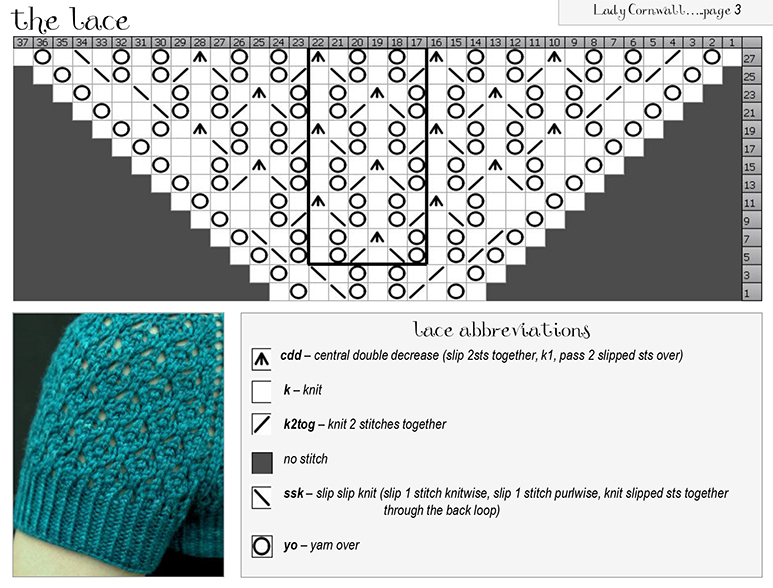
Lace is considered to be amongst the most complicated type of knitting, consisting of intricate patterns of “holes” in the fabric. For these and many other patterns, it’s common to find charts: a grid of squares, where different symbols represent different types of stitches. Each row in the chart is a row of knitting, and the chart is followed from bottom to top. With some education on how to use them, these visualizations can provide two major benefits.

1. What the fabric looks like: the symbols used generally represent the actual stitch shape fairly well. In this example, the wavy pattern of the yarn overs (the big circles) are visible, which appear in the lattice texture of the fabric. Additionally, the knitter can see that this lace pattern increases by two for each row, since dark squares do not have stitches, but they are filled in as the pattern is knit.

2. At-a-glance: knitters can follow the pattern at a glance, using the more pre-attentive pictographs instead of reading specific stitch words. Instead of reading “k1, yo, k1, k2tog, yo, k1, yo, ssk, k1, yo, k1,” the knitter can see the 11 stitches of the bottom row with one glance. Repeats (the stitches within the darker black box) are easy to distinguish from the end stitches that are knit only once. The legend at the bottom helps with remembering what each symbol represents. This at-a-glance interaction can be a boon to a knitter managing tools and yarn at the same time, potentially reducing the amount of mental overload involved.

Infographic: Hot Summer Down Under

tumblr_mj5a1uHrwC1qa4968o1_1280

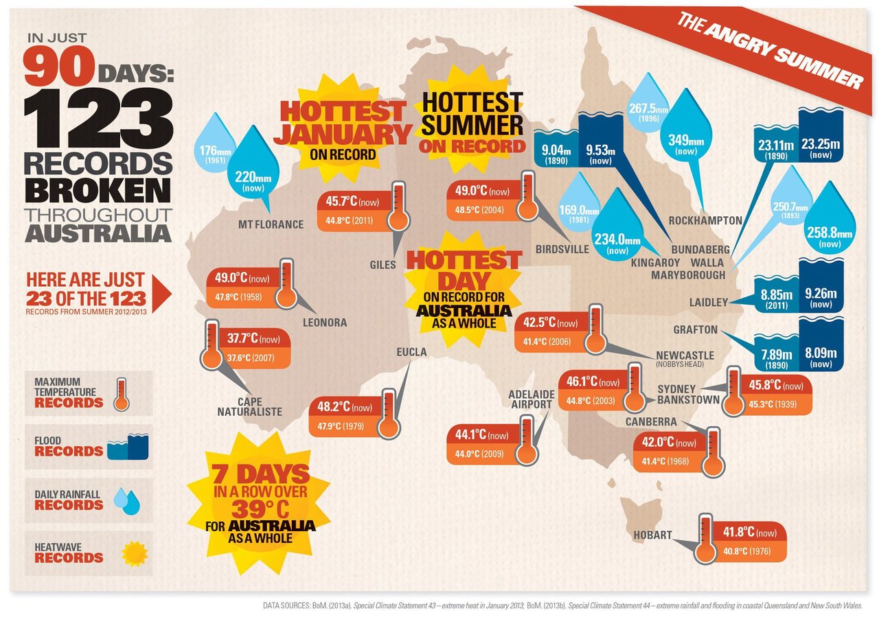
During the last lecture, we saw an example from the Australia Bureau of Meteorology which shows the extreme temperature in Australia this summer. The visualization above, found on a Tumblr blog of a sustainable cities website (thisbigcity.net), is an extension of that idea. It shows information such as temperature, flood, rainfall, and heatwave records in various places in Australia, which altogether explains the “angry summer” that the country is experiencing.

The key information is fairly straightforward. The temperature/flood/rainfall records are quantitative measures that are comprised of the new record (all broken in 2012/2013) and the previous high record. However, I did find the use of icons slightly inconsistent. The flood and rainfall icons are both comparative–they’re each made of a smaller icon and a bigger icon to represent the previous and current record, respectively. The temperature icon, however, is illustrated as only one part (thermometer) with the previous and current record information displayed on the side. I’m not sure why the designer used a different icon logic for temperature, especially since the information displayed is of the same structure.

My biggest annoyance is with the heatwave records, which are spattered all across the map with no discernible logic in their placements and seemingly random typographic hierarchy in terms of size, color, and typeface. Instead of the current placements, these icons could be placed at the bottom together (as 1-dimensional stats) to give the main visualization a little more breathing room.

Overall, the visualization can benefit from some content restructuring. At the moment, the graphic looks crowded and every item is styled in a manner that demands the viewer’s attention (big and bold types, bright colors, icons, etc). While the information conveyed is quite straightforward, creating a little more hierarchy in the visualization–through higher contrast between items and generous use of white space, for instance–will greatly help its narrative flow and convey the idea better.

–Raymon Sutedjo-The, 3/4/2013

Source: http://tumblr.thisbigcity.net/post/44546064005/australia-one-of-the-most-urbanised-countries-in