?
Tag: eicke-david
Gestalt Principles and Affordances on WSJ.com
Gestalt in the News
Analysis of rules seen in the front-page of www.wsj.com (The Wall Street Journal)
Rule #1 – Headings
Consistent formatting helps show what kind of text something is – tab, article title, body, or subsection header. The tabs are indicated by sans serif font (Whitney SSM or Arial), a slightly heavier weight font, small size, black. The titles of articles are indicated by serif font (Chronic Display or Georgia), bold, larger size, black. The body text of articles is serif font (Chronicle SSM or Georgia), regular font weight, small size, black. The subsection/topic headers are sans serif font (Whitney SSM or Helvetica), small caps, of various colors, but all colors have similar value.
Rule #2 – Borders
Borders divide up the page, and the border thickness and color denote how “deep” this divide is. Between completely different sections such as between the tabs and the content, there is a strong black thick border. Between different articles in the same section, there is a pale thin gray border.
Rule #3 – “Read More” Arrow
There is a “right arrow” for each section to read more. This rule is somewhat inconsistently applied. For the “Opinion” section this arrow is at the top to the right of the section title, and is close enough to the section title to be associated with the section title. The “Markets” section has its arrow at the bottom with an additional smaller “MARKETS” label. The “What’s News” has it at the top, but this header bar is so wide that the arrow all the way to the right is so far away from the “What’s News” at the left that in my mind they are not clearly associated.
Rule #4 – Data Visualizations
Data visualizations use a consistent shade of blue for the graphs. The text is gray sans serif.
Rule #5 – 12 Column Grid
The page appears to be laid out on a 12 column grid. In its widest layout, the four columns on the page are, from left to right, width 3, width 4, width 2, width 3.
Rule #6 – Image Aspect Ratio
The image aspect ratio is usually the same for images. This helps gives rhythm rather than chaos to the webpage, which is crowded with text and images.
*Gestalt Principles in play*
Contrast:
The WSJ website uses a reverse-contrast to distinguish between static content on the site (black foreground on white background) and the dynamic content represented by the stock ticker at the top (white foreground on black background). This according to us is a very good use of contrast as it in terms of scale (thin strip compared to the rest of the site), it creates a different context of lower relative emphasis.
Emphasis:
There are a few different ways the WSJ hompage communicates emphasis. The first one is through space. Note that the headings for each subsection of the paper are not much bigger than the rest of the text on the page. The way they stand out is that their entire right side is cleared, giving that word notable prominence, as nothing is on its same level, vertically, until you get to the next section. Another (more obvious) way is font size, as demonstrated by the top left headline. A third way is the use of center alignment for Opinion articles. Everything else is right-aligned, and the disruption of the rhythm created by this alignment is what sets off the section as important.
Balance:
We noticed some imbalance in WSJ.com’s header. The designers seem to have placed all the “extras” in the header on the right side, with nothing on the left to balance it. Subscribe and Sign In links are there, along with a red 50% OFF indicator.
Harmony:
All of the images in WSJ’s layout seem to be of the same 1.5 aspect ratio, despite their varying sizes. This adds a sense of consistency throughout. Also, they tend to use a consistent accent color (a mid-blue) seen in mouse-over transitions and in the Market section’s line graph.
Rhythm:
As I mentioned above, left justification is used almost exclusively throughout. There also seems to be consistent horizontal space between columns and consistent vertical space between vertical elements. As the eye travels down the page, one can see which articles are related through alignment of photos and text, such as the strategy employed with stacked boxes in the business section containing right-aligned photos of the same size surrounded by left-aligned text
Other Case Studies
In getting away from traditional new outlets, we wanted to consider NPR.org, whose news is generally disseminated in audio format, with text being secondary. This website is much simpler than WSJ.com, and after a menu on top, takes advantage of a pattern called “cards” to create a nice sense of rhythm. Each card is the same width with the same amount of space between itself and the next one. Each card is labeled with a category, and most feature a headline, a picture, and a button that allows the user to listen to a story. The type treatment is consistent across roles, so without reading the text, you know what information it’s going to tell you.
Another news website that our group studied which is quite unconventional in terms of visual representation was Slate (www.slate.com). Slate again used reverse contrast but this time, augmented it with scale to add emphasis to the most important article on the front page. To indicate difference in context of the link to the Facebook page as well as the request to disable the Ad Blocker (both of which are lower in hierarchy compared to the main news content), Slate glued thin strips of reverse contrast to the top and bottom of the page. As you scroll down further, there is a clear shift in weight to the top right as the heavy Slate logo stays glued to the top right of the page. This, we thought was an excellent manipulation of balance as users can find the menu and the search option on this ‘heavy’ block.
Al Jazeera, as we studied also had some interesting variations on contrast, emphasis and overall balance across its American, English and Arabic versions. The American version had a visual identity that was quite distant from its English and Arabic counterparts and used scale to indicate hierarchical difference in menu, space to indicate emphasis of the titles and contrast to indicate selected menu item. The English and Arabic version, while more similar at a glance, had some differences in the way they used balance and contrast. The English website was a more Left-to-Right oriented website with the emphatic elements predominantly on the left while the Arabic version followed the opposite trend. However, while the live news update was reverse contrasted, it stayed on the left side of the screen for both versions.
The Guatemalan newspaper Prensa Libre appears well-balanced at the top of the web page, but the design rules do not stay consistent as one scrolls down. In the header, the wide white side bars, use of free space and symmetrical layout create a feeling of balance. The distinctive brush-like font used for “Prensa Libre” contrasts dramatically with the Palatino/ Arial font of the rest of the page. The consistency of the font types, blue/gray colors and balanced arrangement create a sense of harmony. The main content is arranged in three columns of unequal width, with some emphasis given to the headline photo on the upper-left that takes up two columns, and greater emphasis given to the column on the right which is slightly wider than the rest and demarcated with a red line and small red clock symbols highlighting the latest news updates. Since the rest of the text and formatting lines are blue, black or gray, the red contrasts dramatically. The red clock symbols match the one in the drop-down menu, creating a clear consistency. On the other side of the page, the upper-left corner is grounded by a large black box with a simple white outline of a house; our eye is clearly drawn to the homepage link. As we scroll down the page, we see a balanced rhythm of column layout alternating image/ text/ image / text. However, as we scroll further down the page, we hit a shadowed line break where the “headlining news” ends and the “Mas noticias” and “Editorial” sections begin. The right column drops out and the other columns do not realign; instead, we are left with a glaring white space which feels unbalanced. For the first time, we have a left-aligned column of bullet points. The inconsistency is startling – I suppose that it is effective in making us feel like we have moved into another section of the paper.. At the bottom of the page, we hit another shadowed line break and the layout shifts entirely for the “Opinion” section; now we have four equal columns with titles that are center-aligned. If we were to study the “Opinion” section in isolation it would appear well-balanced, but the dramatic shifts in layout between sections destroys the overall harmonicity of the page.
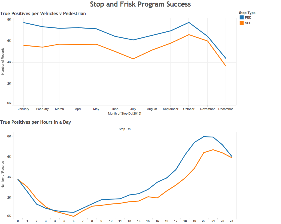
Data Visualization Workshop: Stop and Frisk Program is Effective!
What is your story?
Our story is attempting to educate people about the effectiveness of the ‘Stop and Frisk’ program. Primarily, how it leads to rightful incarcerations as well as notify citizens where and when crime occurs in the Los Angeles area.
How does the selected data support your story?
By solely looking at the “stop and frisks” that lead to a follow-up or incarceration, we can tally the number of times the program effectively lead to a “true positive” outcome. Our story essentially states that without this program in place, this statistic would instead be the number of potential crimes that would not have been mitigated.
The second graph from our analysis shows where and when the true positives occur. This visualization serves as a public service announcement to the citizens of Los Angeles about potentially dangerous areas and when to avoid them.
What data did you omit, and why?
In order to show the effectiveness of the program, we filtered out the data representing “stop and frisks” that did not result in a situation necessitating follow-up or incarceration. In other words, our data represents only “stop and frisks” resulting in arrest — a metric that is indicative of success of the program. We also chose to not create a visualization about gender, race, or division of the LAPD as they could be interpreted as biased and even discriminatory.
How does the representation support your story?
We used Tableau as our main representation graphic as it would give us a clear visual analysis which would be easy for the general public to understand. The graph clearly explains our analysis using two simple color coding system, with line graphs quantifying the number of true positives over time.
What visual metaphor(s) did you use and why?
We chose a line graph to communicate how this data changes over time. We felt that the continuous nature of a line would effectively communicate the dimension of time, going from the conventional left to right orientation. The erratic nature of the line graph communicates the unpredictable and stressful nature of crime in Los Angeles. We can see the constant ebbing and flowing, conflict and resolution, of crime. We have the Stop and Frisk program to thank for helping to bring order to society.
David Eicke
Fierce/Dynamic:
daring
unpredictable
brash
powerful
bold
intense
chutzpah
charisma
sizzling
intriguing
Whimsical/Delicate
capricious
fragile
windblown
snowflake
dreamy
scatter
abstract
flower
flutter
pure
Safe and Efficient:
reliable
convenient
secure
friendly
smooth
established
automated
experienced
regular
slick
David Eicke
Drawing inspiration from my very musical roommate, I went with a bicycle tire as my unexpected object. While it does have a fascinating history (as anyone who’s taken INFO 203 can tell you), the bicycle tire is normally viewed as very utilitarian. It serves the purpose of allowing a human to travel at greater speeds than he or she can on foot. It generates this lateral motion via rotational movement.
And it’s kinda dirty. It splashes through mud puddles and scrapes over asphalt.
To see it used as an instrument seemed to make people laugh, which wasn’t necessarily my intended outcome, but it makes sense in retrospect. Instruments are thought of as vehicles for artistic expression, not as tools for a job. They’re often polished and kept in padded cases, not dragged along the ground. So I think the laughter came from the juxtaposition of the idea of a grimy utilitarian object being used in conjunction with a viola bow, which is associated with fine art and almost neurotic levels of cleanliness.
David Eicke
Part 1 – What does this object mean to you?
I’ve had this rhyming dictionary since undergrad, where I bought it from a library sale. I always thought it was a beautiful artifact. I’ve also actually used it a few times, early on, when writing poetry or lyrics. Now, though, if the need for a rhyme comes up, there are (probably) superior resources online. I keep the book around because I like having it on my shelf—so much so that it’s survived several book purges and four or five moves.
Part 2
1. What if we looked at all objects, people, thoughts, and things in the world this way?
Such careful consideration of things can be valuable and fulfilling. The act of this consideration reminds me of the famous Hamlet quote “I could be bounded in a nutshell and count myself a king of infinite space.” It’s certainly possible to find a lot of significance in not very much. There’s an argument that what lends poetry its gravitas is the careful consideration of word choice. Histories of words, the words’ relationships to other words, and the structure of the words can all play a role. It’s also this same slow, deliberate attention that creates expertise. It seems that this approach would fit better in an Eastern concept of time, where, since time is cyclical and infinite, consideration is perceived as less of a time cost.
On the flip side, it can come at the cost of time and energy, and thus at the cost of breadth of knowledge. At risk of sounding really capitalistic, we all have finite time and energy, and “spending” it on fewer things can result in some one-dimensionality.
2. When would we need to look at the world this way?
As I mentioned above, when we are looking to become experts in some domain, this way of looking at things is essential. It’s no accident that professional dancers know the history of their dances, or that they are aware of the smallest details down to space between fingers.
3. Has the meaning of this object changed?
Looking at my Rhyming Dictionary more closely did make me fonder of it. I realized it was from the library within West Quadrangle in Ann Arbor, where I lived during my sophomore year, and where I met most of the closest friends I have today. I also was able to notice its thoroughness, its beautiful texture, and its age. You could see the care that went into creating that book, down to the detail of the symbol-laden foil stamp on the cover.
David Eicke
Apprehension:
Having always been a picky eater, I am usually nervous about trying new things. I sometimes will gag on food items if my body finds them particularly objectionable, and the last thing I wanted to do is spit something up in front of my classmates. This was an interesting experience because, while I didn’t really try anything new, I did face the same uncertainty; I knew the tastes would vary from my established mental “database.” The question was: how much? Nevertheless, I was too curious to pass it up.
Experience:
I picked up a grape, a glass of vinegar, a lemon, some dark chocolate, and a tomato. The first thing I tried was a grape, which actually just tasted like a grape. So, initially, I was questioning whether I’d done something wrong. But then I tasted the lemon, and sure enough, it was much sweeter than normal. I did notice, however, that the first split second of the lemon taste matched what I was used to. It made me wonder if that initial contact tasted sour because I expected it to taste sour, and then perhaps the actual signal being sent from my taste buds overrode my expectations. A similar thing happened with vinegar: the smell primed me to expect a vinegar taste, and for the first split-second, I did taste what I’d previously come to know as “vinegar taste” before it started to taste like Apple Pucker.
This experience reminded me of something that happens with my slight colorblindness. I will occasionally see something as green, and then someone will correct me and tell me it’s red, and it will turn red in front of my eyes. It’s almost as if, with this experience, it was my taste buds correcting me.
Regarding Frequency:
I imagine there’s a threshold where something stops being surprising. For example, if some stereotype I have is upset once—maybe a female wins an all-gender weightlifting competition—I’d be really surprised. Then, if it happened again a few months later, I’d be surprised again. But if it kept happening, or if it happened once a year, my surprise would go away. But I don’t think surprise is a function of time, necessarily. I taste things every day, but weightlifting competitions (that I know of) don’t happen every day. I would anticipate that everything tasting different once a year would surprise me each time it happened, since there were so many instances of “normalcy” in between.