What is your story?
Our story is attempting to educate people about the effectiveness of the ‘Stop and Frisk’ program. Primarily, how it leads to rightful incarcerations as well as notify citizens where and when crime occurs in the Los Angeles area.
How does the selected data support your story?
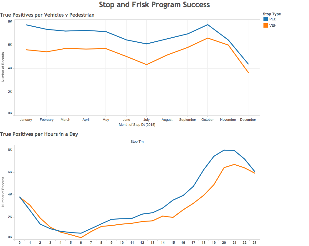
By solely looking at the “stop and frisks” that lead to a follow-up or incarceration, we can tally the number of times the program effectively lead to a “true positive” outcome. Our story essentially states that without this program in place, this statistic would instead be the number of potential crimes that would not have been mitigated.
The second graph from our analysis shows where and when the true positives occur. This visualization serves as a public service announcement to the citizens of Los Angeles about potentially dangerous areas and when to avoid them.
What data did you omit, and why?
In order to show the effectiveness of the program, we filtered out the data representing “stop and frisks” that did not result in a situation necessitating follow-up or incarceration. In other words, our data represents only “stop and frisks” resulting in arrest — a metric that is indicative of success of the program. We also chose to not create a visualization about gender, race, or division of the LAPD as they could be interpreted as biased and even discriminatory.
How does the representation support your story?
We used Tableau as our main representation graphic as it would give us a clear visual analysis which would be easy for the general public to understand. The graph clearly explains our analysis using two simple color coding system, with line graphs quantifying the number of true positives over time.
What visual metaphor(s) did you use and why?
We chose a line graph to communicate how this data changes over time. We felt that the continuous nature of a line would effectively communicate the dimension of time, going from the conventional left to right orientation. The erratic nature of the line graph communicates the unpredictable and stressful nature of crime in Los Angeles. We can see the constant ebbing and flowing, conflict and resolution, of crime. We have the Stop and Frisk program to thank for helping to bring order to society.