Data Visualization Workshop: Stop and Frisk Program is Effective!

What is your story?

Our story is attempting to educate people about the effectiveness of the ‘Stop and Frisk’ program. Primarily, how it leads to rightful incarcerations as well as notify citizens where and when crime occurs in the Los Angeles area.

How does the selected data support your story?

By solely looking at the “stop and frisks” that lead to a follow-up or incarceration, we can tally the number of times the program effectively lead to a “true positive” outcome. Our story essentially states that without this program in place, this statistic would instead be the number of potential crimes that would not have been mitigated.

The second graph from our analysis shows where and when the true positives occur. This visualization serves as a public service announcement to the citizens of Los Angeles about potentially dangerous areas and when to avoid them.

What data did you omit, and why?

In order to show the effectiveness of the program, we filtered out the data representing “stop and frisks” that did not result in a situation necessitating follow-up or incarceration. In other words, our data represents only “stop and frisks” resulting in arrest — a metric that is indicative of success of the program. We also chose to not create a visualization about gender, race, or division of the LAPD as they could be interpreted as biased and even discriminatory.

How does the representation support your story?

We used Tableau as our main representation graphic as it would give us a clear visual analysis which would be easy for the general public to understand. The graph clearly explains our analysis using two simple color coding system, with line graphs quantifying the number of true positives over time.

What visual metaphor(s) did you use and why?

We chose a line graph to communicate how this data changes over time. We felt that the continuous nature of a line would effectively communicate the dimension of time, going from the conventional left to right orientation. The erratic nature of the line graph communicates the unpredictable and stressful nature of crime in Los Angeles. We can see the constant ebbing and flowing, conflict and resolution, of crime. We have the Stop and Frisk program to thank for helping to bring order to society.

Stop and Frisk Program Success

Data Visualization Work on Stop and Frisk

Hasnain Nazar, Anne Gruel, Andrew Lambert, Puneet Sharma

1. What’s our story?

Our background for the infographic is that we are a university professor in the department of Ethnic Studies. Our goal for the infographic is to get students interested in our class and to register for it to learn more about sociological and institutional phenomenons. The infographic aims to depict the disparity of stop and frisk occurrences between the Hispanic, Black and other populations of LA. The overall finding and statistics shown on the infographic show that blacks are stopped and frisked much more than any other racial population.

2. How does the selected data support your story?

The data showing how often blacks are stopped in comparison to other races truly highlights the issue of race and perception in society. The data we selected to use to tell our story was:
Population of LA County by race
Number of stop and frisks by race
Percentage of arrests by race
Our aim of also discussing sociological biases may also be relevant as we can lead our class through a discussion on racial bias, self-fulfilling prophecies and institutional racism. A discourse around race and America may also be relevant but as one can see we have enough to discuss for one class session!

3. What data did you omit, and why?

We wanted to perform a more granular analysis of this issue by drilling down into the city-level to the neighborhood-level data. For example, some neighborhoods may have more blacks than other neighborhoods. Would there be more overall arrests in these neighborhoods? The data set provides neighborhood labels, however we also need the longitude/latitude mapping to explore this spatially. This longitude/latitude data is unavailable to us as part of the data set, so we decided it was out of scope for this exercise.

We also pivoted from our original concept, which used a set of squares to show the disparity between race population and their relative stop & frisk rates. As we looked deeper into the data, we realized we had compared proportions of the absolute population (which sum up to 100%) with the stop & frisk numbers relative to racial categories, which do not add up to 100%. Therefore, we took a step back.

4. How does the representation support your story?

We used numbers like “4x” and “10x” to emphasize the contrast between stop & frisk rates between racial groups. We also used bar graphs to facilitate quick comparisons between the 3 groups. Bar charts allow the viewer to compare quantitative data in a single dimension, which is easier to process than our earlier square visualization, which forced comparisons in two dimensions.

5. What visual metaphor(s) did you use, and why?

Our visual metaphor centered around the humiliating and impersonal nature of stop & frisk. The central illustration shows someone’s personal space being violated in a stop & frisk. We used this metaphor to expose the seriousness of this issue to students, who come from a variety of racial backgrounds.

One conversation we had was how to represent the individual races visually. Should we use icons to depict the races? As an ethnic studies professor, we realized this could compromise the agency of these groups. Marginalized communities already have issues speaking for themselves because they don’t have access to certain channels. We wanted to avoid speaking for populations that we are not a part of. We didn’t want groups to be identified with specific colors, so we stuck to grayscale We also decided to use abstract representations of the data through bar charts and such.

Data Visualization Workshop: Are LA Police Stops Effective?

TEAM #2 City/Mayor

CONTEXT: This is an internal, actionable report on the effectiveness of police stops for the Los Angeles Mayor. Our analysis looks at the police stop accuracy rate, i.e., the percentage of stops that are immediately followed with post-stop activity (as opposed to unnecessary stops which do not justify further activity). We showcase the 5 most effective and 5 least effective neighborhoods, and then further breakdown the police stop effectiveness by race for each neighborhood.

ACTIONABILITY: This data could be used to identify the top performing police precincts, reward their success, and analyze what specifically is superior in their policies and practices. Ultimately, the goal would be to transfer those policies, practices and perhaps even personnel to the lowest performing precincts.

What is your story?

Working in the mayor’s office, we have decided to create an internal, actionable report for the Mayor that cuts to the essentials of what can be quickly acted upon due to the Mayor’s limited time. We focus on the ratio of “Stops with Post-Stop Activity” / “Total Frisk Stops” in ten different neighborhoods across the city to convey the efficacy of Stop-and-Frisk legislation. We focus on the top five and bottom five precincts in order to best understand which practices lead to their success or failure. Additionally, we break down the police stop efficacy by race for each neighborhood to explore the possibilities of racial discrimination in the law’s application.

How does the selected data support your story?

The data allows us to ask, “Do some people get stopped and frisked for no reason?” The answer is yes, the residents of North Hollywood, West Valley, West LA, Devonshire and Pacific are over twice as likely to be stopped for no reason as the more effective neighborhoods like Foothill, Seventy-Seven, Central Bureau, Mission and Newton.

The data allows us to ask further, “Is there racial bias in who is stopped for no reason?” Given the national statistics in white versus black treatment by the police, one might assume that blacks are more likely to be stopped for no reason, but surprisingly, this “police stop efficacy” measurement is roughly equivalent between whites and blacks in all the neighborhoods. In other words, when blacks and whites get stopped and frisked in Los Angeles, they have a similar likelihood of experiencing further police activity, which suggests that blacks are not suffering discrimination. One surprising statistic is that Asians are the most likely to be stopped and frisked for no reason; in every single neighborhood, the “police stop effectiveness” is the lowest for Asians than for any other race.

Despite these interesting trends, our data is missing several key metrics: are more blacks getting stopped overall? We do not look at absolute numbers. Are fewer Asians stopped on average? We do not take into account the population balance of the different races in each neighborhood. It is possible that blacks underrepresented in the overall population but overrepresented in the percentage of stop-and-frisk incidents. Also, if blacks have an equal or even slightly higher percentage of post stop activity, is that really because police “accuracy” is higher, or could it be because whites get let off the hook slightly more often? Our chosen metric of “stop accuracy” uncovers surprising insights, but begs further investigation.

What data did you omit and why?

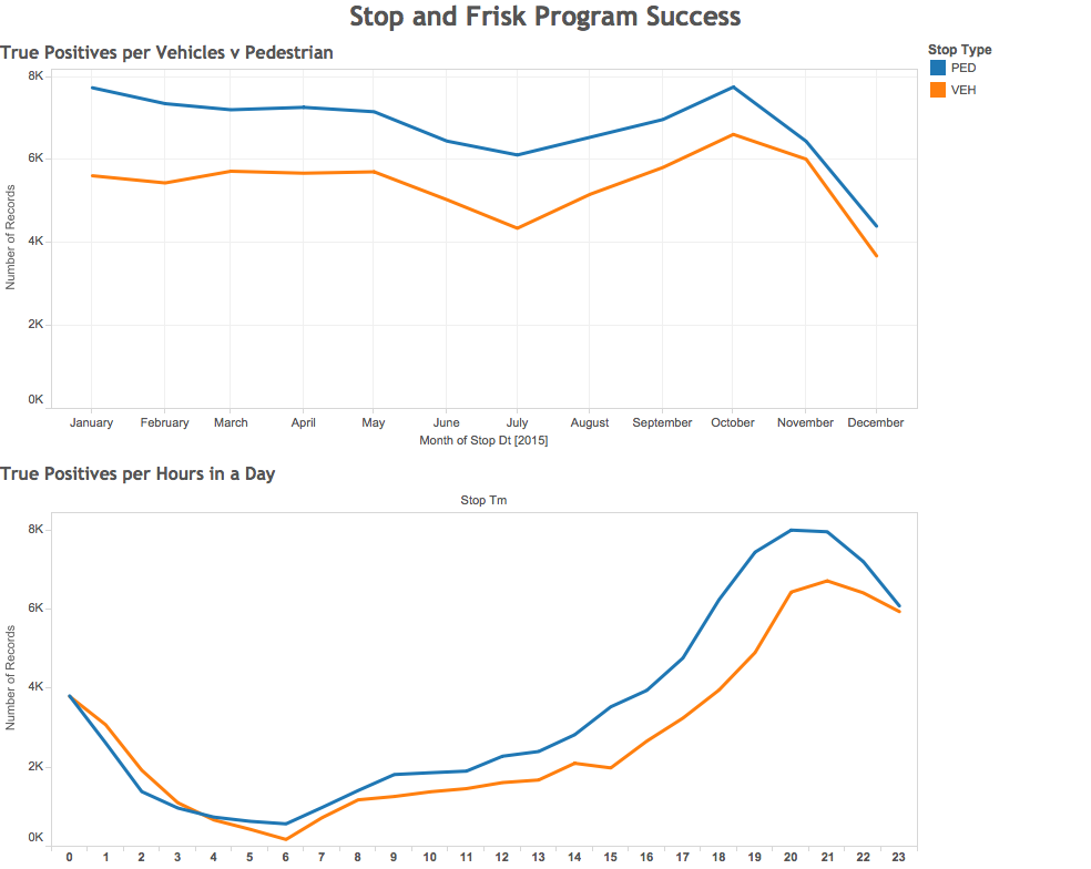
The most significant omission was the data (race and ID number) about the particular officers that were carrying out this law. Though these could be important for discovering the “accuracy” (in terms of the aforementioned ratio) of various officers as well as their personal, racial biases, its is both out of the scope of our report and outside the purview of the mayor to scrutinize individual officers in a city whose police force numbers over 10,000. Following the same logic of including only the information that could be absorbed in a limited window of time, other variables such as time of day, date of stop, and stop type (vehicle or pedestrian) were omitted.

How does the representation support your story?

The representation supports our story because bar graphs are simple to interpret, and keeping the y-axis the same for all graphs makes it easy to make comparisons between different towns and different races. For example, bar graphs made it easy to see that blacks and whites have about the same “stop accuracy” with it being slightly higher for blacks. Simplifying the color of the background and bar graphs makes it instantly recognizable which towns have more effective police stop policies (blue) versus those that do not (orange).

What visual metaphor(s) did you use and why?

The bar graph was chosen because it was the most immediately comprehensible. Though we considered using a map with pie charts and various layers with more sophisticated graphics, owing to the limited amount of time provided by our scenario of meeting with the mayor, we agreed that bar graphs would be the most efficient means of communicating the necessary information. The more effective neighborhoods are coded blue to signify well-being and stability, whereas the least effective neighborhoods are coded orange to signify danger and instability.

Data Visualization Workshop (Politicians of LA county)

What is your story?
Our group was assigned to play the role of the Politicians of LA county. We brainstormed several storylines that a local politician could adopt, perhaps for an upcoming election campaign or as a PR activity while in office. Possibilities included adopting a “tough on crime” stance, a campaign to celebrate the accomplishments of the police department, an appeal to increase or decrease funding for the police department, to pass a piece of legislation regarding the stop & frisk programs, or to develop a more effective stop & frisk program using data-driven evidence. Given the data set we had access to, our group settled on the story of a local politician who is advocating for reform of the police department’s stop & frisk policies through enhanced sensitivity training. We sought to highlight the inconsistencies in how the program was implemented and draw attention to the wide range of individual officer practices. We felt like a politician would adopt this stance to maximize efficiency and provide legitimacy to LAPD practices with concrete data while simultaneously appealing to the potential cost savings and social justice angles of the story. We also thought that we would get more credence as a politician running for office, if we offered a constructive and proactive measure to tackle problems as opposed to simply showing data.

How does the selected data support your story?
This is a table that shows the divisions who had over 5000 stop and frisks. There is clearly a large discrepancy between the success rates. Some areas are as low as 4% and some are as high as 50%. It seems like bias may be playing a prominent role in some locations and that may need to be addressed with bias and sensitivity training for officers.

Division

Number
of Frisks

Frisks
Ending in Arrest

VALLEY
TRAFFIC

53558

4%

METROPOLITAN
DIVISN

45679

50%

WEST
TRAFFIC

40917

5%

CENTRAL

34478

26%

CENTRAL
TRAFFIC

34368

4%

HOLLYWOOD

32014

31%

SOUTH
TRAFFIC

30556

7%

PACIFIC

27871

9%

SEVENTY-SEVENTH

26271

40%

SOUTH
EAST

25575

34%

SOUTH
WEST

23064

32%

NEWTON

21790

38%

NORTH
EAST

19612

25%

HARBOR

19246

29%

FOOTHILL

18201

43%

WILSHIRE

17955

19%

OLYMPIC

17898

24%

RAMPART

15552

32%

HOLLENBECK

14529

28%

VAN
NUYS

14506

31%

WEST
VALLEY

14328

15%

DEVONSHIRE

13990

14%

TOPANGA

13698

27%

NORTH
HOLLYWOOD

13567

17%

MISSION

12325

38%

WEST
LA

8046

14%

What data did you omit and why?
We did not look at any of the data about the person who was stopped (e.g. their race or gender). This is because our visualization focused on the story of how successful stops and frisks are and which officers may be making too many stops without leading to an arrest or citation. This is because as politicians we are interested in using our citizens’ tax dollars efficiently so we want to conduct training to help officers make fewer and more effective stops. (Note: For the purposes of this visualization we are defining successful stops as those that lead to post-stop activity. This dataset does not allow us to address whether the stop or the subsequent citation or arrest were justified on legal or ethical grounds nor does it address the efficacy of stop and frisk programs in terms of overall well-being. These questions are very important but are outside of the scope of this dataset and visualization.) We also did not include any of the time (date and time of day) data on the stops because we are interested in identifying trends for particular officers or divisions rather than looking for time-based trends.

How does the representation support your story?
We tried various visualizations to analyze efficiency of frisks – bar charts, line graphs, scatter plots etc. However, what stood out from a specific scatter plot (after we used Tableau to obtain a first look into what the data showed) where we plotted Stops per officer v Number of Successful Stops was that the efficiency of frisks was to a great degree, poor. In the representation below, while it was reasonable to expect less successful stops with less stops, the fact that officers making high number of stops returned poor turnover rates of successful stops stood out. By investigating individual officer turnover rates in correlation with graphs that explore location, times, ethnicities of people frisked in addition to a study of demographics of people living and travelling through these locations, we would devise a sensitivity training plan. We would also use this representation to monitor and target moving the dots to the right side as a short term measure, where we can see the overall increase of the number of successful frisks, and then moving the dots downward as a long term measure, where we increase the efficiency of successful frisks.

What visual metaphor(s) did you use, and why?
Since our unit of analysis for this visualization is an individual police officer, we used a scatterplot in which each dot represents an officer. The number of stops and successful stops are represented spatially following the convention of larger numbers being further up on the y-axis and further to the left on the x-axis. We also use color to encode divisions.

Data Visualization Workshop (Journalist)

What is your story?

We wanted to dig into the possibility that police divisions may be profiling certain races as stop-and-frisk suspects more often than they should. This hypothesis is based on some of the occurrences that happened in the last year that suggests police officers may be unfairly targeting African-Americans. As data journalists, we know this is a hot topic in the media and wanted to provide context on what we’re seeing in the Los Angeles region.

How does the selected data support your story?

Taking the top 11 police divisions that had the most number of stop-and-frisks allowed us to break down the contribution of each race as a % within the total number of encounters. This data showed us that there is definitely the possibility that certain police divisions are targeting African Americans more often than other races considering the racial makeup of their assigned neighborhoods. We need an additional set of data to confirm this, which would be the racial breakdown, by neighborhood, of residents over the age of 14 (a gauge for possible stop-and-frisk suspects). We would then compare our data with the racial breakdown data to see if police in certain divisions are unfairly targeting African-Americans (the % of African Americans in their stop-and-frisk encounters is higher than the % of African American residents in those neighborhoods above the age of 14). If this comparison did indeed show that certain divisions were particularly targeting African Americans, then they could be easy targets for division-wide training programs to help them recognize their biases.

What data did you omit, and why?

There are 25 police divisions that we omitted in order to just pick the ones that had the most number of stop-and-frisk encounters. Instead of just picking the top 10, we chose to also include the division with the 11th most encounters since it had a very large % of African Americans involved. As for the other data metrics, we felt that the police officers’ division and the race of the suspect were the most critical dimensions to evaluate based on our intended investigation.

How does the representation support your story?

The representation shows that there are a number of divisions with a very large % of stop-and-frisk encounters involving African American suspects. The data representation provides us with a clear starting point of divisions to investigate to see if they are targeting a higher % of African Americans than there are in their assigned neighborhoods.

What visual metaphor(s) did you use and why?

We want to present this data through a geographical representation as well so that our audience (readers of our journal) can easily identify what the data shows for their neighborhood. This is most relevant to our audience since it is a broader group that would be concerned about their location. We would want to also use the concept of small multiples to have a separate geographical representation for each race.