Tweetbot is a fully-featured Twitter application that allows you to view your timeline, reply to mentions, and see what’s trending. Crafted by Tapbots, a team with a strong design philosophy, this app is filled with lovely gestures and comes wrapped in a beautiful design.
Timeline

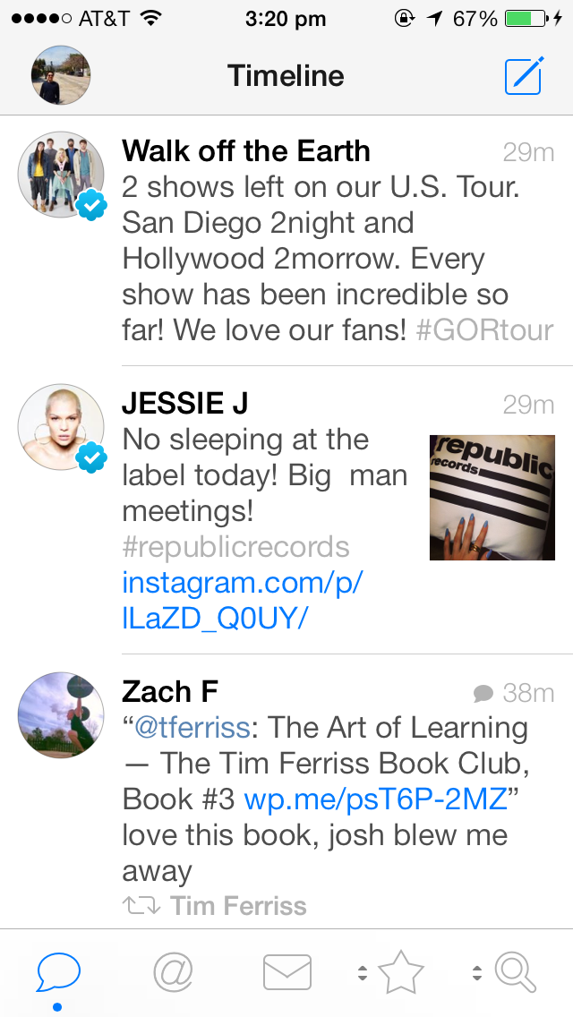
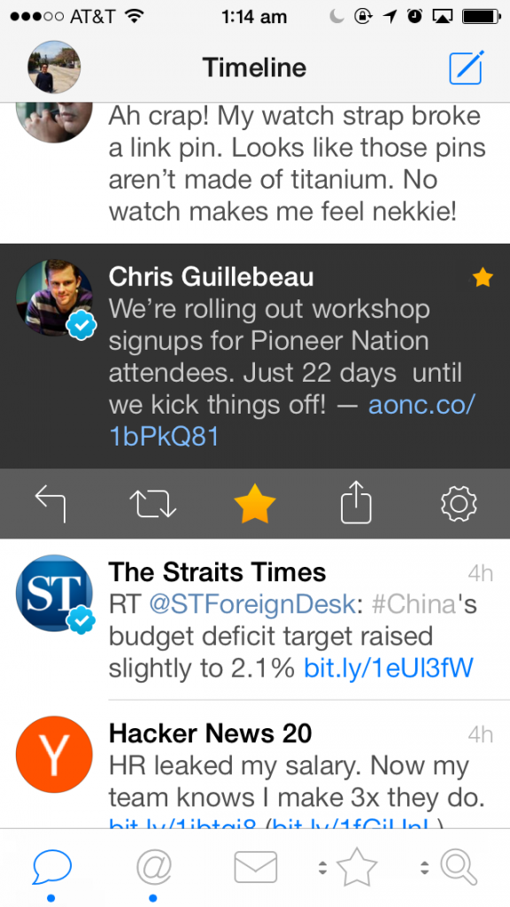
My Timeline
The first screen in this app is the Timeline, arguably the most popular screen. In this tab, you can see what your friends or the people you follow are talking about. When new tweets show up, there is a subtle filled dot on the tab itself (at the bottom left, beneath the icon), indicating to you that there are new tweets to be read. Verified profiles show up with a tick next to their icon, while tweets that belong to conversations (say if the tweet was a reply to someone), has a speech bubble at the top right of the tweet. Since it is mentally tiring for a user to process multiple tweets, subtle hints such as the aforementioned work well.
Tweetbot takes advantage of gestures in this view as well. When you swipe to the left, you can view the entire conversation. When you swipe right, you can easily favorite or reply to a tweet, depending on how far you swipe.
Favorited Tweet
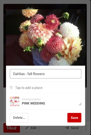
Composing a Tweet
Composing a Tweet [VIDEO]
This editor is basically a WYSIWYG editor – you can add photos, mention somebody, or pull up a hashtag. What’s nice about this is that the tweet you were replying to is right below yours, in case you forgot what you were replying to. Controls are nicely hidden all around this screen, and are not intrusive nor distracting to the user, allowing the user to fully concentrate on writing his tweet. Drafts are supported in Tweetbot (if you close the screen with text entered), and a blue triangle flaps over when you re-enter this screen. What would have been nice would be to schedule tweets, a feature not yet supported in Tweetbot.
Mentioning A User
Mentioning someone is a piece of cake. You can either enter his twitter handle, or part of his name. This brings up a list of options which you can choose from.
Muting
One of my favorite features in Tweetbot is the muting ability. Say Justin Bieber broke up with Selena Gomez and you hate hearing about him. Instead of following your friends, why can’t the app do it for you? Do not despair, Tweetbot can help you restore peace on Earth!
You can also mute hashtags, twitter clients or other people.
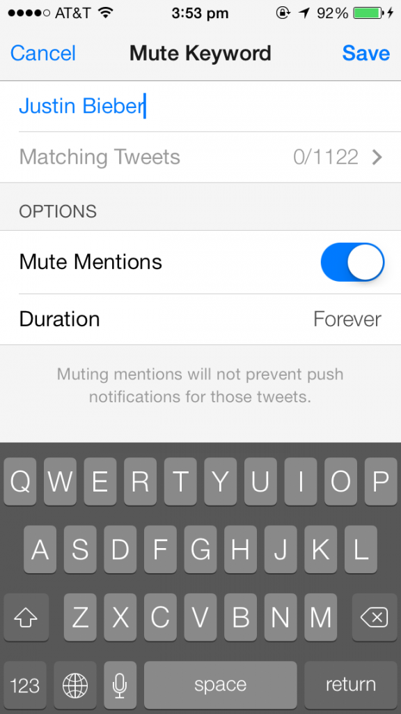
Muting Justin Bieber
Search
One of the better features on Tweetbot (they’re arguably all very good) is Search. When an explosion happened on campus last semester, I immediately whipped out Tweetbot and started searching for the keyword “fire”. But what’s the point of searching the entire Twitterverse? Well, Tweetbot has taken care of that and allows you to search near you.
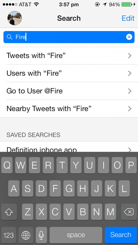
Searching
Aside from searching near you, you can also search from your saved phrases, or browse trending topics and people.
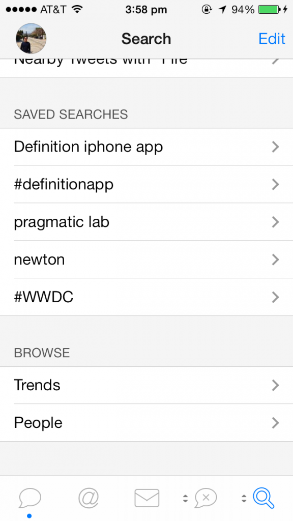
Saved Searches / Browse Trends
Settings
Even the settings is heavily customizable. You can choose how you want your tweets formatted, what sounds you want the app to use, and also the font size. (Extra tidbit if you’re a dev: Tapbots got into a bit of a trouble when they switched over to Dynamic Type when Tweetbot 3 came out, and received a huge backlash from users. They quickly added the ability to turn it off & customize your own font size.) Last but not least, my favorite settings feature is the ability to change from night/day.
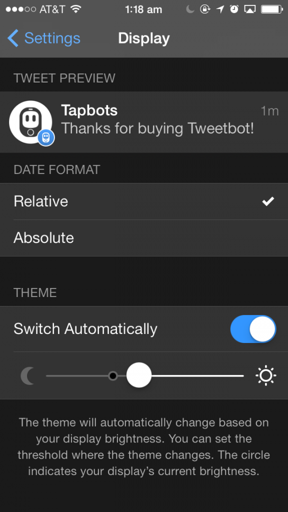
Customizing Day/Night Themes
Design Details
Now let’s dig down into the exciting stuff. Tweetbot heavily utilizes iOS 7’s robust physics and particle engine. Animations are extremely smooth with this engine. This is seen in the following three videos. There were more but I didn’t want to make this post too long, but if you’re interested, come find me!
Playing With A Photo [VIDEO]
Custom Alert Sheets [VIDEO]
Use Two Fingers to Change Brightness (like a switch) [VIDEO]
Conclusion
For a two-person team, this app was shown a lot of love. Tapbots once again lived up to their expectations and delivered an incredibly fast and beautiful app. (They also reinvented the Twitter experience after Tweetie was bought by Twitter). Building a Twitter application that is used by many is not easy, since every user wants the ability to customize the app to their liking, based on which Twitter functions they loved most. Tweetbot solved this with a changeable tab bar (you can change tabs by long-pressing them). On the technical side, Tweetbot syncs your timeline, as well as your rad messages, across all your devices, so you can pick up where you left off from a different device. How awesome is that? If you can spare $4.99 and love Twitter as much as I do, getting this app is a no-brainer.
Download App [$4.99]