iShows

iShows is an iPhone app that helps you manage and keep track of your favorite TV Shows.

Introduction
There are so many great TV shows on right now that it can be hard to keep up. iShows aims to help you manage and keep track of your favorite TV shows in a simple but visual aesthetic way. Unlike “TVShow Time,” and some other show tracking apps, iShows does not require you (or offer the ability) to create an account. Also, most apps in this category contain an excessive amount of features whereas iShows focuses on providing a few features, but doing it very well.

Navigation
Basically, the app contains three sections, which act like panels and make it easy to know where you are:

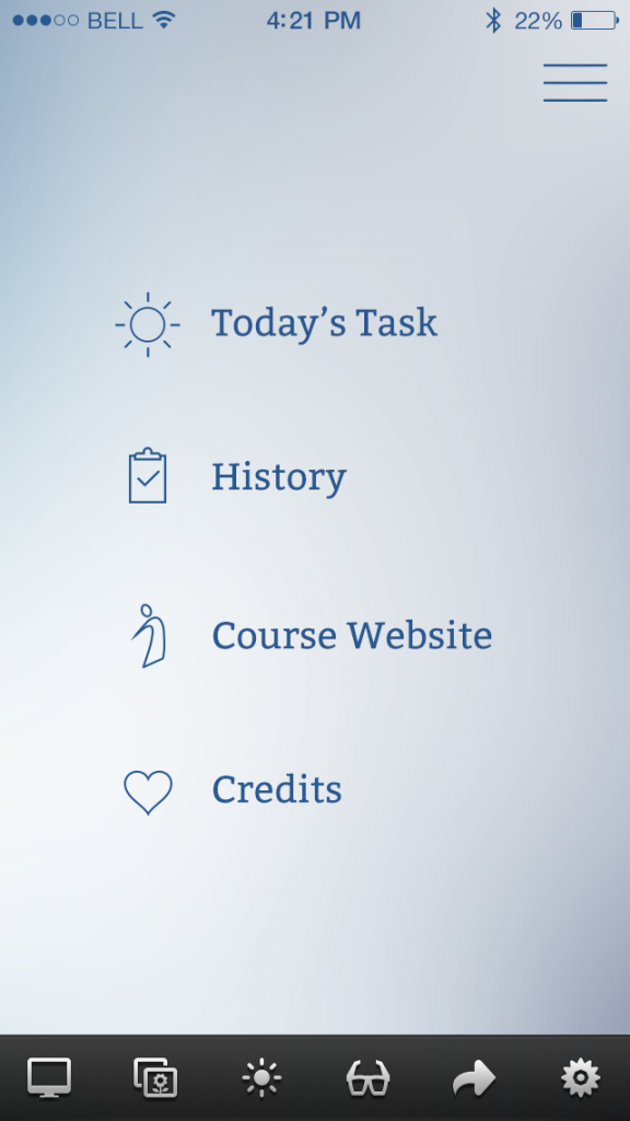
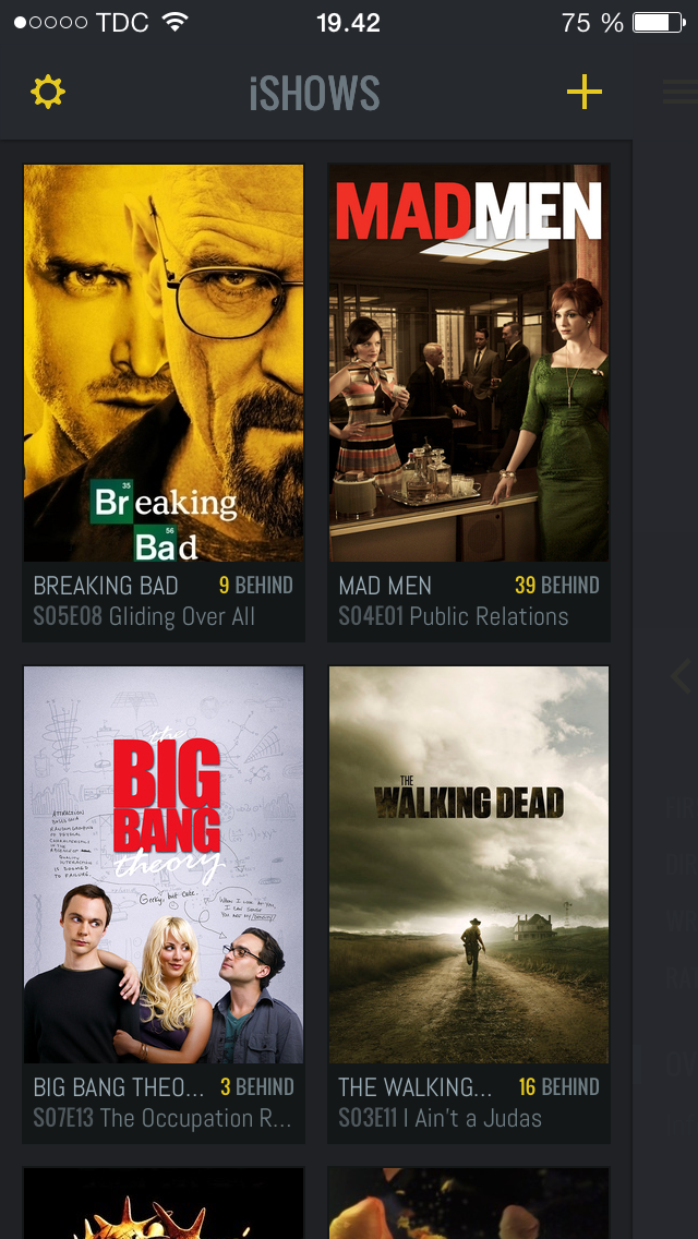
1. The main panel is the one you will see when you open the app. It displays a list of shows you are following and provides the option to add new shows via the + icon. Adding a new show is just entering the title into the search field or choosing from a list of “trending” shows. The “Following” view includes two layout options – list and grid.

IMG_1122

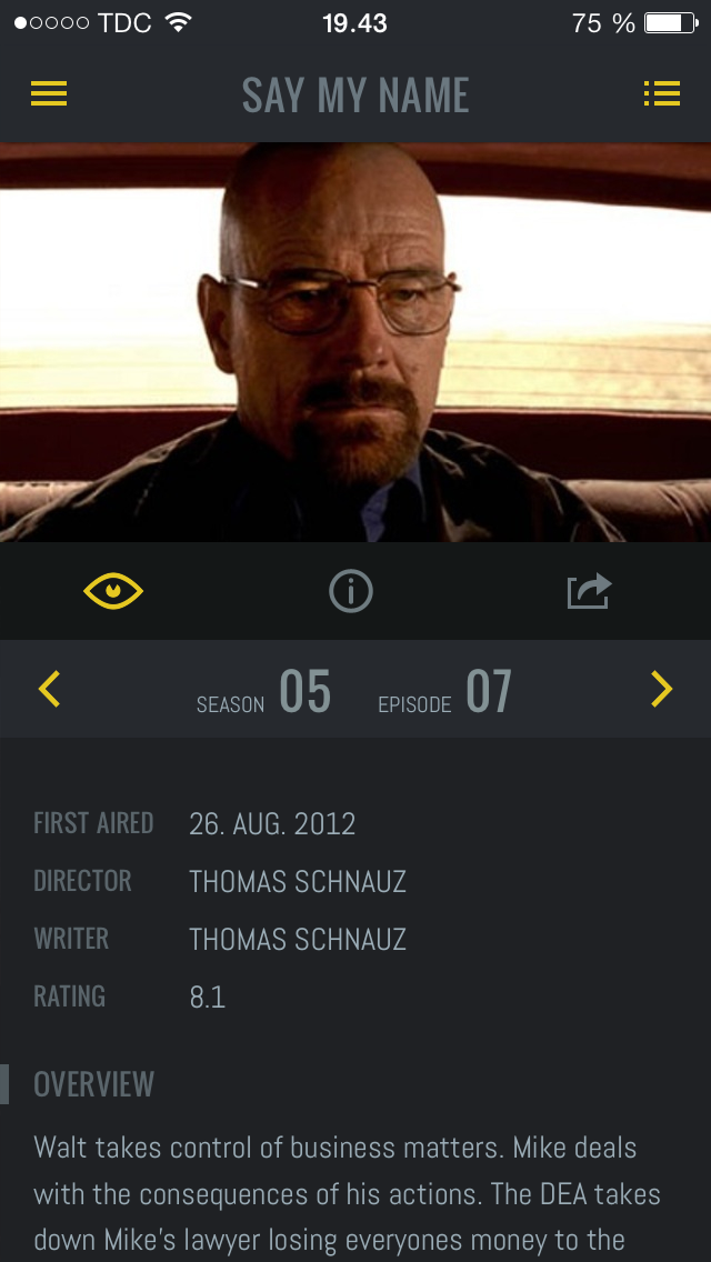
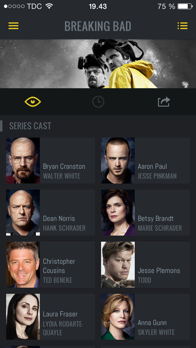
2. You get to the second panel when clicking on one of your listed shows. It displays general information about the TV show or a specific episode. Since the app aims to be concise, only basic information such as air dates, short episode/series plots and casting is provided. For additional information, IMDB links are provided.

IMG_4799 IMG_9047

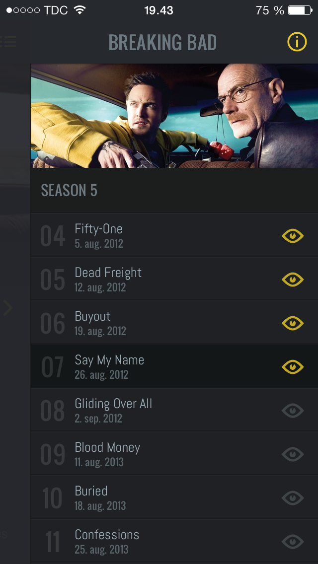
3. The third panel can be accessed by moving the second panel to the left. This is the actual management of episodes. Here, you can mark which episodes you have seen in order for iShows to tell you if you are behind on any episodes or when the next episode is up. It is as simple as tapping the eye icon on an episode or a season name to mark it as watched

IMG_1106

Customization
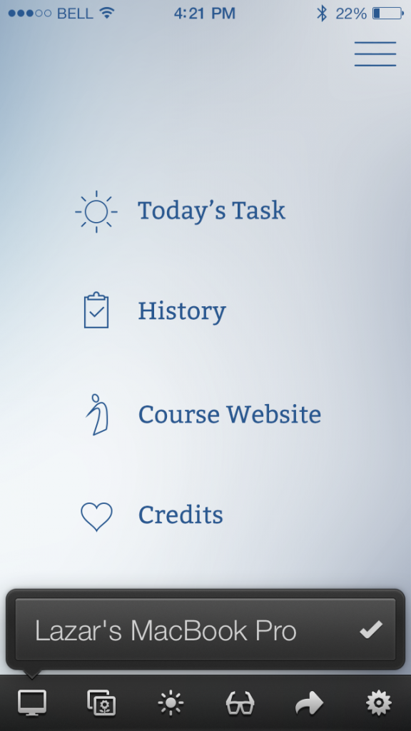
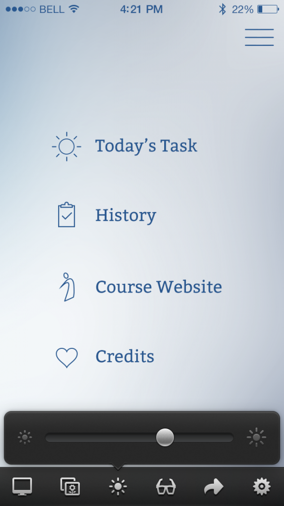
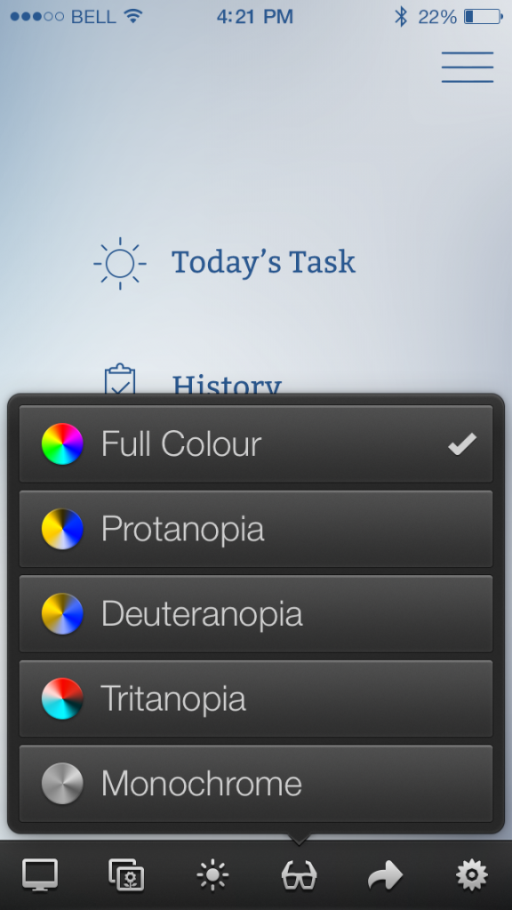
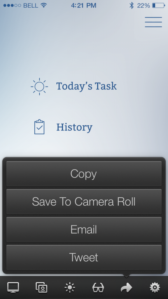
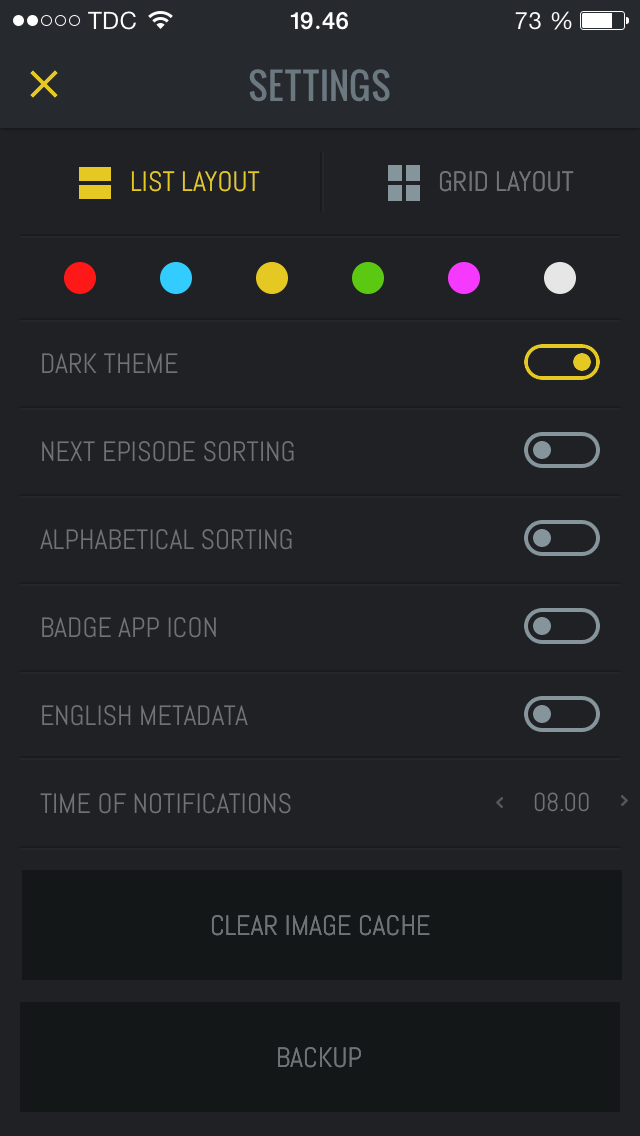
An extra and really cool yet simple feature in iShows is the ability to customize the UI design. As mentioned it is possible to choose between list and grit layout, between a light or dark theme, sort by episode or alphabetically, choose to display an app badge count, clear the cache, and select your notification preferences – that’s it.

IMG_8732

Parting thoughts
iShows is a good example of how an app can be designed to upstage those that are already well established. Interacting with iShows is a pleasure because of its simple focus and structure and its polished design. For me personally, the app covers a real need by tracking my TV shows since my brain gave up a long time ago.

Links

– Elin Linding Jørgensen

Circa

Circa is a news-reading app that breaks news into small chunk to provide better reading experience. It’s free on both App Store and Google play.

Summary

Once the user clicks on a story, it always starts with a picture and an one-paragraph summary.

homepageHomepage

summaryFirst view after clicking a story


Segmentation

One thing I like about Circa is that it breaks a whole story into paragraphs and let the user swipe to navigate through each section. Unlike traditional reading experience, scrolling while reading increase the cognitive effort for eyes to follow the text, especially if one is reading in a mobile situation. Therefore many content-rich app use pagination to solve this problem.

However, unlike Flipboard or many news-reading app, Circa breaks down the news in a more meaningful and comfortable way. While reading content in Flipboard, the user flips a page because the content exceeds the space of the page, not because he finishes reading a paragraph. The user still needs to somehow memorize the last sentence or word in the previous page. It seems to be an indifferent detail, but to me, Circa mitigate this cognitive effort and improve my reading experience by segmenting the content and pausing at a meaningful point.

flipboardFlipboard

paragraphCirca

UI-wise, the indicators on the right suggest how many pages (sections/paragraphs) in this story. Once you swipe up, the next paragraph will snap to the top without bouncing. While the user mainly focuses on current paragraph, you can still see the next part in a lower opacity. Surprisingly I found it trustworthy and non-distracting.


Follow the Storyline 

Another thing I like about Circa is that it provides a “follow” feature for the user to follow the storyline if one’s interested in the news he just read. The user can chooses to enable notification if there are follow-up stories.

followed


Improvements

A drawback of Circa is that currently it’s manually summarizing and segmenting stories, so there are only a few sections for user to choose from. Some machine-learning mechanisms might help. UI-wise, the interactions with pictures and multi-media now depends on buttons (GUI). It’d be great if they integrate gesture-based interactions (NUI) such as how we currently interact with the pictures in Facebook app (swipe-up to full-screen, and swipe-down to close it).

sectionsSection to pick

picturePicture view with buttons

Colorschemer

Introduction

Colorschemer is an app designed for designers. It does one thing only and it does it well. It allows you to create and share five color palettes for use when designing digital products such as apps or websites. When a palette is saved it is also published to the community creating a vast pool of color palettes to be inspired from. Colorschemer has an http counterpart called colourlovers.com. Combined they make up a community built entirely around the creation and sharing of color palettes.

CS1

Getting inspired

The home/default screen of the app is a seemingly never ending stream of color palettes. The tab is called “All Pallettes”. The main goal of the app is to inspire the user by showing the collective creations of the community. This feature can be very useful when coming up with the initial thoughts for a design and how this should “look and feel”.

foto 2 (2)

Creating your own

When you have been inspired by the works of others you can create your own color palette which can then serve as a useful tool throughout the rest of the design process. The app has a couple of methods for choosing the colors carefully. I prefer the “Photoschemer” which allows you to choose colors from pictures using a classic eyedropper tool. That way I can get inspired by beautiful things I have taken pictures of in the past and try to recreate the atmosphere of the picture in five simple colors. It’s challengin but fun. In the picture below I have created a color palette from a picture I took of some ridiculously colorful shoes a couple of weeks ago.

foto 2 (3)

Inspiring others

A color palette can by saved to “My Palettes” to be used as a design tool or just for inspiration. When it is saved it is also automatically published to the community and will appear in the “All Palettes” stream. Other users can then be inspired by your work, and has the option to save it, comment and like as known from other social network/community services.

Personal opinion

Colorschemer is one of those apps created for a niche of users with very specific needs. I happen to be one of those users but I doubt the app will ever become mainstream, useful or interesting to the majority of people. I have personally been impressed with the pure simplicity of both design and content of this app. It is very focused on doing one thing and doing that thing well. I especially find the contrast between the simplicity of the medium (five colored squares in line) and the endless combinations (one iphone pixel can show 16,777,216 color variations) intriguing. I have also experimented with creating recognizable objects in using this simple medium. See if you can find/guess three of them in this screenshot:

foto 3

Read more and get the app here. It may very well come in handy in the design process we are in the beginning of.

Ronnie


Readmill

Readmill is an ebook reader for iOS and Android designed to let users read and share ebooks.

I decided to review Readmill’s iOS app as part of my final project’s competitive analysis, specifically because they’ve attempted to build some of the features that we envision for an ereader. Generally speaking, Readmill’s app is  well polished with consistent visual design and interaction design. Readmill uses a navigation paradigm that is consistent and easy to learn, with an icon bar across the bottom of most content pages and a back icon used on the reading view.

bottom_nav
The Bottom Navigation Menu

Typical to most ebook readers,  all navigation and action menus are hidden away from users on the reading page, providing a distraction free reading viewer, and are easily retrieved by tapping the screen when needed. The choice not to include the navigation bar on the reading viewer, was an obvious design decision to create the minimalist viewer.

Readmill's typical minimalist reading viewer
Readmill’s typical minimalist reading viewer


reading_nav
The reading view action menu, note the back navigation icon on the left

Readmill also manages to include a few well designed features that puts their app experience ahead of the Kindle and iBooks reading experience.

Library

Ever important to ebook readers, Readmill’s library provides a number of unique features to users. The first time a user downloads and starts the Readmill app, their on-boarding process allows the user to easily import ebooks (epub files and pdf files) from a Dropbox account. The app then presents users with a screen where they can decide which ebooks to add to their library. After adding ebooks to the app, Readmill’s back end service attempts to associate each ebook with a canonical book record and the associated metadata. This allows for Readmill to associate public reviews and annotations with different book files that have been uploaded by any number of users.

Importing my epub files into Readmill

Annotations

Because Readmill does extra work to disambiguate user uploaded ebooks, the app is able to show public annotations made to a book while the user is reading. This encourages engagement while reading a book, because the user can discuss the contents of a book with other readers. Because annotations are made publicly visible by readers, Readmill uses public annotations to create a social network around books, and also allows users to push annotations out to their social network medium of choice.

A public annotation
A public annotation
Easily comment on another reader's annotation to start a discussion
Easily comment on another reader’s annotation to start a discussion

Reviews

Another feature Readmill provides to encourage engagement is allowing users to review books after they finish reading. The app allows users to push their reviews out to social networks, and Readmill uses the reviews to promote books in an explore view and engage users in a public activity feed. One negative aspect of this feature is that a review is typically written in a longer format, and Readmill only gives users the ability to write reviews on their mobile device. Even though users can view their library on Readmill’s browser website, they can only create reviews on their mobile device. I would expect that this limits review length and possibly user engagement.

Finish reading and leave a review

 Parting Thoughts

As mentioned previously, Readmill’s iOS app is well polished with sensible interactions and a visual design that is consistent and easy to navigate. One interesting feature, or lack of feature, is their approach to exploring content that a user does not yet have in their library. Readmill populates a view called Explore, with popular public domain content, such as Sherlock Holmes, and excerpted non-public domain content made available by authors. Users can pull books into their library from this view, but no content is available for purchase. On Readmill’s website, some books in my library were linked to the Kobo.com bookstore, which sells books in the format (epub) compatible with Readmill’s ebook reader. It is possible that Readmill is still building their bookstore and has not yet released the feature. 

QuizUp

photo 1

I first heard of QuizUp last November, and as a trivia nerd I couldn’t help downloading it. I thought that like every other game app, including Scrabble / Words with Friends, I’d get over it within a few days and never again go onto it. Instead, I found myself hooked and I play multiple rounds of trivia games a day. QuizUp hit 1M downloads within the first week of its launch, and was no.1 on the app store in mid November. The app has a beautiful designed user experience, starting with the simplicity of the layout. Their biggest strength lies in the number of questions they have curated across categories ranging from TV shows to standard general knowledge questions and more.

Engagement:
The app is extremely engaging, and builds in some strong techniques for this:

  • The questions are timed which means a user is fully engaged when they’re attempting to answer the 10 questions in a round. Further, you can never really stop with just one round – a win motivates you to go for a winning streak, a lose motivates you to challenge the winner in an attempt to win the next round.
  • It gives you an opportunity to get a custom title once you pass Level 10 in a category. Just the thought that you can move up from ‘beginner’ to ’novice’ to finally creating something cool for yourself keeps you hooked. This also helps increase engagement because you can level up based on your performance in a specific area of strength. I tend to keep playing the Literature trivia because I do well at it, and I’m sure each user has a personal favorite which they use to motivate themselves when they’re on a losing streak.
  • It also has some really well done visualizations that you can use to track your progress and motivate you to keep playing, and in a way feels like a quantified self app for trivia.

photo 2 photo 3 photo 4

All of these are standard principles used across games, but QuizUp has managed to apply them well, and tie them in with an easy to use, extremely pleasing experience.

The Social Component:
While the app incorporates a social component where you could challenge your friends, I also like that it does not make this option in-your-face. You could just as easily choose to play with a random opponent.

Trivia, coupled with a system of levels and well designed user interface ensures that I stay up playing this game over and over in the hope that I will finally beat some random person across the globe in a game of brand trivia. And now that I opened the app to write this post (and played 2 rounds in the process of collecting pictures for this post), I’m going to have to go back to keep playing till I win.


Flappy Bird

FlappyBird

If you’ve been following recent tech news, you may have heard about an app called Flappy Bird that has gone viral. Before the developer took down the app, Flappy Bird was the number one free app  in both the Apple App Store and the Google Play Store.

Many people have criticized the game because it is too simple, the graphics are heavily borrowed from Nintendo’s Super Mario World, and that the game is unforgivingly difficult. But at the same time, I believe these criticisms are exactly what helped the game become so popular.

With regards to simplicity, there is an extremely low bar for entry to this game. If you can tap your finger on your smartphone screen, you can play this game. The way the developer programmed this game, you can load up the game and start playing in a matter of seconds, which seems to be a good attribute for smartphone games.

With the Nintendo graphics, I believe the controversy helped give this app free marketing. It gave tech blogs an interesting angle to write their posts about, and controversy helps drives more click through traffic. With the blog posts about the game reaching a wider audience, I think this helped drive app downloads.

Finally, the fact that the game is so difficult, gives the game it’s addictive and frustrating nature that has spawned many YouTube videos and hilarious comments in the app store review sections. It’s addictive nature is akin to a carnival game, where the premise looks so simple, but success is elusive. Furthermore, the time it takes to restart the game after a failure is so fast, that it seems to encourage a, ‘just once more’ sort of mindset.

Whether intentional or not, the developer of Flappy Bird seemed to nail three aspects of creating a wildly successful app: Low barrier to entry, creating controversy, and making the game hellishly addictive.

http://mashable.com/2014/02/04/flappy-bird-developer

http://mashable.com/2014/02/10/flappy-bird-story/

Skala View

Skala View

Introduction

Back in December, I was hired as a Graduate Student Researcher (GSR) by Professor Morten Hansen. A part of my responsibilities was to design an iOS app that would eventually end up being deployed to students enrolled in this Spring’s INFO 225: Managing in Information-Intensive Companies.

Being interested in behavior modification mobile technology, I was very much looking forward to the task. However, I faced the same workflow challenge I have had to confront every single time in the past I needed to design for mobile. The issue was previewing my work on an actual phone while designing it on a computer.

There simply was no convenient way to do it in real time, so over time I have developed all kinds of workarounds for the problem. For example, I would save the mockup I was working on in Photoshop, then move the saved file to My Photo Stream in iPhoto so it got synced to iCloud, and finally open the image from the Photos app on my iPhone to get the feel of how it looked and felt on an iOS device. Unfortunately, such a process is slow, cumbersome, and very easily breaks the designer’s concentration and focus.

Then, just as I was about to start working on the app for Professor Hansen, I stumbled upon Skala View, a free app which allows me to beam images from Photoshop to my mobile device in real time. Needless to say, it solved my problem and made me a happier and much more productive designer.

Skala (Pre)View

To be more precise, Skala is not a single app, but rather two interdependent apps: one for your Mac and one for your mobile device (iOS or Android). Setting everything up is very easy and straightforward.

Skala Preview is the OS X app. Once you download it from Mac App Store, all you have to do is create a remote connection in Photoshop, and just keep Skala running.

Skala Desktop

Next step is downloading Skala View for your mobile device from either Apple App Store or Google Play. Provided both your Mac and your phone are connected to the same wi-fi network, you should instantly get a live preview of whatever you are working on in Photoshop when you open the app on your phone.

Skala Mobile

Features

In addition to its main function of getting image from your Photoshop to your phone without hassle, Skala View has a few other useful features.

Multiple Connections

If there are several designers on the team but only one mobile device for previewing mockups, the team members can take turns using Skala. The mobile app will recognize all incoming desktop connections on the network and whoever is perusing the device at the moment can choose which image he/she wants streamed to the phone.

Multiple Connections

Photo Access

This feature enables you to open your photos and preview an image from the app, giving you access to Skala’s other tools, such as color blindness testing (see below). You can use this feature even when the phone is not tethered to a Mac.

Brightness

You can change brightness from within the app, thus easily identifying which UI elements are harder to interact with when the phone’s screen is dimmed.

Brightness

Color Blindness Testing

By default, the app displays the Photoshop image in full color. However, it offers additional four filters: Protanopia, Deuteranopia, Tritanopia, and Monochrome. By previewing the mockups with these on, the designer can make sure that the user experience that is being built is satisfying to everyone, including people afflicted with these common forms of color vision deficiency.

Color Blindness Testing

Sharing Options

If you are particularly proud of something you have built, you can copy it to your device’s clipboard, save it to photos, email to someone, or tweet for the whole wide world to see.

Sharing Options

Final Verdict

Skala View deserves to be an essential tool in any mobile designer’s toolkit. The app performs its primary function of bridging the workflow gap between your computer and your mobile device extremely well. Last but not the least, it is 100% free (no in-app purchases or any other such hidden “freemium” costs). I wholeheartedly recommend it.

Links