Assignment 7: Type 2

Type 2

You will design UI of a new mobile weather app again, this time utilizing weight. Create typographic hierarchy with the following set of rules:

Use Verdana as typeface
Use scale
Use weight
You may use rotation of text
Background is white and figure is black
No gray scale (only black or white)
No images/photos/illustrations
No italics
Screen size is 750 × 1334px
You can choose to omit punctuation
Use all the copy below:

  • February 23, 2015
  • Berkeley, CA 94720
  • Monday Clear
  • Precipitation: 0%
  • Humidity: 62%
  • Wind: 7mph
  • 68°F
  • Tuesday 64
  • Wednesday 64
  • Thursday 66
  • Friday 66

Create two variations of design. Version 1 should focus on typographic hierarchy (i.e., help a user understand information through a logical and meaningful journey). Version 2 in contrast, should play with possible emotional aspects of interaction with weather app (e.g., funny, nostalgic, angry, etc.). However, the same rules apply to this version. You should use the same emotion you used for Type 1. Document your results in your “Workshop Document” (available in Keynote or PowerPoint). Please use your name in the following filename format: LastnameFirstnameA7_1.pdf. Due as a blogpost with a PDF attachment on Thursday March 12th 9AM.

Assignment 6: Blocking

This week’s assignment is due on Thursday March 5th 9AM.

Create 3-5 wireframe sketches with grids by only using the blocking method. Must use the final format size. Show examples in full size if possible, on black, no other type or information on screen. Show with and without grids. Grid to include, Column, Rows, Modules, and definition of why you chose this grid. Which constraint helped you set this grid? Document results of your UI aesthetic analysis in your “Blocking Document” (available in Keynote or PowerPoint). Please use your name in the following filename format: LastnameFirstnameA6.pdf. Due as a blogpost with a PDF attachment on Thursday March 5th 9AM.

Assignment 5: Aesthetic Analysis and Type 1

This week’s assignment has two parts and they are both due on Thursday Feb 26th 9AM.

Part I: Type 1

You will design UI of a new mobile weather app. Create typographic hierarchy with the following set of rules:

  • Use Verdana as typeface
  • Use scale
  • You may use rotation of text
  • Background is white and figure is black
  • No gray scale (only black or white)
  • No images/photos/illustrations
  • No italics or weight (bold)
  • Screen size is 750 × 1334px
  • You can choose to omit punctuation
  • Use all the copy below:

February 23, 2015
Berkeley, CA 94720
Monday Clear
Precipitation: 0%
Humidity: 62%
Wind: 7mph
68°F
Tuesday 64
Wednesday 64
Thursday 66
Friday 66

Create two variations of design. Version 1 should focus on typographic hierarchy (i.e., help a user understand information through a logical and meaningful journey). Version 2 in contrast, should play with possible emotional aspects of interaction with weather app (e.g., funny, nostalgic, angry, etc.). You are free to interpret the possible emotional aspects. However, the same rules apply to this version. Document your results in your “Workshop Document” (available in Keynote or PowerPoint). Please use your name in the following filename format: LastnameFirstnameA5_1.pdf.  Due as a blogpost with a PDF attachment on Thursday Feb 26th 9AM.

Part II: Aesthetic Analysis

Pick two UI exemplars to engage in UI aesthetic analysis. The two example UIs you choose will serve as pieces of “competitor analysis” for your UI, with an emphasis on aesthetic. Document results of your UI aesthetic analysis in your “Research Process Document” (available in Keynote or PowerPoint). Please use your name in the following filename format: LastnameFirstnameA5_2.pdf.  Due as a blogpost with a PDF attachment on Thursday Feb 26th 9AM.

Assignment 3: Composition 2 Objective

Step I

Read selected chapters (pp. 20-38 and pp. 85-103) from Dondis, D.A. (1973) A Primer of Visual Literacy.

Step II

Create 5 new pairs of contrasting compositions, based on Dondis’ reading. More objectively apply the gestalt principles. Document your results in your Workshop 2 document (available in Keynote or PowerPoint).

Part III

Discuss how the reading from Dondis’ book helped you create your new set of compositions (5 new pairs of contrasting compositions). Your writing should go on the second page of this week’s document.

Due as a blogpost with a PDF attachment on Thursday Feb 12th 9AM.

Assignment 2: Composition 1 Intuitive

Gestalt principles are among the fundamental properties of the perceptual system. Providing the basis of our ability to make sense of the sensory signals.

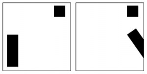
gestalt.example01

In this assignment, you will create 5 pairs of contrasting compositions, as you will interpret the gestalt principles below. Each pair of compositions you will create should compare and contrast with each other. The entire set (the 5 pairs) will be your ‘series,’ which should look and feel like a related body of work. There are many more Gestalt principles, but these are some of the primary principles. Be prepared to explain your work.

Sets (5 pairs):

  • Contrast vs. Harmony
  • Boldness vs. Subtlety
  • Symmetry vs. Asymmetry
  • Proximity vs. Similarity
  • Leveling vs. Sharpening

Rules:

  • Ground will be white
  • Figure will be black
  • White square 8×8 inches
  • Black squares 1×1 increment inches (e.g., 1×2, 1×3, 1×9, etc.)
  • No shapes to extend past the white square. If it extends, it must be cut at the edge of the white background (e.g., the second example on the top).
  • Black squares may be rotated
  • Create balance and interest

Document your process in the course workshop document called, “Workshop01.Comp1” (available in Keynote or PowerPoint). Create and attach a PDF of your Workshop Document 01 Comp1 to your blogpost. Due as a blogpost with a PDF attachment on Thursday Feb 5th 9AM.

In addition to your workshop document, please use the feedback from this week to update your Place and Interpretation Documentation.  Updated version is due as a blogpost with PDF attachment on Thursday Feb 5th 9AM.