BandHype: Final Report
Team
Prabhavathi Matta – Data Visualization & User Interface
Rahul Gupta – User Interface & Backend
Quinn Shen – Tweet Gathering & Tweet Aggregation
David Adamson – Tweet Aggregation & Tweet Analysis
Argyris Zymnis – Mentor
Goal
Twitter is a medium for users to express what’s on their mind. We want to aggregate these tweets to help both bands (or artists) and promoters of a venue. We are trying to execute two main functions:
- For a band, develop a geographic depiction of the band’s popularity to gain insight on where they are most popular
- For a promoter, rank artists/bands by popularity to understand whom to book for shows and performances
The overarching goal of this project is to make a website that details the popularity of a band throughout geographic areas as well as to detail the most popular bands within the a certain geographic area. This means analyzing a stream of tweets to calculate a band’s popularity over time and presenting this analysis through a user friendly interface and website.
Strategy
We have split the project into three main tasks: Tweet Gathering, Tweet Aggregation, and Tweet Visualization.
Tweet Gathering
We are currently gathering tweets via two different pipelines to collect both “talking” tweets and “listening” tweets. We define “talking” tweets as those where the twitter user manually types text to comment on a particular band or musician; in contrast, we define “listening” tweets as those that are generated programmatically by a music playing application when a user listens to a song by a particular artist. These two forms of data reflect different interactions between twitter users and the bands they reference and thus can be useful in different contexts (e.g. we would expect that “talking” tweets would be more useful in tracking musicians on tour since no tweets are generated programmatically when a user listens to a band live). Additionally, these two forms of data present distinct technical benefits and challenges when compared to one another; we discuss these differences below.
To gather our “talking” tweets, we are using the twitter streaming API to continuously download tweets from within the 48 continental United States. We accomplish this using the tweepy to open a twitter stream filtered by a bounding box (coordinates: -125.0, 24.5, -66.5, 49.5) which restricts the download to geocoded tweets in that area. As we download, tweets without explicit GPS coordinates are not processed (an estimated 10% of the total number of streamed tweets). For each tweet that is processed, we store the following pieces of information: (1) the username of the individual that generated the tweet, (2) the longitude and latitude coordinates where the tweet was generated, (3) the date and time stamp for when the tweet was generated, and (4) the text of the tweet. Since these pieces of data are stored in TSV format, regular expression filtering is used to remove tab and newline characters from the tweet text; those characters are replaced with spaces to preserve the separation of tokens that were previously separated by tab or newline characters.
We downloaded these “talking” tweets at a rate of 1-2 million tweets per day allowing us to collect over 54 million tweets of this form in the period between October 22nd and November 25th 2012. While we were able to collect these tweets in large quantities, the vast majority of these tweets do not discuss musicians (and thus are not relevant to the BandHype application) and the band discussed in tweets that do discuss musicians is not explicitly tagged. We further analyze this collection of tweets to remove those which do not mention musicians and to tag tweets that do discuss musicians with the appropriate band name (see below).
To gather our “listening” tweets, we again use the twitter streaming API, but this time we filter the twitter stream by the keywords “listening to” and “by”. The tweets collected in this way are subsequently filtered by a regular expression which determines if they are automated tweets generated by popular listening stations (i.e. tweets generated by the “share” feature in music stations). We currently capture tweets from 12 different stations including Spotify, Rdio, Pandora, ex.fm, Grooveshark, Songza, last.fm, SoundHound, HulkShare, Track8.fm, and DoubleTwist. We also capture user-generated tweets to popular hashtags like #iTweetMyTunes or #NowPlaying that follow common patterns.
Unfortunately, the twitter streaming API does not allow the stream to be filtered both by geolocation AND by keyword. Including geolocation and keyword filtering results in a stream where the results are need only satisfy one of the filtering criteria (i.e. either the geolocation filter OR the keyword filter). Since these “listening” tweets are not filtered by location through twitter, we must impose our own filter on the data that twitter sends us. This limits the speed at which “listening” tweets can be collected since most of the 30-40 tweets per second that twitter pipes to us will be thrown out by our own filter. To ensure that a collected tweet has sufficient geolocation data for use by the BandHype application, we attempt to reverse geocode three different fields within the tweet; the highest priority is given to the most reliable information (status.coordinates, status.place, and a user-generated location). To gain information from a user-generated location, we also query MapQuest which will correct for inaccurate/incomplete spellings and odd formats (e.g. “San Fran, USA” or “city of Atlanta”). Tweets that do not contain enough information for us to accurately find a specific county are thrown away. Collection of “listening” tweets ran from November 27th to December 5th, resulting in a dataset of just above 20,000 tweets with suitable geographical information.
Unlike “talking” tweets, “listening” tweets have the benefit that the artist is mentioned in a formulaic way within the tweet, and thus we extract the band name and tag the tweet with that band name upon storage.
Tweet Analysis & Aggregation
Band Tagging
Analysis of the “talking” tweets required that individual mentions of bands be identified within the tweet text, and that the tweet be tagged with the name of the band mentioned. To accomplish this, we manually curated a list of 500 unigram and bigram band names of varying popularity for comparison against tweet text. The band names and tweet text were both converted to lowercase prior to comparison. To efficiently perform the matching of band names to ngrams within tweet text and the tagging of was performed using PIG scripts using Amazon’s Elastic MapReduce (EMR) infrastructure. This tagging process reduced the data set of >54 million “talking” tweets to a more manageable ~680 thousand tweets that actually contained one of the ngrams from the list of 500 band names. This “band tagging” analysis step was not required for “listening” tweets as tagging occurs upon gathering the tweet (see above).
Geographical Data Enrichment
To convert the location data into a format suitable for aggregation, we perform reverse geocoding using two additional APIs to enrich each tweet’s geographic data. We use the MapQuest API to identify the city and state in which each tweet was sent, and and use the Federal Communications Commission (FCC) API to reverse geocode for the county and to determine the Federal Information Processing Standard (FIPS) code for that county. We access these APIs via Python scripts. We performed this data enrichment on both “talking” and “listening” tweets.
Aggregation
Once we appended the city, state and county information to each tweet, we aggregated this data in several ways to allow for the distinct methods of visualization presented in the BandHype application. This aggregation was performed using PIG scripts on Amazon’s EMR. By stripping the time stamp from the date & time string, we were able to consolidate tweets from each day into separate groups. Subsequently, we aggregated tweets based on band, band and county, band and state, and band and city – resulting in lists where the number of tweets describing a particular band in a particular area have been tabulated. These lists are subsequently imported into the web-based database for use by the BandHype application (see below).
Future Directions
There are two main problems facing the analysis of “talking” tweets. Firstly, some band names are highly ambiguous (e.g. train or queen) and thus ngrams in the text of a tweet which correspond to the name of a band may not actually reflect a reference to the band itself but may represent some other usage of the word. Secondly, not all references to a band or its work will explicitly mention the band name (or may mention the band name in a non-standard form).
To address the first problem (i.e. false positives) we considered several methods for performing word sense disambiguation to remove tweets that contain a band name ngram but that are not actually discussing the band. One method was to utilize a naive bayes classifier trained to identify the most common single words found in tweets about the band in question. Performing a supervised machine-learning method such as this, however, requires a training set of preclassified data. One method for pre-identifying tweets that mention a band (e.g. the band “train”) is to look at tweets that mention the twitter account of that band (e.g. “@train”). What can be trickier, however, is finding a set of tweets that is representative of usage of the band name that is not a mention of the band. This is problematic since the common non-band meaning of the band’s name is not always clear a priori. In the case of “train” the common non-band usage is public transit related whereas for “PSY” the common non-band usage is related to psychology. Because the ratio of band to non-band use of the band’s name varies widely across the range of bands, it is not appropriate to use the set of tweets that are known to not mention the band via their twitter handle as non-band usage tweets; for some bands nearly all usage of the ngram will be band related while for others, nearly none will be. Based on this analysis, the most effective simple mechanism for word sense disambiguation in this case may be to use unsupervised methods that look for common words associated with mentions of a band in general (e.g. “listen”, “album”, “song”…) as well as terms associated with the band (e.g. the name of a song, album, or band member).
To address the second problem (i.e. false negatives), the best option seems to be to download the album and track names of an artists work to see if those titles match against tweet text. Here again, however, we open ourselves to the problem of word sense disambiguation with the possibility of album or song titles that hold different meanings in different contexts. It is likely simpler to deal with multiple synonymous spellings of a band name by merely having multiple entries for a given band to match against (e.g. ac-dc vs. ac/dc or mia vs. m.i.a.) that are then grouped together.
One of the main benefits of using the “listening” tweet data is that, although it is more sparse, there is a much better guarantee that the band is identified correctly. The only complications to that lie in the consolidation of multiple similar tokens or ngrams that describe the same band (e.g. artist = “justin bieber” vs. “justin bieber (holiday)”).
Tweet Visualization
For data visualization, we initially experimented with various maps like Google Maps, leaflets and D3. We finally realised that D3 caters to our need to display huge amount of data using Svg, Html and CSS in an elegant and intuitive way. For Bands Visualization, we utilized a choropleth, a map where areas are colored in proportion to a statistical variable, for depicting the popularity of a band within the United States. In order to take advantage of choropleths, we incorporated FIPS codes, unique identifiers for every county, into our database and matched counties from the data analysis to their respective codes. For the Promoters visualization, we used barcharts to show the top bands for a city and additionally, a time-series chart at the bottom showing the distribution of tweets for a period of time.
Features :
- Interactive maps for geographical distribution of tweets for bands
- Interactive barcharts to show top bands for a city
- Timelines for both Band and Promoters visualizations to show trending over a period of time
- Autocomplete feature for searching bands
- Zoom facility for the map
Original Timeline
Week of October 22nd:
- Research publications related to our project.
- Start acquiring twitter data with location information in within the continental US. Establish robust method for continuous tweet collection.
- Research data storage and database solutions.
- Implement solution to share data among team-members (e.g. github, dropbox).
- Brainstorm project brand name.
Week of October 29nd:
- Research publications related to our project and work on majority of writeup.
- Begin setup of web infrastructure.
- Design database schema.
- Begin preliminary analysis of data (mapping GPS data to a city name, create an index with bands and their associated tweet frequency for those cities.)
Week of November 5th:
- Finish research of publications.
- Finalize write-up.
- Finalize an illustrative visualization for in-class presentation (e.g. non-interactive heat map of 48 states describing tweet frequencies for a selected band).
- Complete minimum viable product (a functional website for queries on our dataset).
Week of November 12th:
November 13th (9am) MID-SEMESTER DELIVERABLE
- Begin development of the interactive heat map (or related) visualization. (COMPLETE)
- Work on web user interface.
- Finalize basic analysis (e.g. the basic indexes which map bands to locations should be completed and integrated with the web infrastructure.) (COMPLETE)
- NEW ITEM: Extend current data analysis from 10 to 100 bands. Perform this analysis on more than 10 million tweets.
Week of November 19th:
- Begin advanced data analysis – (e.g. analyze band name and its related meta data to categorize tweet for a band when a band name is not given explicitly; confirm that our product works by checking that the hype of a band increases around dates that they play in a particular area).
- Trend Analysis (absolute data) for a particular band within the US, over time in general.
Week of November 26th:
- Analyze temporal trends in the mentions of bands in an area to determine if bands are becoming more or less popular.
- Trend Analysis of top bands for a particular city.
- Continue advanced data analysis (see above).
Week of December 3rd
- Finish user interface/visualization.
- Finish analysis of the effectiveness of the product: (does this product effectively identify hotspots of activity of the band where it is playing).
- Finish project writeup.
December 10th (5pm) FINAL PROJECT DUE
Literature Review
(1) (Reviewed by David Adamson)
Roberto Navigli [2009]. “Word sense disambiguation: A survey.” ACM Comput. Surv. 41, 2, Article 10. DOI: 10.1145/1459352.1459355
This review article lays out a variety of common approaches to the problem of “word sense disambiguation” (WSD) which the author defines as “the ability to identify the meaning of words in a computational manner.” This topic is of significant importance to the BandTrends project because as we programmatically search for band names within the text of a tweet, tokens or ngrams that we detect as matches to real band names (e.g. “The Cure”) could be used in the tweet in a wholly non-music related manner (e.g. the cure for a disease). The author qualitatively divides the space of approaches for WSD along two axes: the degree of supervision employed, and the amount of a priori knowledge used. “Supervised” approaches us machine-learning techniques and make use of labeled training sets (e.g. where tweets are pre-labeled as “discussing a band” or “not discussing a band”); ‘unsupervised” approaches do not make use of such training sets. Knowledge-rich (a.k.a. dictionary-based) approaches make use of machine-readable bodies of text that can provide a context for terms and aid in differentiating between several possible word meanings. Knowledge-poor approaches do not have such dictionaries. Specific approaches to WSD can make use of one or both of these strategies. As the author discusses, the best performing approaches to WSD are typically supervised approaches, but unsupervised methods “have the potential to overcome the knowledge acquisition bottleneck.” In other words, unsupervised methods have the benefit that they do not rely upon the curation of a training set – which for some applications would be untenable.
Of the approaches discussed in this review, “exemplar-based” (a.k.a. instance-based learning) was of particular interest due to its good performance. This approach is supervised in that it requires a training set of example references to a token (or ngram), each with pre-assigned meanings. New uses of a token (or ngram) are then compared to the existing sets (via some norm, e.g. the Hamming distance), to assess which group it belongs to. The “support vector machine” approach was also of particular interest, since we discussed in class programs which draw dividing hyperplanes between sets of unlike points. Within the unsupervised methods, word or context clustering are interesting options for their comparative simplicity – although without training sets the amount of data required for reliable classification of terms increases.
In summary, this article describes in useful detail the advantages and disadvantages of various approaches to the word sense disambiguation problem, and it presents them within a simple conceptual framework that simplifies their comparison. This paper is a good resource for BandTrends as we consider how to classify whether individual ngram occurrences represent band mentions.
(2) (Reviewed by David Adamson)
Takeshi Sakaki, Makoto Okazaki, & Yutaka Matsuo [2010]. “Earthquake Shakes Twitter Users: Real-time Event Detection by Social Sensors” Proceedings of the 19th International Conference on World Wide Web; 2010 April 26-30 Raleigh, NC. New York: ACM Press; c2010. 851 p.
This paper presents the idea of using twitter users as “social sensors” capable of responding to and describing their environment. While the authors apply this notion specifically to the task of identifying when and where earthquakes have occurred (by monitoring, for instance, when multiple twitter users mention the word ‘earthquake’ in a spatiotemporally localized way), this concept of event detection using social sensors is also applicable to the BandTrends project since it would be useful for our software to be able to extrapolate when and where individual bands have performed based upon twitter information. In this paper, Sakaki et. al. use query words (such as “earthquake” or “shaking”) to identify earthquake occurrences but they face the problem of differentiating mentions of an earthquake occurring at the moment of the tweet from other situations in which the query words would arise. This problem is an example of word sense disambiguation (WSD) problem discussed in the above review by R. Navigli – and the authors of this paper make use of the support vector machine method that was also described there.
In order to identify the timing of an earthquake event, Sakaki et. al. first examined data from tweets around time when earthquakes and other natural disasters were known to have occurred. By doing this, the authors are able to model the exponentially decaying probability that an individual will tweet about an earthquake after it has occurred. Using this knowledge, and making the assumptions (1) that the false-positive rate for tweeting individual is 0.35, and (2) that tweets are independent and identically distributed, the authors are able to write a formula that, given a desired overall false-positive ratio, indicates how many positive tweets must be accumulated before claiming an earthquake has occurred.
In order to identify the spatial localization of an earthquake, the authors generated a baseline weight distribution that takes into account the distribution of the population in Japan (where the earthquake locations were to be identified). They use this baseline distribution as the starting point for a particle filtering algorithm that recursively converges to an estimate of the earthquake epicenter.
In summary, the authors of this work use machine learning algorithms to classify tweets as describing earthquakes in progress, and subsequently use probabilistic models to then characterize when and where earthquakes are likely to have occurred based upon ensemble measurements from these “social sensors.”
(3) (Reviewed by David Adamson)
Shota Ishikawa, Yutaka Arakawa, Shigeaki Tagashira & Akira Fukuda [2012]. “Hot Topic Detection in Local Areas Using Twitter and Wikipedia” Proceedings of the 2012 Conference on the Architecture of Computing Systems; 2012, Feb. 28-29 Muenchen, Germany. New York: Springer; c2012.
This paper describes a method for characterizing topics that are ‘trending’ in particular locations and differs from other related work in that it does not require a predefined set of query terms. This method involves several steps, including (1) the grouping of terms into clusters which allows words on related topics to be associated with one another based upon their co-occurrence within tweets and their co-occurrence within other “dictionaries” (e.g. Wikipedia), and (2) the detection of “burst topics” which represent words from an associated collection that are overrepresented relative to an expected baseline level. One interesting element to the implementation of this method was that, to save on computation time, the areas analyzed were dynamically split or aggregated to ensure that there were no individual area units that had an excessive number of tweets and no individual area units that had few-to-no tweets. This particular concept could be applicable to the BandTrends project as we develop our visualizations since more granularity in location can become important as the population (and thus the population of tweeters) in an area increases.
(1) (Reviewed by Prabhavathi Matta)
“Graphical Perception: Theory, Experimentation, and Application to the Development of Graphical Methods” – William S. Cleveland; Robert McGill. Journal of the American Statistical Association, Vol. 79, No. 387. (Sep., 1984)
The paper analyzes various methods of data visualizations mainly graphical representations based on graphical perceptions- the visual decoding of information encoded on graphs. The paper talks about the experiments conducted to record judgements of people’s extraction of quantitative information on graphs and further provides guidelines for graph construction.
During the experimentation on elementary perceptual tasks, William and Robert have come up with identification of perceptual building blocks and described the aspects of their behaviour. They analysed bar charts, pie charts, Curve-difference charts, Maps with shading and Cartesian graphs for the following elementary tasks :
1. position along a common scale
2. position along non-aligned scales
3. Length, direction, angle
4. Area
5. Volume, curvature
6. Shading, color saturation
For the sake of brevity, I am discussing the graphical visualization related to our project here. They found that for maps with shading(also known as patch maps) like geographical maps, subjects could not distinguish shades of various places accurately. The experiments showed that framed rectangular chart having some type of quantitative display legend like bars(shown below) in each state can be perceived clearly.
Since the advantage of showing huge data points on a single graphical representation through shading cannot be undermined, we plan to implement a combination of shading map along with a legend and other visual cues like showing data on-mouseover in our project.
(2) (Reviewed by Prabhavathi Matta)
Maureen Stone[2003]. “A Field Guide to Digital Color”, published by A.K. Peters[2003]
[http://www.b-eye-network.com/newsletters/ben/2235]
The problem of choosing colors for data visualization is expressed by this quote :
“…avoiding catastrophe becomes the first principle in bringing color to information: Above all, do no harm. “ (Envisioning Information, Edward Tufte, Graphics Press, 1990)
The article talks about basic principles of color design in data visualisation. A good organizing principle is to define categories of information, grouped by function and ordered by importance. An effective use of color will group related items and command attention in proportion to importance.
Contrast and analogy are the most important principles that define color design. While contrasting colors are different, analogous colors are similar. Contrast draws attention and analogy draws groups. Contrast in value defines legibility as well as having a powerful effect on attention. The single factor that determines legibility is the difference in value between the text and its background. This difference in value, is the perceptual stimulus that the human visual system uses to see edges. The higher this contrast, the easier it is to see the edge between one shape and another.
The article also talks about the three dimensions of color: hue, value, and chroma. Hue is the color’s name, such as red, green or orange. Value is the perceived lightness or darkness of the color. Chroma describes its colorfulness. High chroma colors are vivid or saturated, low chroma colors are grayish or muted. It is important to choose the opposite colors on the hue circle, for eg: for Blue/Green,orange/Red are the opposite colors. For Purple, yellow is the opposite color for better contrast and effective display.
(3) (Reviewed by Prabhavathi Matta)
Bernice E. Rogowitz . “How NOT to Lie with Visualization” [http://www.research.ibm.com/dx/proceedings/pravda/truevis.htm]
Perception is governed by presentation. In this article, the author focuses on the various ways of using color and colormaps for conveying information. The article also makes a compelling argument about proliferation of bad color maps and gives good reasons of why they are bad. It is also interesting to learn that there exists a book called “How to lie with statistics” and, according to the author, there existed IEEE conferences with discussions on the general topic of “How to lie with visualizations”.
A good understanding of how variations in color intensity and hue convey information to the user is absolutely essential to provide an adequate visualization. A badly chosen ( or god forbid, a maliciously chosen ) color map can hide information or even divert attention to inappropriate areas of the visualization. For example, the color yellow, which is perceived as the brightest by the human visual system, attracts attention to itself in a visualization containing other lighter hues. If used in a graphic with smooth gradients, the yellows attract attention to themselves, even though the yellow areas might be of no special significance. It does tell us that yellow can be put to good use for highlighting important areas.
Also, the human eye has a better ability to perceive differences in luminance, and it does best when making out differences in grayscale images. This is one of the reasons why the medical community primarily uses grayscale images. It has also proven difficult to create dependable medical visualizations using color maps using multiple colors. Its most often the case that adding colors to a medical visualization tends to make it difficult to get a better perception.
However, the author also emphasizes that there is no one best color mapping for all visualizations. Knowledge of the structure of data is very important in judging what color map would be most appropriate for the purpose. Finally, the author recommends the use of an iterative procedure which takes into account the fundamentals of color theory and learnings from previous research to narrow down the search domain of colors for prototyping.
(Reviewed by Quinn)
Understanding the Demographics of Twitter Users
by Alan Mislove , Sune Lehmann , Yong-yeol Ahn , Jukka-pekka Onnela , J. Niels Rosenquist
(link: http://www.ccs.neu.edu/home/amislove/publications/Twitter-ICWSM.pdf)
Twitter is quickly becoming a widely-used medium for sampling; however, how accurate of a representation of the United States is it? Alan’s team of researchers beg this question and attempt to answer it by analyzing a dataset of over 1.7 billion tweets from over 54 million users between March 2006 and August 2009.
In order to determine geographic information about the users, Alan’s team uses Google Map’s API to query for a longitude and latitude. From there, they use US National Atlas and US Geographical Survey to map longitudinal and latitudinal coordinates to the US counties. This allows them to compare the representation of the users of twitter to US census data.
From their findings they noticed that twitter significantly over-represents populous counties and significantly under-represents smaller counties suggesting bias when sampling from twitter. They conclude that the midwest is significantly underrepresented while the east and west coasts are significantly overrepresented.
Alan’s team also attempts to look into gender-bias of twitter users. They determine that there is a large male-bias; however, it is continually decreasing as time passes.
It’s important for us to consider the issue of over & under sampling certain regions if we are to truly consider this as a commercial product. A simple way to incorporate these findings into our project would be to re-weight certain counties based on whether they are over or under represented! For example, if we know that certain counties in the midwest are significantly underrepresented we can weight a single tweet to 1.2 tweets when performing baseline/trend detections.
(Reviewed by Quinn)
The Eyes Have It: A Task by Data Type Taxonomy for Information Visualizations
Ben Shneiderman
Ben discusses the importance of visual data flow when representing large data, offering a mantra and taxonomy for different visualizing different sets of data. One of his main mantras is: Overview first, zoom and filter, then details-on-demand. Basically, the idea is that you don’t throw the user everything at once and overwhelm them; instead, present a simple initial graphic that over-simplifies things. The user should be the one determining when he/she is ready to receive information and it should be information directly relevant to what they desire!
Ben classifies data visualization into seven main categories for ‘types’ of data. The type most relevant to our current project would be 2-dimensional data – or geographical map data.
I think the main thing to take away from this article is that you shouldn’t go too in-depth in the information you present the user unless you know that information is relevant to the user! Ben stresses details-on-demand, and it makes intuitive sense.
In our project, we can incorporate Ben’s mantra by having multiple filter stages that would determine what a promoter or band wishes to see visualized before fully visualizing a detailed map to them.
(Reviewed by Quinn)
Hip and Trendy: Characterizing Emerging Trends on Twitter
Mor Naaman, Hila Becker, Luis Gravano
In this article, Mor’s team discusses how they collected trends (two main methods) and categorized the resulting trends before analyzing them. They compared their two generated trends list: one was based off the trends generated by twitter itself, and the other was based on a baseline temporal analysis of keywords within a status.
The importance of trends in our project is that we can increase the usefulness and functionality of our web app by monitoring and classifying the trends of twitter. For example, a promoter of a venue probably already knows and tracks the popularity of the top 100 billboards within the United States; for our data to be useful to a promoter, we need to show them lesser known bands within an area that is gaining a lot of “hype” – one that is ‘trending’. By monitoring the trends of twitter or creating a baseline of our own, we can first check if the trend is categorized in “music”. If so, we can then perform more intricate analysis to determine if it’s data that can easily be incorporated. This will allow us to circumvent the necessity of tracking all bands in existence, instead you would simply track a top XX list of bands and an additional list of “music” trends as well.
(Reviewed by Rahul)
The End of the Rainbow? Color Schemes for Improved Data Graphics. A. Light and P.J. Bartlein,
EOS, Vol. 85, No. 40, 5 October 2004, pp. 385 & 391.
This paper discusses how the technology for producing graphics has vastly improved but the designs behind data graphics has not. Moreover, it explains how color can be improperly used to the point where simple greyscales are more productive in depicting data. One important factor the authors of the article bring to the reader’s attention is the need to depict data such that color blind individuals can understand it. What’s interesting is that color blindness affects 8% of Caucasian men, which is a much higher rate than other demographics.
The authors provide advice on how to appropriately color data in order to properly display a gradient of values. According to the article, the best way to display a progression is by using a single hue progression, which is what we use for our choropleth map. Another suggestion is to use color intensity to proportionately indicate the magnitude of a the corresponding statistic.
In the end, this article helps us properly depict information to the user in a way that is easy to understand and pleasant on the eyes.
(Reviewed by Rahul)
https://www.npd.com/wps/portal/npd/us/news/press-releases/pr_090623a/
This article simply describes the importance of twitter to the music industry. More importantly, it states that twitter users are worth more than non-twitter users to the music industry for a variety of reasons. First, twitter users, on average, buy more music than non twitter users. The report also states that Twitter users are better at music discovery and help targeted marketing of music to specific demographics.
While this article does not really help us attack any of our problems, it validates our belief that twitter users and twitter data is valuable to those that act within the music industry. Hence, the information within this article can be used as an incentive to persuade potential users to use our project in order to improve revenue and business models.
(Reviewed by Rahul)
http://www.mongodb.org/display/DOCS/Schema+Design
This is the documentation for MongoDB which is a NoSQL database. It describes how to design a schemas for an application. One of the main takeaways from this document is that there is no explicit declaration of schemas as there is in an SQL database. This feature is one of the biggest reasons for our decision to use MongoDB. After all, we realized that we did not have a set schema in mind as the data we wanted to present could change and expand over time. Therefore, we did not want to run into the scenario where we would define a table and then realize that we forgot to add a column, forcing us to perform a data migration from one table to another. Without a schema, we have a great deal of flexibility for how to represent our data.
MongoDB has built in support for sharding as well, which could come in handing as we begin to scale. However, at the moment this is not an issue. Furthermore, Mongdb has built in support for mapreduce functions which will allow us to do simple and interesting calculations which we did not do in Pig.
In the end, we used this document to understand the best practices for setting up a MongoDB database and designed a schema following those guidelines.
Work done post Mid-term Project Delivery
Data Analysis
- We included a larger set of bands to check against tweets (increasing our curated list from 10 to 500 bands).
- We expanded the analyzed “talking” tweet data set from ~1.5 million tweets from 1 day to over 54 million tweets over 1 month.
- We included programmatically generated “listening” tweets from services such as Rdio and Spotfiy.
- We validated our product by confirming that there is extra hype for selected bands in areas where they have played (e.g. Madonna was on tour and nearly all of her concert dates and location correspond to significant increases in tweets containing her name in the area).
Data Visualization
Band Data Visualization:
- Show the Trends of a particular band over a time-line.
- Show the popularity of a band across the United States and across a state.
- Zoom to the counties within a state by clicking on a state
- Show the popularity of a band in a location as a function of time
Promoter Data visualization
- Display bar-charts of various bands in a particular location over a period of time.
- Show popularity trends of top bands within a specific area.
Project Goals – Checklist and Accomplishments
Project Goals : ‘A’ Grade Requirements. At least 9 out of the following 11 items were required: 10 out of 11 were accomplished.
- Downloading >10M location-enabled tweets as a basis set. ACCOMPLISHED
We collected and analyzed a dataset of over 54 million location-enabled tweets.
- Create/get a large database of band names and related information for searching against. ACCOMPLISHED
For “talking” tweets, we curated a list of 500 band names for pairing against tweet text.
Our “listening” tweet gatherer allowed us to expand this set and create an even larger database of band names (currently >5,000 distinct artist names). Currently, we listen to and capture the band names in the library of 12 different music stations. Certain radio stations will also mention the specific artists twitter handle which can also be incorporated and searched against. In our “listening” data we currently also capture the song name (currently an unused data set) which is additional information that can help searching for an artist.
- Create/interface with a database of location names to turn location requests into GPS bounding boxes for pulling out tweets from an area. ACCOMPLISHED
All of the tweets that we collect from tweet stream have GPS location data. We filtered it so that we would only be receiving tweets from within the US borders. From the GPS location we are able to reverse geocode and find the city, county, state, and FIPS code for any given tweet .
To achieve this, we use the MapQuest API to find the city and state of tweets and FCC API to find the county and FIPS code of a tweet. This information is later used in visualization, enabling us to get this information in a more consistent format than was available from twitter itself.
- Compare band names with tweet text to identify hits for a particular band. Count total number of tweets that mention bands. These counts shall be defined as “band mentions.” ACCOMPLISHED
Once tweets are collected, we compare the text of each tweet against a preset list of band names. We have a PIG script that analyzes the data from the aggregation and counts the number of tweets per band by itself as well as on a per day, per county, per state, and per city basis. We analyzed more than 54 million tweets in this way using Amazon’s Elastic MapReduce service.
- Bucket band mentions to locations and normalize those counts based on the total number of tweets in that area. ACCOMPLISHED
We bucket band mentions based on a variety of a variables. We bucket band mentions based on both locations and times. For locations we bucket based on state, county, and city. For times, we bucket based on day, and have the ability to bucket post data aggregation on greater time buckets, such as weeks and months, on the front end. Hence, our bucketing mechanism provides us with a very rich dataset. Normalizing a band related data item is done by taking the number of tweets for that band and then dividing by the total number of tweets within the location, whether it is city, state, or county.
- Analyze temporal trends in the mentions of bands in an area to determine if bands are becoming more or less popular. ACCOMPLISHED
We show the temporal trends in the form of a time-series for both Band Visualization and Promoter Visualization, which means trends in states, county, and cities. The trends show both increase in popularity and decrease in popularity. These temporal trends show evidence for events such as the American Music Awards. A user can experience this temporal trend visually by seeing the change in popularity over a country as well as over a state on a timeline and by seeing the change in popularity over a county by viewing the change in color intensity when hovering over a particular point in time.
- Have a mechanism for finding mentions of bands in tweets even when the band name is not mentioned explicitly. OMITTED
Certain music stations will directly link to the artist’s tweet handle when sharing music. We currently capture and parse for these tweet handles when gathering data on our listening gatherer which can be used to help identify band names. We have, however, not yet implemented such a mechanism.
- Create a heat map that shows popularity of a band as a function of location. ACCOMPLISHED
Band Data Visualization
To show the popularity of a band, we use a choropleth depiction of the United States, which allows us to bucket tweets based on county and state and then assign a color intensity based on the tweet count per county. We take advantage of d3js, which allows us to draw the choropleth and use the data, sent by the server in json format, to provide color intensities to each county. We also setup interactivity with the map by hovering over counties and states to get exact tweet counts per county and state to get the percentage of tweets for that band within the location for a particular point in time. We also incorporated showing counties within states by clicking on a specific state. Hovering over a particular point in time in the time series changes the color intensities of the locations on the map.
- Show trend of a band over time in general and within a specific geographical area. ACCOMPLISHED
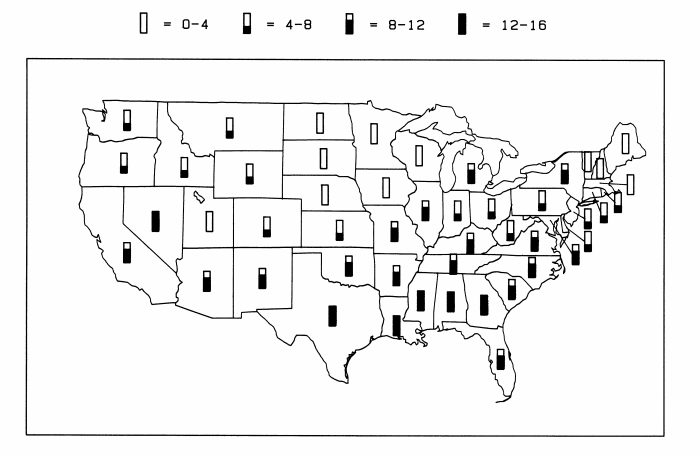
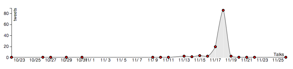
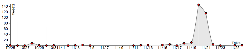
As shown below, the BandHype interface allows the user to display mentions of a band or artist (e.g. Madonna) either in aggregate across the 48 United States, or in a specific location.
Tweets mentioning “madonna” in the 48 United States:

Tweets mentioning “madonna” in New York, NY:

- Show popularity trends of top bands within a specific area. ACCOMPLISHED
Promoter Data Visualization
For showing band data at a particular city, we use d3 barcharts, which query the server for the top ten bands within a state, and display them in order from most popular to least popular.
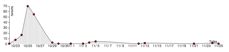
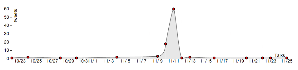
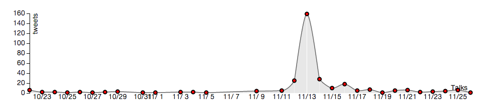
- Perform a validation of our product by confirming that there is extra hype for selected bands in areas where they have played. ACCOMPLISHED
We selected Madonna for a simple case-study having found that she was on tour during our month of data collection. Her concert schedule is shown below along with some selected plots of tweet activity in those cities as a function of time. Spikes in activity occur near the concert date for all of the cities in the tour itinerary. NOTE: the timestamp on the tweets collected was in GMT, which is why the peak of the spike appears to occur one day later than the scheduled concert.
Madonna tour dates from October 24th to November 20th, 2012:
October 24, 2012 Houston
October 25, 2012 Houston
October 27, 2012 New Orleans
October 30, 2012 Kansas City
November 01, 2012 St. Louis
November 03, 2012 St. Paul
November 04, 2012 St. Paul
November 06, 2012 Pittsburgh
November 08, 2012 Detroit
November 10, 2012 Cleveland
November 12, 2012 New York City
November 13, 2012 New York City
November 15, 2012 Charlotte
November 17, 2012 Atlanta
November 19, 2012 Miami
November 20, 2012 Miami
Tweets mentioning “madonna” in Houston, TX:
Tweets mentioning “madonna” in Cleveland OH:
Tweets mentioning “madonna” in New York, NY:
Tweets mentioning “madonna” in Atlanta, GA:
Tweets mentioning “madonna” in Miami, FL:
Software architecture
Server Design
Server was built using Django and is connected to a NoSQL backend. The server handles all the data requests from the websites. Whenever the user selects a band or a location, the server receives the request and sends the data in a json format.
Database Design
We utilized MongoDB, a NoSQL database, in order to take advantage of schema-less databases. In other words, as we enter in data from the analysis, we can avoid having to fit the data to a specific schema, which prevents the possibilities of dealing with table migrations in SQL databases. When importing the analysis results into the database, we add FIPS county codes to the county related data, in order to provide the visualization described in the next section.
Coding
Our coding languages were mostly python, for Django, twitter streaming scripts, and mongodb insertion scripts. We also used javascript, for d3js and interactivity with the website. Our backend is MongoDB, which has a shell that uses javascript, and is wrapped in an ORM module, django-mongodb, for use within the Django framework. For the data aggregation, we used Pig Latin, which has an SQL syntax.
D3 is utilized to make visualizations – Map, Barcharts and for interactive Timelines; we also used Twitter Bootstrap for layout of the application and make the site pleasant to look at.
Instructions for the Application:
Link to the App:
tinyurl.com/bandhype (http://fierce-atoll-8542.herokuapp.com/)
To run the django server on your local machine :
- Download the code via github (ask for permission).
- Install venv.
- Use the command: source venv/bin/activate
- The packages needed can be found and edited in requirements.txt
- Use pip (or sudo pip) install -r requirements.txt
Visualization Instructions:
Bands Visualization:
When you search for a band X :
1. a map is generated which shows the geographical distribution of tweets across US
2. The intensity of the color of a state in a map represents % of tweets in the country.
3. Hovering on a state/county shows the no of tweets in that location and the percentage of tweets for a specific location that are for that band for a specific point in time.
Next to the map, we have the time-series for the band X
1. t indicates the tweets generated for the period between October 22nd and November 25th
2. Each node represents the count of tweets for that band on that day.
3. When you hover on the node. the map dynamically changes showing the distribution of tweets on that day and the percentage of tweets for that day that are for band X.
4. The time series changes when clicking on a state in the map to represent the time series within that state.
Promoters Visualization:
1. On hover of each barchart of a band, the time series gets dynamically generated at the bottom.
2. This time-series shows how many tweets mentioning a band occurs during the period between October 22nd and to November 25th in that city Y.
3. On hover on each on time-series, the tooltip shows the percentage of tweets for that band on that day in that city.
Instructions for Accessing Raw Data:
“Talking” Tweets (no band name tags: generic tweets from within the 48 United States):
The original >54 million tweets can be downloaded in several parts from amazon s3 as per the table below. Some files span several days; the date stamp in the filename indicates the date when the download began (GMT). The files are tab delimited and the fields from left to right are: username, longitude, latitude, datetime stamp, tweet text. Most exotic characters along with tabs and newline characters have been removed from the tweet text via regular expressions.
| public file URL | file size |
| http://s3.amazonaws.com/ucbtwitter-student2/STAGE 1 Data: Raw Tweets/cln22Oct2012.txt | 188.5 MB |
| http://s3.amazonaws.com/ucbtwitter-student2/STAGE 1 Data: Raw Tweets/cln23Oct2012.txt | 189.4 MB |
| http://s3.amazonaws.com/ucbtwitter-student2/STAGE 1 Data: Raw Tweets/cln24Oct2012.txt | 201.1 MB |
| http://s3.amazonaws.com/ucbtwitter-student2/STAGE 1 Data: Raw Tweets/cln25Oct2012.txt | 196.1 MB |
| http://s3.amazonaws.com/ucbtwitter-student2/STAGE 1 Data: Raw Tweets/cln26Oct2012.txt | 171.5 MB |
| http://s3.amazonaws.com/ucbtwitter-student2/STAGE 1 Data: Raw Tweets/cln27Oct2012.txt | 516.6 MB |
| http://s3.amazonaws.com/ucbtwitter-student2/STAGE 1 Data: Raw Tweets/cln30Oct2012.txt | 192.5 MB |
| http://s3.amazonaws.com/ucbtwitter-student2/STAGE 1 Data: Raw Tweets/cln31Oct2012.txt | 77.6 MB |
| http://s3.amazonaws.com/ucbtwitter-student2/STAGE 1 Data: Raw Tweets/cln01Nov2012.txt | 775.7 MB |
| http://s3.amazonaws.com/ucbtwitter-student2/STAGE 1 Data: Raw Tweets/cln08Nov2012.txt | 789.8 MB |
| http://s3.amazonaws.com/ucbtwitter-student2/STAGE 1 Data: Raw Tweets/cln12Nov2012.txt | 289.0 MB |
| http://s3.amazonaws.com/ucbtwitter-student2/STAGE 1 Data: Raw Tweets/cln14Nov2012.txt | 204.2 MB |
| http://s3.amazonaws.com/ucbtwitter-student2/STAGE 1 Data: Raw Tweets/cln15Nov2012.txt | 2.2 GB |
“Talking” Tweets (band names tagged, data is geoenriched):
Once band names from 500 bands were tagged, the data set shrunk dramatically. This data set contains just over 680 thousand tweets. The data has been geoenriched as described above. The files are tab delimited and the fields from left to right are: band name, username, longitude, latitude, datetime stamp, tweet text, city, county, state, county FIPS code.
| public file URL | file size |
| http://s3.amazonaws.com/ucbtwitter-student2/STAGE 3 Data: Contains MapQuest Location Tags/fipsOut500.txt | 102.5 MB |
“Listening” Tweets (band names tagged, data is geoenriched):
We downloaded just over 20,000 programmatically generated tweets. The data has been geoenriched as described above. The files are tab delimited and the fields from left to right are identical to those for the geoenriched “talking” tweets above: band name, username, longitude, latitude, datetime stamp, tweet text, city, county, state, county FIPS code.
| public file URL | file size |
| http://s3.amazonaws.com/ucbtwitter-student2/fipListen.txt | 3.5 MB |
Current API (subject to change)
Query: http://fierce-atoll-8542.herokuapp.com/statecount?query=<band_name>
Description: Gets the time related information for band talks and the state relation information for each point in time for that band.
Response: See example http://fierce-atoll-8542.herokuapp.com/statecount?query=cake
Query: http://fierce-atoll-8542.herokuapp.com/countycount?band=<band_name>&state=<state_fips>
Description: Gets the time related information for band talks in a particular state and the county related information for each point in time for that band.
Response: See example http://fierce-atoll-8542.herokuapp.com/countycount?band=calvin%20harris&state=48
Query: http://fierce-atoll-8542.herokuapp.com/getcity?city=<city_name>&state=<state_abbreviation>&start=<start_val>
Description: Gets the start_val highest rated plus ten bands in a particular city within a state and the related time series for the bands in that city.
Response: See example http://127.0.0.1:8000/getcity?city=new%20york&state=NY&start=0
Relative Group Member Contributions:
| David Adamson | Rahul Gupta | Prabha Matta | Quinn Shen | |
| “Talking” Tweets Data Collection | 100% | |||
| “Listening” Tweets Data Collection | 100% | |||
| Python-Based Band Identification | 100% | |||
| Pig-Based Band Identification | 100% | |||
| Pig Aggregation | 50% | 50% | ||
| Amazon EMR for Analysis & Aggregation | 100% | |||
| MapQuest & FCC API Integration for Geoenrichment | 100% | |||
| Back-End Server Development (MongoDB) and Frontend integration | 100% | |||
| Django Framework | 95% | 5% | ||
| Google Maps for Bands data | 100% | |||
| D3 Map for Bands | 75% | 25% | ||
| Barcharts for Band Visualization at a Particular Location | 20% | 80% | ||
| D3 Time series | 50% | 50% | ||
| User Interface | 100% | |||
| Documentation and Reporting | 25% | 25% | 25% | 25% |
| Literature Review | 25% | 25% | 25% | 25% |