Finishing up with last week’s in-class assignment to respond to election-day twitter activity, some other great work from the class:
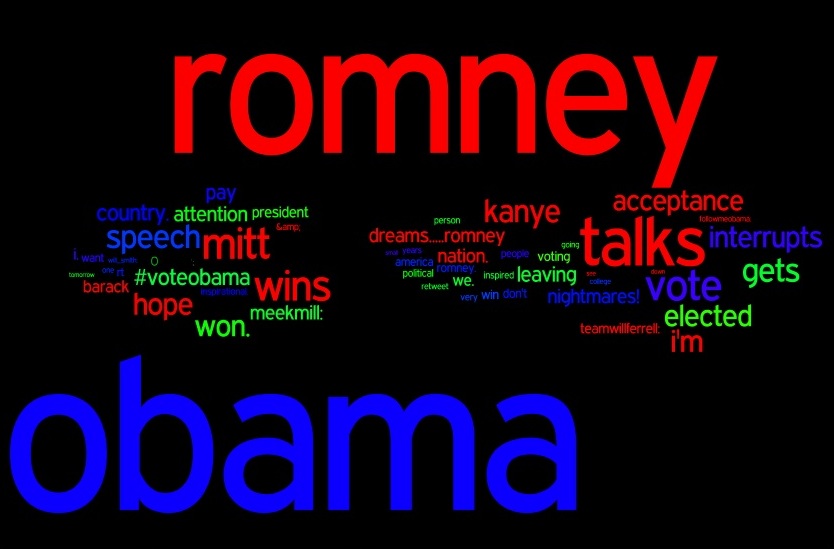
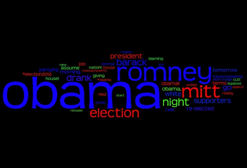
Priya Iyer processed a collection of tweets just before and after the election returns and pulled out the most frequent words. She then ran them through the wonderful Wordle program to create a visualization where size indicates frequency (color was chosen by the program, and coincidentally (?) choosing blue and red for “obama” and “romney”.
Before the election:
Just after the returns:
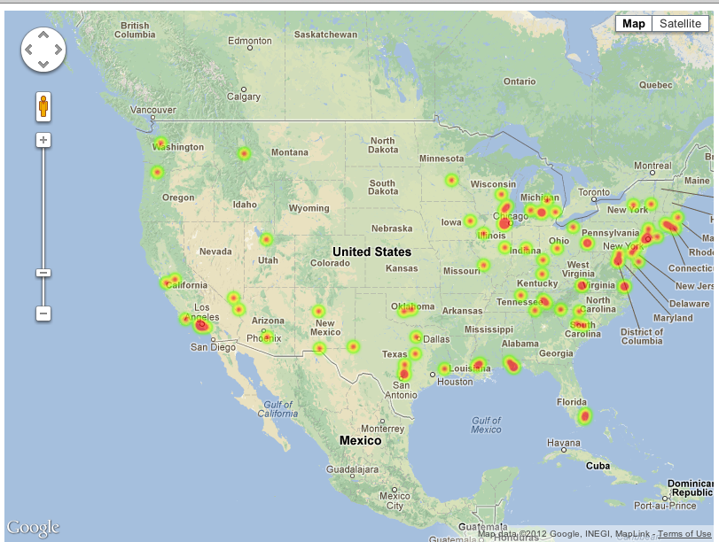
Below is a heatmap of the locations of people who tweeted with the hashtag #Ivoted on election day, based on their geolocation information, by the BandHype team.
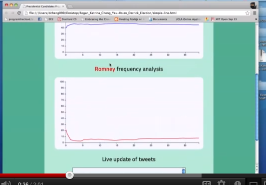
Derrick Cheng and Katrina Rogan made a video of their app running that shows the proportion of tweets that talk solely about Obama and solely about Romney. Here is a screenshot:
I think this was a great exercise, as we all learned from each other a bit more about how to get our apps online and get faster at doing our coding, which should help with the final projects.


