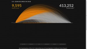
This is one of the most unique visualizations that I have ever come across and quite effectively communicates the information about gun killings in the US in 2010. The data about these killings comes from the FBI.
The intent of this visualization is to show the number of deaths caused by gun shootings in every month of the year 2010. The larger the diameter of the curve, the higher the age of the person when they were shot. This is not a static visualization wherein you can see the number of deaths per month in the year 2010. There are several features in this visualization with different user intents:
1. As the visualization loads, the cumulative sum of the number of deaths keeps on increasing as the months go by.
2. Also, it is interesting to see that initially when the first couple of curves are being plotted, a symbolic bullet/gun pellet drops to the X- axis when the person reaches the age when he/she is killed.
3. Clicking on the “age” box in the bottom left corner gives you a static graph in a different format (User Intent: Encode or show a different representation)
4. If you hover over any of the areas in the visualizations (of both kinds), it describes when, how and at what age that person was shot. (User Intent: Abstract/Elaborate)
5. However, the most interesting part of this visualization for me is the sum of the number of stolen years from all these people killed. they assume a different life expectancy of every individual (obtained from some data).
Technologies used: Examining the source, they seemed to have used AJAX and Javascript for rendering the visualization.
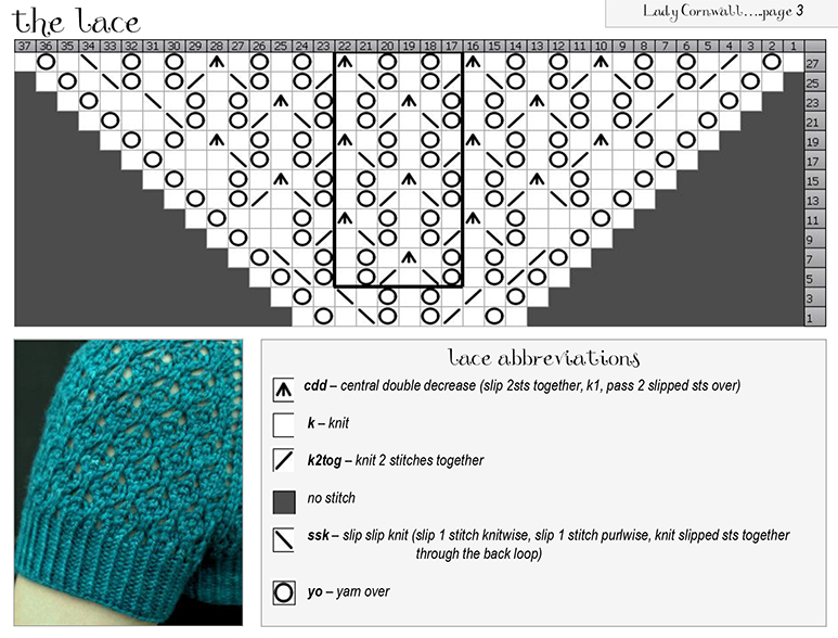
When we think of data, we normally think of values: numbers, percentages, averages, and the like. But as we saw with assignment one, we interact with a lot of different types of information on a daily basis. For knitters like myself, patterns are excellent examples of this: while some designs are very simple, requiring only knowledge of only one or two stitches, others require a lot of knowledge, and the information contained in the pattern can be quite complex and difficult to follow.
Lace is considered to be amongst the most complicated type of knitting, consisting of intricate patterns of “holes” in the fabric. For these and many other patterns, it’s common to find charts: a grid of squares, where different symbols represent different types of stitches. Each row in the chart is a row of knitting, and the chart is followed from bottom to top. With some education on how to use them, these visualizations can provide two major benefits.
1. What the fabric looks like: the symbols used generally represent the actual stitch shape fairly well. In this example, the wavy pattern of the yarn overs (the big circles) are visible, which appear in the lattice texture of the fabric. Additionally, the knitter can see that this lace pattern increases by two for each row, since dark squares do not have stitches, but they are filled in as the pattern is knit.
2. At-a-glance: knitters can follow the pattern at a glance, using the more pre-attentive pictographs instead of reading specific stitch words. Instead of reading “k1, yo, k1, k2tog, yo, k1, yo, ssk, k1, yo, k1,” the knitter can see the 11 stitches of the bottom row with one glance. Repeats (the stitches within the darker black box) are easy to distinguish from the end stitches that are knit only once. The legend at the bottom helps with remembering what each symbol represents. This at-a-glance interaction can be a boon to a knitter managing tools and yarn at the same time, potentially reducing the amount of mental overload involved.
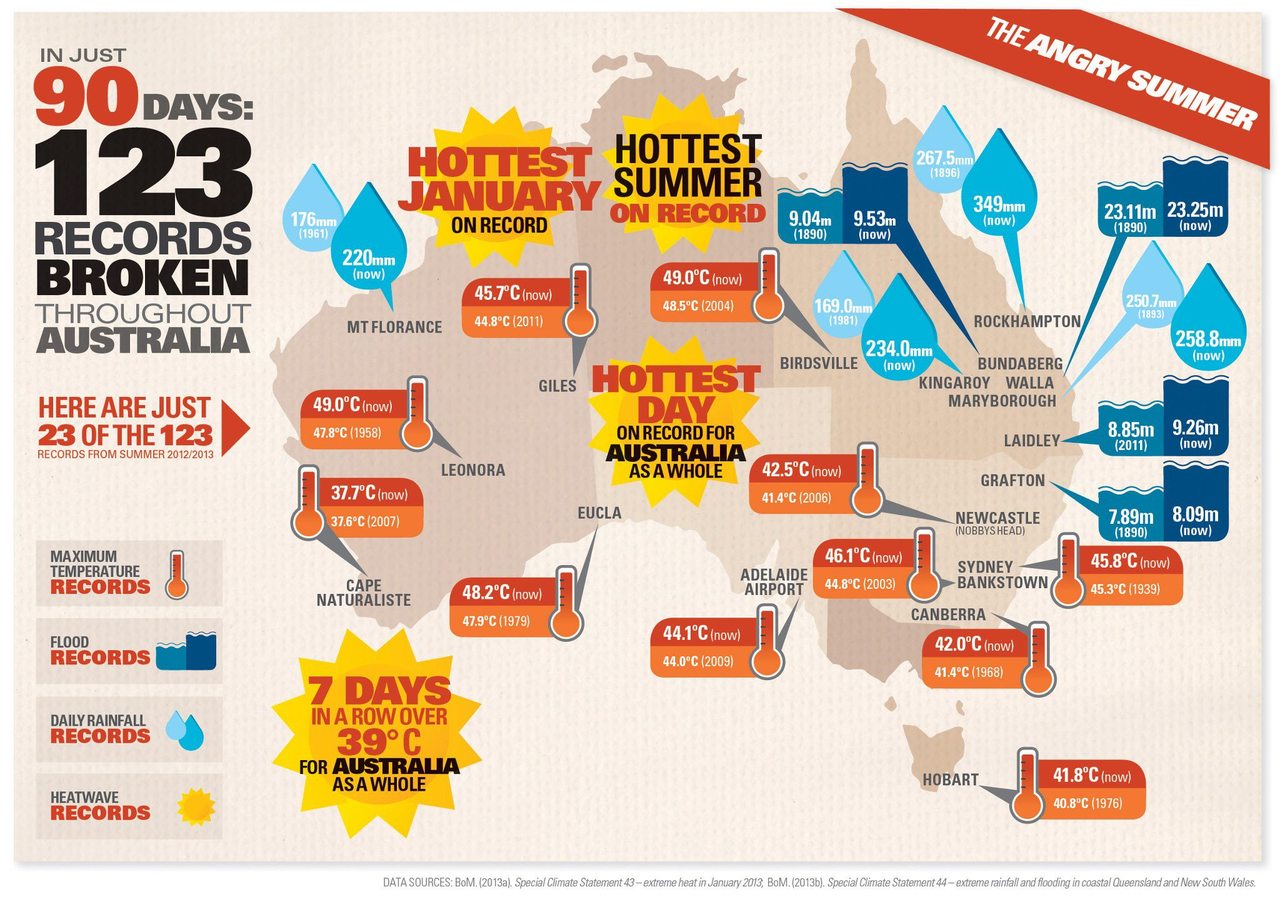
During the last lecture, we saw an example from the Australia Bureau of Meteorology which shows the extreme temperature in Australia this summer. The visualization above, found on a Tumblr blog of a sustainable cities website (thisbigcity.net), is an extension of that idea. It shows information such as temperature, flood, rainfall, and heatwave records in various places in Australia, which altogether explains the “angry summer” that the country is experiencing.
The key information is fairly straightforward. The temperature/flood/rainfall records are quantitative measures that are comprised of the new record (all broken in 2012/2013) and the previous high record. However, I did find the use of icons slightly inconsistent. The flood and rainfall icons are both comparative–they’re each made of a smaller icon and a bigger icon to represent the previous and current record, respectively. The temperature icon, however, is illustrated as only one part (thermometer) with the previous and current record information displayed on the side. I’m not sure why the designer used a different icon logic for temperature, especially since the information displayed is of the same structure.
My biggest annoyance is with the heatwave records, which are spattered all across the map with no discernible logic in their placements and seemingly random typographic hierarchy in terms of size, color, and typeface. Instead of the current placements, these icons could be placed at the bottom together (as 1-dimensional stats) to give the main visualization a little more breathing room.
Overall, the visualization can benefit from some content restructuring. At the moment, the graphic looks crowded and every item is styled in a manner that demands the viewer’s attention (big and bold types, bright colors, icons, etc). While the information conveyed is quite straightforward, creating a little more hierarchy in the visualization–through higher contrast between items and generous use of white space, for instance–will greatly help its narrative flow and convey the idea better.
I found this infographic through a news link LinkedIn sent me. It’s full of information and reasonably effective at presenting it. At no point in viewing this infograph did I completely misinterpret something. However, there were also a few things I felt it could have done better.
Job preparedness indicator: This uses red to yellow to show qualities managers want but don’t see in job seekers ordered by a combination of importance and least seen. The use of a dial makes sense based on the combined importance and least seen value, but the dial also seems to imply the qualities are on a continuous spectrum where one builds on top of another. If a job seeker were to try and use this graphic to determine what they need to work on their weaknesses would most likely be speckled throughout the indicator, not a single continuous section from one extreme to some point. Also the arrow on the indicator is superfluous. Removing it might help lessen the idea that the qualities build on each other.
What employers value vs how job seekers describe themselves: The red in this section of the infograph really pops out. However just looking at the numbers confuses why they are all given equal weight of importance, some are small and some are big with different extremes. It is also repeated information since the line graph with it’s value labels provide you the same information. If these values had to be there, I think it would have been better to emphasize them less with a more subdued color so they don’t pop more than the orange and green or just make them black. Also are these numbers percentages? If they are labeling the y-axis values with a “%” would be nice.
Skills can be learned: They used four distinct colors to indicate where a hiring manager believes you can learn a skill. This is fine, not too many colors. However they decided to use pie charts to show percentages for each skill. In class the only time pie charts seemed reasonable are when one portion is close to 50%. Here only the first pie chart has an item close to 50%. Without the numbers it would be difficult to really know the proportions. If the goal is to show the top 2 locations to learn a skill I think that the choice of pie charts is not too bad though. This is more because of the data than the medium though because there is a large difference in the values between the top two and lower two for this particular data set (except for the accountability skill). Also I wish that they had been consistent in where they started their pie chart (ex. start each green section at 12:00 and work their way around in the same color order). So I could more easily compare the pie charts with each other.
Job seekers confident in their abilities…: My previous comment on where to start coloring the pie chart holds for the pie charts in this section as well. My biggest problem with this section though has to do with the percentages. Using the same color for the number and some of the people icons would cause the brain to link them together. However they are actually opposites. The black people icons represent the percentage and the colored icons are what is left. Swapping the colors might not necessarily make it more aesthetically pleasing, but it at least wouldn’t confuse viewers into thinking the colored people icons represent the percentage value.
Once again over all a pretty good graphic. It uses a lot of color but each choice seems reasonable and it causes the eye to want to look at the entire graphic, which is part of the goal for something like this. The infographic also uses backgrounds to break things up and better tell it’s story.
The first portion of the article talks about why some primates evolve to see different colors (3 dimensions of color).
One theory is that that primates evolve to distinguish fruit colors on trees. However, this article suggests that primates evolve to see different colors to sense emotions. For this reason, primates that can see 3 dimensional colors have no fur on their faces, etc. Blood color changes depending on the amount of oxygen present and so the color vision is sensitive to that color.
The second half of the article is about how the theory is used to come up with glasses for color blind people.
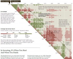
I found this visualization in the business section of The New York Times’ website. It accompanied the article “In Investing, It’s When You Start and When You Finish.” In this article, the author finds that ordinary investors expect average of 7% return on their investments when they invest over a long period of time – 10 to 20 years. However, the historical data do not support this conventional wisdom and the author demonstrates that stock market returns on investments vary widely depending on starting and ending points of individual investments. He chooses this graphic to analyze and communicate the historical evidence in support of his claim that market returns are more volatile than most people realize, even over longer periods of time.
Besides providing clear annotations, this heat map displays two quantitative dimensions – average real annual returns and time periods measured in years to illustrate that returns on 20-year investments can vary depending on when money was first invested and when it was withdrawn. It allows easy comparisons of various investment timeframe combinations. The reader can easily see that long-term investments done from mid-1960’s through mid-1970’s could hardly keep up with inflation. In contrast, short-term investments made in 1980’s and late 1990’s produced more than 10% returns. When following a typical 20-year investment line, it is obvious that 20 years is not the magic number and the returns vary from not keeping up with the inflation to 7-10% returns.
I like this graphic because it does a good job organizing and presenting a great deal of quantitative information and supporting author’s claims. It uses colors that are intuitive for readers to interpret (shades of red – loss or low returns; shades of green – 3%+ returns). It also provides enough context through legend, annotations, and 20-year return example that makes it very easy to read and interpret.
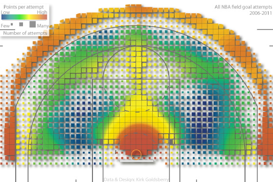
The graph depicts five years of every NBA shot attempt from 2006 to 2011, visualization work credited to Prof. Kirk Goldsberry, who teaches geography at Michigan State University. He published a paper titled “CourtVision: New Visual and Spatial Analytics for the NBA” while he was a PhD at Harvard. (Paper link: http://www.sloansportsconference.com/wp-content/uploads/2012/02/Goldsberry_Sloan_Submission.pdf) He introduces CourtVision, what he called “a new ensemble of analytical techniques designed to quantify, visualize, and communicate spatial aspects of NBA performance with unprecedented precision and clarity.” He believes that visual and spatial analyses represent vital new methodologies for NBA analysts.
Introduction
Prof. Goldsberry presents a whole new way to look at NBA data. His paper on CourtVision investigates spatial and visual analytics as means to enhance basketball expertise. Goldsberry and his research team propose a new way to quantify and visualize NBA player’s shooting ability with unprecedented precision and clarity. In the paper, an exploratory case study is introduced. Goldsberry attempts to examine spatial shooting behavior and performance for every NBA player by applying his CourtVision method. He concludes with evidence that Steve Nash and Ray Allen have the best shooting range in the NBA.
Hypotheses
Who is the best shooter in the NBA? This is the question asked by Goldsberry. Conventional evaluative approaches would probe into FA (field-goal attempted) and its derived FG% (field-goal percentage). This approach fails to provide a simple answer to this question. For example, Nene Hilario and Dwight Howard led the league in FG% in the 2010-2011 season, but neither is considered to be a great shooter. NBA reporter David Aldridge suggests that Ray Allen is the best shooter because of his ability to shoot well from many different locations on the court. Goldsberry introduces two metrics to quantify player’s shooting performance and validate reporter Aldrige’s opinion.
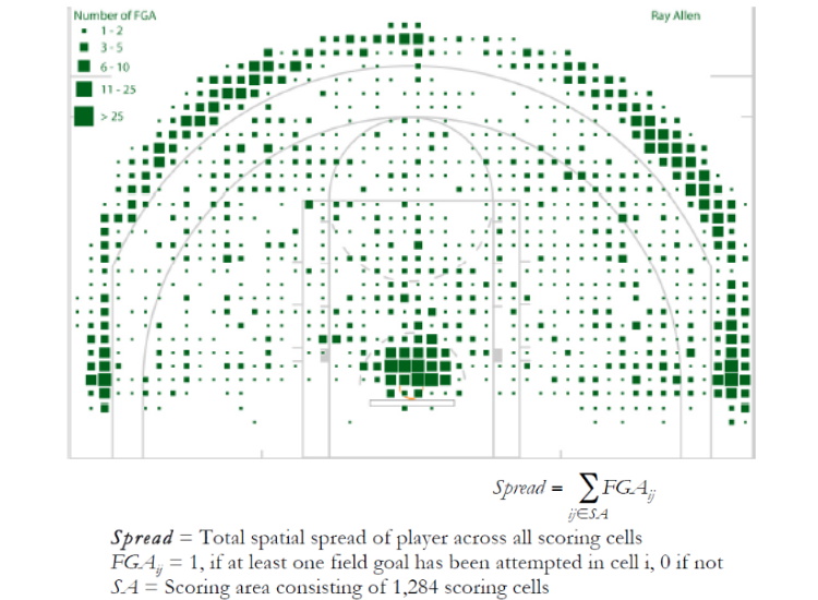
Visualization: Shooting Spread
Visual depiction of Ray Allen’s Spread Variable
The research team compiled a spatial field goal database that included Cartesian coordinates (x,y) for every field goal attempted during 2006-2011. The shooting data is mapped to a standard NBA basketball court and the map is divided into 1,284 squares for analysis of Spread, which describes the overall size of a player’s shooting territory.
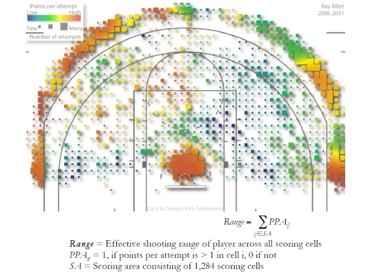
Visualization: Shooting Range
Visual depiction of Ray Allen’s Range Variable
But Spread alone is not enough. It reveals shooting tendencies but not effectiveness. Range, thereof, indicates the percentage of the scoring area in which a player averages more than 1 PPA (points per attempt). Steve Nash is ranked first, with a Range value of 406, indicating that he averages over 1 PPA from 406 unique shooting cells, or 31.6% of the scoring area. Ray Allen was ranked second (30.1%). Although the hypothesis about Ray Allen being the best shooter in the league is wrong, but Goldsberry proves that Allen is still the second best shooters in terms of the Range metric.
Effectiveness
The paper presents new spatial metrics and advanced visualizations that allow better understanding of the complex spatial dynamics of NBA players and teams. CourtVision integrates database science, spatial analysis, and visualization to demonstrate players’ or teams’ spatial shooting signatures.
Connections to Lecture/Lab
Visual encoding process: Record, Analyze, and Communicate
Linear mapping of size and value for FGA (see legend on Visualization of Spread)
Use of color spectrum and correlated dimensions to illustrate PPM (points per attempt)
Conclusion
CourtVision is an informative and beautiful visualization of shooting analysis dedicated to NBA fans, players, coaches, analysts, and executives. The presented spatial and visual analytics could be vital new tools for informing future game plans, practice regimens, and for scouts to find potential players.
I’m attempting to keep a running list of tools and resources mentioned in class over on the Resources page. Send me a note or post a comment here if you’d like to see something listed that isn’t currently. (Or put up a blog post about it!)
Onward! And do keep those blog posts coming. Priya got us off to a great start. If you have questions about blog post guidelines, look at the bottom of our Assignments page.
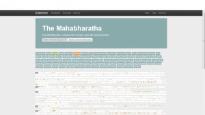
I came across the visualizations of this India based company called Gramener a while ago. There are many more interesting ones on their online portfolio but I especially liked this one since it is the outcome of scanning the text of the magnum opus and the longest epic of India: the Mahabharata. With 1.8 million words in it, I would consider this visualization to be “Ancient Big Data” visualization.
The intended function of this visualization is to highlight those parts in the epic wherever the selected characters have been mentioned. This helps us to directly navigate to those parts of this huge unstructured data to find topics on characters of our interest. Thus, the intended function of this visualization is to communicate the same. The author’s main objective here is to ease the navigation of unstructured data with 1.8 million words and communicate to us directly the parts of the epic where we might find the data (about the characters) we are looking for. It could be seen as a visual information retrieval system.
Other Potential Applications:
Research paper text scanning: One problem that I have often faced while going through research papers for projects or assignments is that sometimes, I have to go through the entire paper to find information about topics of my interest, only to realize that it was not an important paper. With such an application, I can easily decide if I need to read the paper by simply looking at the visualization of the text as shown above.
Does anyone know of a good book that talks about color? Something about the “science” of color or color design?
(Sorry that this isn’t a post to share something, but a question. One of my greatest design weaknesses is color. And I thought it would be better to ask it here, so I get and can share the classes thoughts.)