When we think of data, we normally think of values: numbers, percentages, averages, and the like. But as we saw with assignment one, we interact with a lot of different types of information on a daily basis. For knitters like myself, patterns are excellent examples of this: while some designs are very simple, requiring only knowledge of only one or two stitches, others require a lot of knowledge, and the information contained in the pattern can be quite complex and difficult to follow.
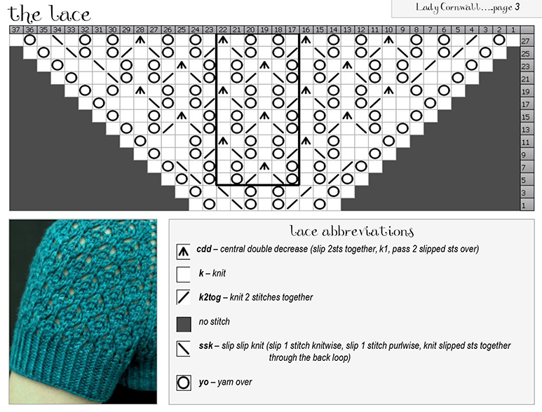
Lace is considered to be amongst the most complicated type of knitting, consisting of intricate patterns of “holes” in the fabric. For these and many other patterns, it’s common to find charts: a grid of squares, where different symbols represent different types of stitches. Each row in the chart is a row of knitting, and the chart is followed from bottom to top. With some education on how to use them, these visualizations can provide two major benefits.
1. What the fabric looks like: the symbols used generally represent the actual stitch shape fairly well. In this example, the wavy pattern of the yarn overs (the big circles) are visible, which appear in the lattice texture of the fabric. Additionally, the knitter can see that this lace pattern increases by two for each row, since dark squares do not have stitches, but they are filled in as the pattern is knit.
2. At-a-glance: knitters can follow the pattern at a glance, using the more pre-attentive pictographs instead of reading specific stitch words. Instead of reading “k1, yo, k1, k2tog, yo, k1, yo, ssk, k1, yo, k1,” the knitter can see the 11 stitches of the bottom row with one glance. Repeats (the stitches within the darker black box) are easy to distinguish from the end stitches that are knit only once. The legend at the bottom helps with remembering what each symbol represents. This at-a-glance interaction can be a boon to a knitter managing tools and yarn at the same time, potentially reducing the amount of mental overload involved.