Visualizing “Avaaj Otalo” Platform Usage

Usage Trends and Patterns of the AO Platform

Avaaj Otalo (literally, “voice stoop”) is an interactive voice application for small-scale farmers in Gujarat, India. It provides farmers with access to relevant agricultural information and a virtual community of peers to share their knowledge with over the phone. By dialing a phone number and navigating through simple audio prompts, farmers can browse, listen to, and record agriculture-related information, as well as respond to questions.

This service was designed in 2008 as a collaboration project between the UC Berkeley School of Information, Stanford’s HCI Group, IBM India Research Laboratory, and Development Support Center – an NGO in Gujarat, India. The system has been “live” since 2010, serving the community of Gujarat farmers. Every time a farmer places a call, the system creates a record of important information about that call such as date and time, duration of the call, inquiry topic, selected forum, and crop that the call was about.

Avaaj Otalo researchers would like to have a visualization tool that can help them track and visually explore system log data. They can use this information to make improvements to the existing services and possibly expand the project scope to other regions in India. Thus, the main objective of our visualization is to allow the founders and the researchers of Avaaj Otalo to analyze and visually explore key metrics behind application usage.

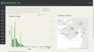
Our visualization focuses on providing insight into the trends and patterns of weekly call volumes. The bar chart displays weekly number of calls to the application over the course of a year. Color intensity indicates how average duration of the calls is related to call volume (darker colors signify longer calls). The map identifies the Gujarat’s villages that these calls are coming from. The small multiples on the bottom of the page exhibit call topic trends. Since all crops have very different seasonal and agricultural cycles, the visualization is organized by individual crop.


You can view our visualization here: http://priya-i.github.io/visualize-ao/

Team: Julia, Seema & Priya

In-class Visualization – America’s Wealthiest

Team Members: David, Raymon, Fred, Morgan, Priya

The Story:

We are the job creators!
We are the job creators

We wanted to create the visualization from the perspective of the highest income group in America; different from what was shown in the video at the beginning of class. The main purpose of this infographic is to show the general audience how the America’s wealthiest are actually contributing to its profit and growth. They are not just the highest earners but also the highest tax payers.

US Gun Killings in 2010

GunKillings

Linkhttp://guns.periscopic.com/

This is one of the most unique visualizations that I have ever come across and quite effectively communicates the information about gun killings in the US in 2010. The data about these killings comes from the FBI.

The intent of this visualization is to show the number of deaths caused by gun shootings in every month of the year 2010.  The larger the diameter of the curve, the higher the age of the person when they were shot.  This is not a static visualization wherein you can see the number of deaths per month in the year 2010. There are several features in this visualization with different user intents:

1. As the visualization loads, the cumulative sum of  the number of deaths keeps on increasing as the months go by.

2. Also, it is interesting to see that initially when the first couple of curves are being plotted, a symbolic bullet/gun pellet drops to the X- axis when the person reaches the age when he/she is killed.

3. Clicking on the “age” box in the bottom left corner gives you a static graph in a different format (User Intent: Encode or show a different representation)

4.  If you hover over any of the areas in the visualizations (of both kinds), it describes when, how and at what age that person was shot. (User Intent: Abstract/Elaborate)

5.  However, the most interesting part of this visualization for me is the sum of the number of stolen years from all these people killed. they assume a different life expectancy of every individual (obtained from some data).

Technologies used: Examining the source, they seemed to have used AJAX and Javascript for rendering the visualization.

Mahabharata Visualized! “Ancient” Big Data Visualization

Link: http://gramener.com/mahabharatha/

I came across the visualizations of this India based company called Gramener a while ago. There are many more interesting ones on their online portfolio but I especially liked this one since it is the outcome of scanning the text of the magnum opus and the longest epic of India: the Mahabharata. With 1.8 million words in it, I would consider this visualization to be “Ancient Big Data” visualization.

The intended function of this visualization is to highlight those parts in the epic wherever the selected characters have been mentioned. This helps us to directly navigate to those parts of this huge unstructured data to find topics on characters of our interest. Thus, the intended function of this visualization is to communicate the same. The author’s main objective here is to ease the navigation of unstructured data with 1.8 million words and communicate to us directly the parts of the epic where we might find the data (about the characters) we are looking for. It could be seen as a visual information retrieval system.

Other Potential Applications:

Research paper text scanning: One problem that I have often faced while going through research papers for projects or assignments is that sometimes, I have to go through the entire paper to find information about topics of my interest, only to realize that it was not an important paper. With such an application, I can easily decide if I need to read the paper by simply looking at the visualization of the text as shown above.

Screenshot:

Mahabharata