Final project showcase, May 7 & 9

Join us for our Information Visualization final project presentations! The 10 group projects represent a variety of topics and audiences and are the culminating work of the students over the semester. For more information and to preview the projects, visit our Student Showcase page.

[highlight]Student Showcase > >[/highlight]

Avoiding pitfalls in your final project: Story and Narrative

We’ve gotten some feedback from you that the sort of “story” we were looking for you to tell in Assignment 4 was somewhat ambiguous. Is an exploratory visualization telling a story? Or is that what an explanatory visualization does?

The answer is that both types can tell a story. The key question is, given your objective, what do you want to in a sense guarantee that your viewer will walk away with? What are you suggesting more subtly, and what do you want them to discover on their own? The point is to have these takeaways in mind, and use the elements of storytelling discussed in lecture to help guide the viewer through. Even if you decide to create an exploratory visualization, you are not exempt from applying storytelling concepts in your final project.

The biggest pitfall is probably the idea that you can plop the viewer in front of your visualization and assume they have an internal drive to explore your data on their own and draw their own conclusions. This may be the case; certainly if your job depends on it, you’re motivated. But broader audiences have more casual motivations, and you need to think hard about how to capture their attention, draw them in, and tell your story. You can leave them to play on their own—in fact, that can be the main function of your visualization. But you still have to pay attention to how you stimulate and maintain their interest.

The point is that exploring a detailed interactive visualization such as those we talk about in class requires a significant investment of cognitive resources on the part of the viewer. Think about it—you’re essentially asking your audience to learn an entirely new interface. Avoid the pitfall of assuming your audience will come already highly motivated to explore your visualization. And if the viewer has only a little bit of time or effort to spare, can they still get something out of your visualization?

Resources page

I’m attempting to keep a running list of tools and resources mentioned in class over on the Resources page. Send me a note or post a comment here if you’d like to see something listed that isn’t currently. (Or put up a blog post about it!)

Onward! And do keep those blog posts coming. Priya got us off to a great start. If you have questions about blog post guidelines, look at the bottom of our Assignments page.

Emoji

Our conversation about Chernoff faces yesterday made me think of emoji (emoticons) and how the visualization of emotion is becoming more important as text-based messaging and interaction grow relative to voice and face-to-face communication. Our faces and voices carry rich emotional information, while our text interactions don’t.

But visualizing emotion is hard. It’s multi-dimensional. And, to me, the somewhat disorderly way companies go about creating emoticons speaks to how hard it is. Popular messaging apps have pages upon pages of emoticons in an attempt to help users add some emotional meat to the cold bones of text.

The iPhone has emoji (you have to enable a special keyboard), and it’s fun to me to think about how Apple designed and ordered them (though they seem primarily designed for a Japanese market).

photo 1

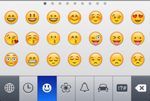
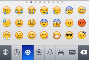
The first page of emoji shows five faces that you could call happy (or contented) followed by an assortment of faces grouped by feature—winking, hearts, kissing, tongue-sticking-out, etc. Then there’s surprise (unpleasant?), teeth-gritting (I think?), a sad face, another random happy face, and a few other sad faces the meaning of which is hard to infer exactly. The second page has a number of other faces, mostly negative in emotion, along with the all-important face mask emoji:

photo 2

It’s not a super coherent representation of our various possible emotions, but perhaps it’s “good enough” or suits our culture (or, rather, the Japanese culture) well. What would be a better or more complete representation? Maybe a few icons at least per “basic emotion”? Arranged by intensity? (i.e. neutral smiley to really smiley smiley, or neutral smiley to anxious smiley, or…you get the picture). It’s interesting to ponder.

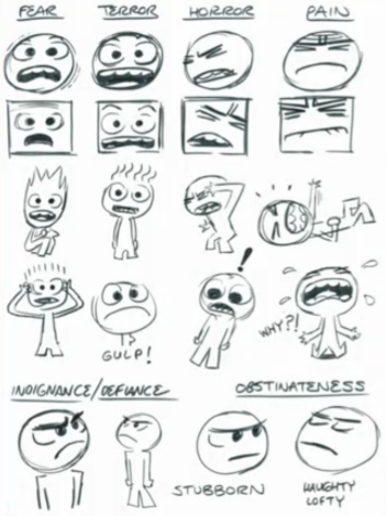
Facebook is clearly pondering this—check out the new experimental feature that lets you set a mood for your status update. A few Facebook researchers also at a recent public presentation said they worked with an animator at Pixar to experiment with some new emoticons, using Darwin’s emotions as a basis. I thought some of them were fun:

Screen Shot 2013-02-05 at 11.06.46 PM


-Galen 😛

Readings for Tuesday

Just a heads-up to note that readings were posted for next week’s lecture. Tuesday 1/29 your Assignment 1s are due, then the following Tuesday 2/5 your first days of data for Assignment 4 are due. Probably a good idea to invest a little creative energy this weekend thinking about the kind of data you want to collect every day.

Some inspiration: