Healthcare is an important topic that is often difficult for people to understand. Considering the scope of resources being committed to Healthcare in the United States alone, improved understanding will only become more important with time. Innovations in visualizing healthcare data will prove useful to visualizing complex data sets more generally.
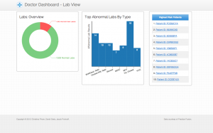
We decided to address this topic by building a dashboard that doctors can use to view overall health data of their patients, on a broader high-level scope to granular patient-level data. One major concern was to have all of the charts and data be simple and easy to glance through in order to make the process of understanding the data much quicker. The front page focuses on the types of abnormal lab results received by that practice. We highlight the number of abnormal lab results as well as the different kinds of abnormal labs.
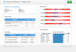
When moving forward to the patient-level data, we highlighted past Diagnoses of each patient, known allergies, vital statistics relative to the average, and prescriptions that have been assigned to them. It was important for the most essential information of each patient be exposed and well visualized for doctors to gauge the health of their patients.
We’ve received a lot of really helpful feedback that led us to making better design decisions for our product. One especially important comment was to focus on each patient from the main dashboard view. It helped us really disperse the potential information overload on the home page, and we were able to produce detailed pages for each patient in the practice. Currently our dashboard is optimized for desktop viewing, but ideally when we move forward with this project we want to customize it for tablet use. We think the data and the ability to review essential information like this would be extremely helpful for doctors who are moving from room to room and want to review patient information from any place within their office.
You can view our project HERE.
– David Greis, Christina Pham, Jacob Portnoff