Team: Charles Wang, Sonny Vernard, Sonali Sharma, Seema Puthyapurayil
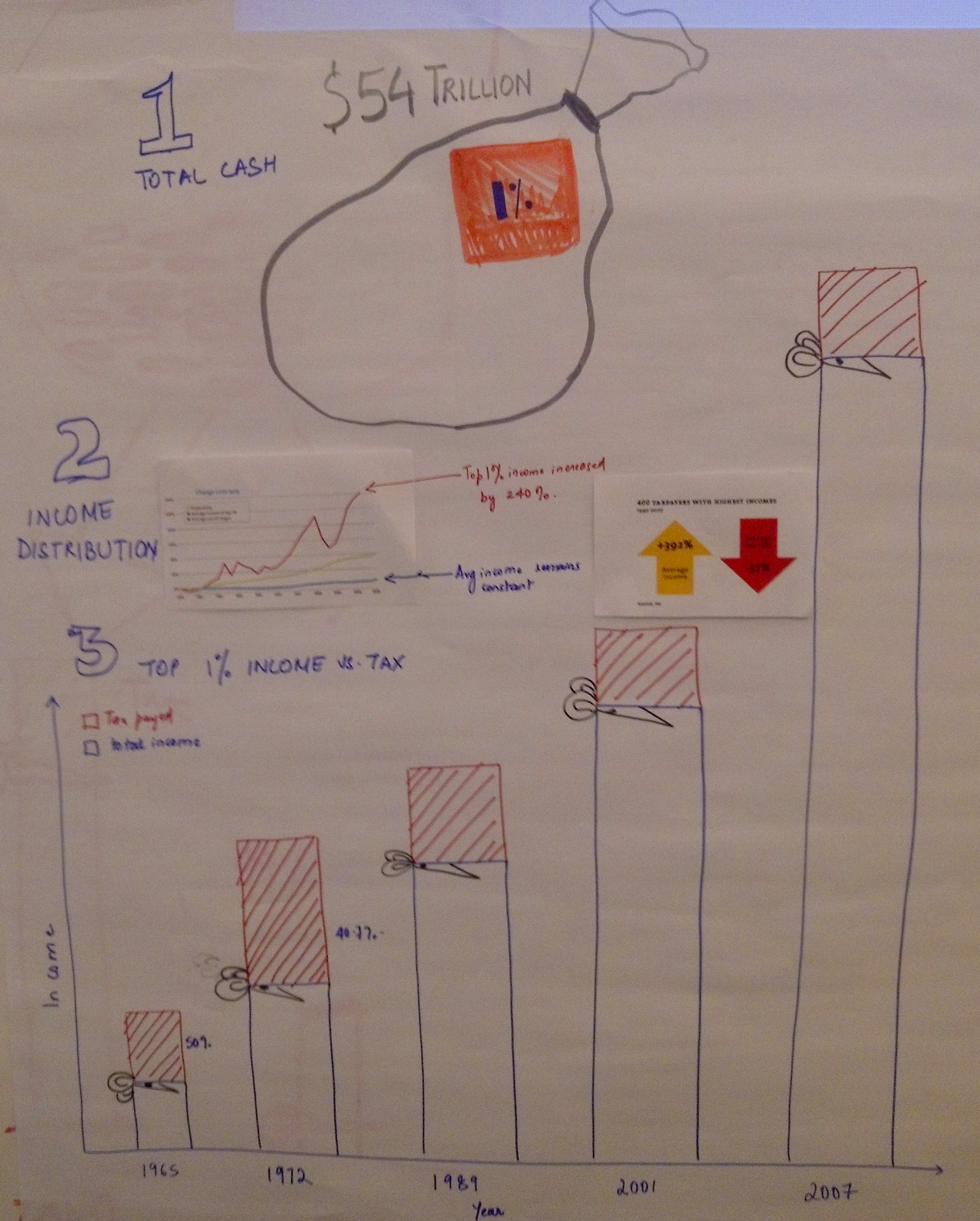
Our objective was to show the unfairness of the richest 1% in America paying decreasing amount of taxes while their income had increased by 240% from 1965 to 2007. We applied a 3-step approach in our narrative. In step 1, a cash sack was drawn to illustrate the total $54 trillion national income. The richest 1% was highlighted as our target group. In step 2, we used a line chart to show the income distribution from 1960’s to 2007. We observed dramatic increases of income for the richest 1%, whereas the average income for low-wage earners had pretty much remained constant. In step 3, we applied a unique visualization that indicates not only the wealthy had become richer over time in absolute dollars, but also captured the story of America’s richest paying a lesser share of taxes as their incomes increased. Furthermore, two arrow indicators beside the bar chart expressed the obvious opposite trends of taxes paid by the richest and the income they made. The decreasing amount of taxes paid by the 1%, our biggest concern, was emphasized with red color.
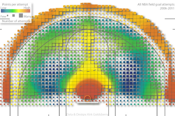
The graph depicts five years of every NBA shot attempt from 2006 to 2011, visualization work credited to Prof. Kirk Goldsberry, who teaches geography at Michigan State University. He published a paper titled “CourtVision: New Visual and Spatial Analytics for the NBA” while he was a PhD at Harvard. (Paper link: http://www.sloansportsconference.com/wp-content/uploads/2012/02/Goldsberry_Sloan_Submission.pdf) He introduces CourtVision, what he called “a new ensemble of analytical techniques designed to quantify, visualize, and communicate spatial aspects of NBA performance with unprecedented precision and clarity.” He believes that visual and spatial analyses represent vital new methodologies for NBA analysts.
Introduction
Prof. Goldsberry presents a whole new way to look at NBA data. His paper on CourtVision investigates spatial and visual analytics as means to enhance basketball expertise. Goldsberry and his research team propose a new way to quantify and visualize NBA player’s shooting ability with unprecedented precision and clarity. In the paper, an exploratory case study is introduced. Goldsberry attempts to examine spatial shooting behavior and performance for every NBA player by applying his CourtVision method. He concludes with evidence that Steve Nash and Ray Allen have the best shooting range in the NBA.
Hypotheses
Who is the best shooter in the NBA? This is the question asked by Goldsberry. Conventional evaluative approaches would probe into FA (field-goal attempted) and its derived FG% (field-goal percentage). This approach fails to provide a simple answer to this question. For example, Nene Hilario and Dwight Howard led the league in FG% in the 2010-2011 season, but neither is considered to be a great shooter. NBA reporter David Aldridge suggests that Ray Allen is the best shooter because of his ability to shoot well from many different locations on the court. Goldsberry introduces two metrics to quantify player’s shooting performance and validate reporter Aldrige’s opinion.
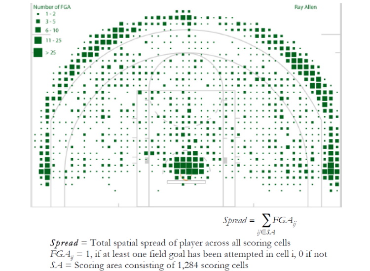
Visualization: Shooting Spread
Visual depiction of Ray Allen’s Spread Variable
The research team compiled a spatial field goal database that included Cartesian coordinates (x,y) for every field goal attempted during 2006-2011. The shooting data is mapped to a standard NBA basketball court and the map is divided into 1,284 squares for analysis of Spread, which describes the overall size of a player’s shooting territory.
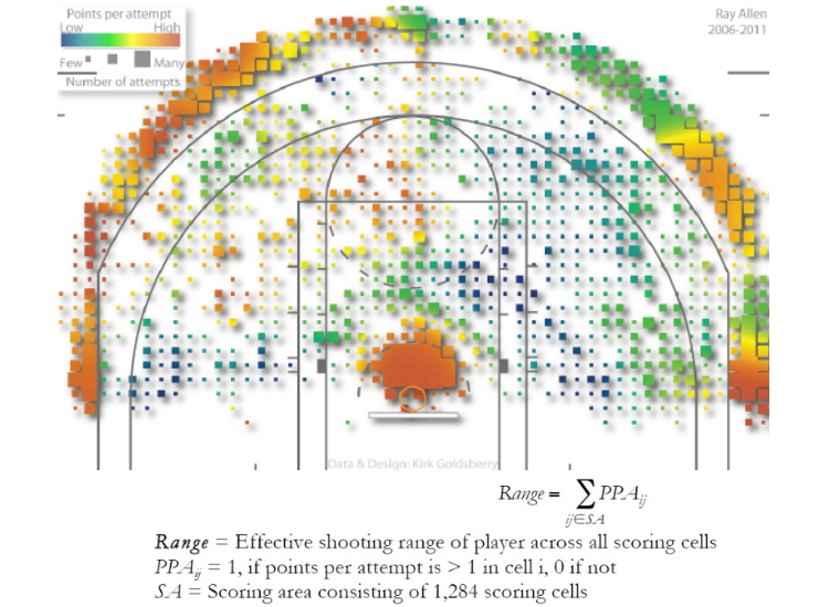
Visualization: Shooting Range
Visual depiction of Ray Allen’s Range Variable
But Spread alone is not enough. It reveals shooting tendencies but not effectiveness. Range, thereof, indicates the percentage of the scoring area in which a player averages more than 1 PPA (points per attempt). Steve Nash is ranked first, with a Range value of 406, indicating that he averages over 1 PPA from 406 unique shooting cells, or 31.6% of the scoring area. Ray Allen was ranked second (30.1%). Although the hypothesis about Ray Allen being the best shooter in the league is wrong, but Goldsberry proves that Allen is still the second best shooters in terms of the Range metric.
Effectiveness
The paper presents new spatial metrics and advanced visualizations that allow better understanding of the complex spatial dynamics of NBA players and teams. CourtVision integrates database science, spatial analysis, and visualization to demonstrate players’ or teams’ spatial shooting signatures.
Connections to Lecture/Lab
Visual encoding process: Record, Analyze, and Communicate
Linear mapping of size and value for FGA (see legend on Visualization of Spread)
Use of color spectrum and correlated dimensions to illustrate PPM (points per attempt)
Conclusion
CourtVision is an informative and beautiful visualization of shooting analysis dedicated to NBA fans, players, coaches, analysts, and executives. The presented spatial and visual analytics could be vital new tools for informing future game plans, practice regimens, and for scouts to find potential players.