The GDP is one of the key economic indicators we use to judge the prosperity of a country. But what does GDP actually mean, and how does it grow?
Our visualization is split into two very different parts.
The first half is explanatory. We provide the viewer with an intuitive understanding of what the Gross Domestic Product is, and how it can be interpreted. We chose to visualize the production side interpretation (another common one is to interpret it as all goods consumed) as it seems most intuitive to us. Though the use of pictograms it becomes obvious that the abstract concept of GDP actually refers to tangible things produced by humans. We then abstract the individual goods by turning the pictograms into rectangles and then reshuffle all of the small rectangles to form a larger one, which represents the abstract GDP. While doing this we preserve the dimension of population count on the y-axis, and point out that the length of the x-axis can be interpreted as the average output per human, which is called GDP per capita.
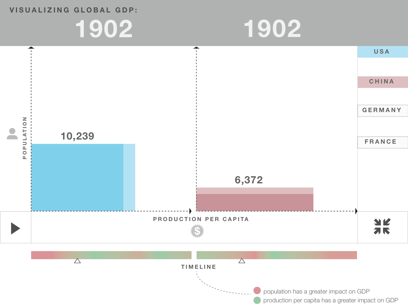
Thus, we have explained the GDP and GDP per capita, while at the same time explaining the viewer our second half of our visualization. Our second half visualizes historic GDP data and estimates from the Maddison Project (http://www.ggdc.net/maddison/) for different countries. It uses the same idea of the GDP being seperable into the two factors population and GDP per capita, with the GDP being represented by the area of a rectangle.
Once the viewer has selected two countries he can hit play and watches those countries economic development throughout the years. The different sides of the rectangles grow and shrink individually from each other and the viewer gets an intuition for where which factor had more impact on the total growth for a time period of his interest.
The visualization can be viewed here: http://people.ischool.berkeley.edu/~stlim/gdp/
Team: Alec Hanefeld, Andrew Win, Kelly Park, Seongtaek Lim