
Vimal Kini, Gaurav Shetti and Jen Wang
We were inspired by a recent article in the New York Times and decided to make a visualization about the Israeli-Palestine conflict. It being a particularly broad topic, we based our visualization on one aspect which we had been hearing a lot about in recent years: that of Israeli settlements in the Palestinian territories.
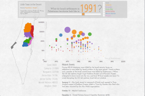
We gathered data from various sources like BTSelem.org, fmep.org and Wikipidea. We want to see if there is any correlation between periods of settlement expansion and those of violent conflicts.
Our initial design intuition was to visualize the population data on a map. During some of our early feedback/review sessions with potential audience we found out that geographic mapping was not really adding value to the story we wanted to tell, but would be helpful as a reference.
We decided that a bubble chart representation over a timeline would be the best design to convey our story. The historic events data and a map with outlines of the different regions within the palestinian region would provide more context to the whole visualization.
The final visualization plays automatically the first time, as a preview to user. Users can then move the slider to look at any data more closely and see the changes in population along with significant historic events during that time. We also have provided checkboxes that enables only selected regions.
To see more: http://54.225.108.90/InfoViz/israel2.html