For those interested in public transportation and demographics, here’s an interesting visualization by The New Yorker. It organizes New York City’s subway lines by the average earnings of its riders.
http://www.newyorker.com/sandbox/business/subway.html
Background:
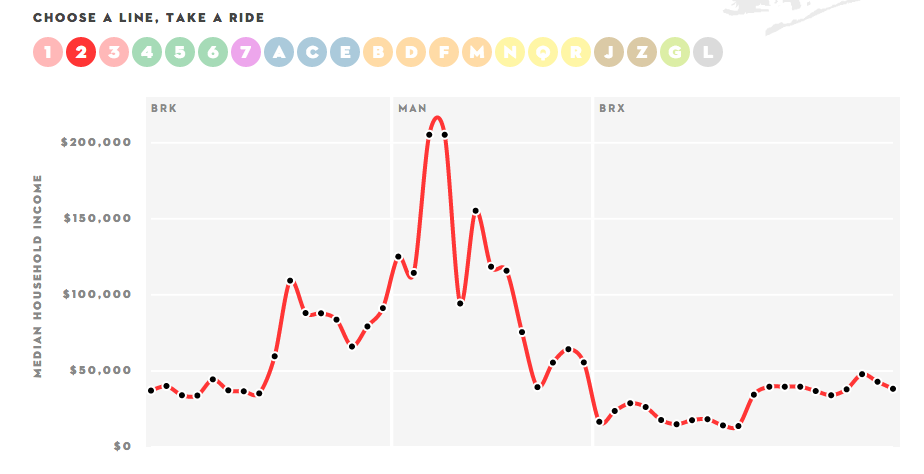
This exploratory visualization is an interactive infographic about New York City’s subway system and the problem of income inequality. It shows median household income along each stop of the line, which vary from poverty to wealthy. Users may interact with the visualization by choosing which line they’d like to explore; the lines are indicated by the actual colors and symbols used in NYC’s subway system.
Effectiveness:
The juxtaposition of the line sprawled on a map of NYC with the median household income below was effective for me, as it gave me a sense of where such patterns are taking place. I thought it was interesting, but perhaps no surprise, to see the stark contrast of earnings between Manhattan, Brooklyn, Queens, and the Bronx. I liked the separation of rail lines based on what borough they were running through. However, I thought the shorthand labels for the boroughs such as “MAN” and “BRK” are not intuitive, particularly for people who have never traveled or lived in NYC. In all, an interesting exploratory visualization on NY’s subways.
-Andrew Win