
Link: http://gramener.com/mahabharatha/
I came across the visualizations of this India based company called Gramener a while ago. There are many more interesting ones on their online portfolio but I especially liked this one since it is the outcome of scanning the text of the magnum opus and the longest epic of India: the Mahabharata. With 1.8 million words in it, I would consider this visualization to be “Ancient Big Data” visualization.
The intended function of this visualization is to highlight those parts in the epic wherever the selected characters have been mentioned. This helps us to directly navigate to those parts of this huge unstructured data to find topics on characters of our interest. Thus, the intended function of this visualization is to communicate the same. The author’s main objective here is to ease the navigation of unstructured data with 1.8 million words and communicate to us directly the parts of the epic where we might find the data (about the characters) we are looking for. It could be seen as a visual information retrieval system.
Other Potential Applications:
Research paper text scanning: One problem that I have often faced while going through research papers for projects or assignments is that sometimes, I have to go through the entire paper to find information about topics of my interest, only to realize that it was not an important paper. With such an application, I can easily decide if I need to read the paper by simply looking at the visualization of the text as shown above.
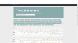
Screenshot:
Thanks for the link Priya. I haven’t seen this particular example yet, and it’s a nice preview to what’s about to come later in the semester:
We will look at examples visualizing collections of documents or individual texts after Spring Break when we cover text visualizations. The way they only show selected characters is good practice when you have more than a handful categories to show through the use of colors. We’ll look at this and other interaction techniques in a few weeks.
Keep these examples coming, folks! The best way to learn about visualization is to critically look at them and figure out why they work – or don’t work.