Faded

Faded is a photo editor for iOS devices that allow you to have a greater depth of customization when editing your photos. One of the distinguishing aspects of Faded is the ability to let you edit more aspects of the photo, such as the contrast, and temperature. They allow you to do this while still maintaining standard photo editing features that other apps have, such as special effects, dust and scratches, cropping sizes, custom frames, and a wide varieties of filters to choose from. This is all wrapped together in a cohesive and beautiful interface that is easy and straightforward to use.
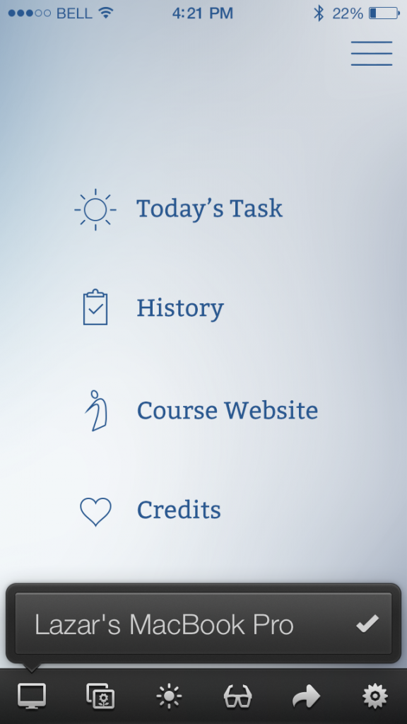
Selecting Photos


2014-03-05 21.37.29


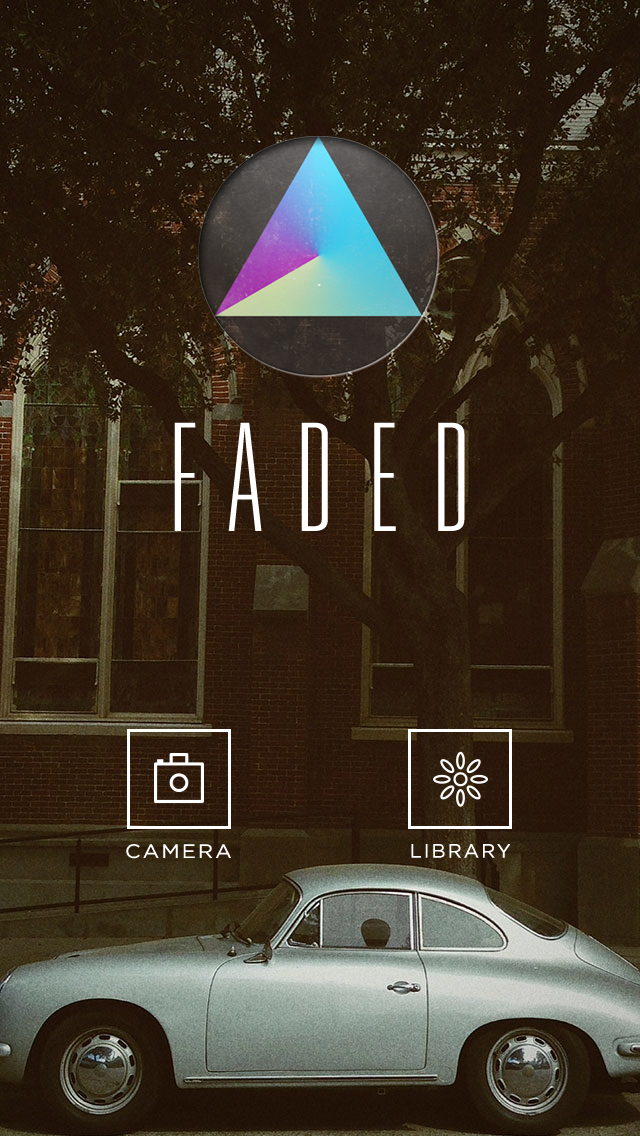
Faded’s home screen is beautiful and elegant, although sometimes the photos that rotate can restrict the visibility of the icons. You’re given two options: either take a photo with the camera or choose photos from your library.

When you choose to select photos from your library, they provide a very clear and clean interface to choose which album you want to select your photo from. They show a preview of the most recent photo on the album to remind users which photos are in which albums.
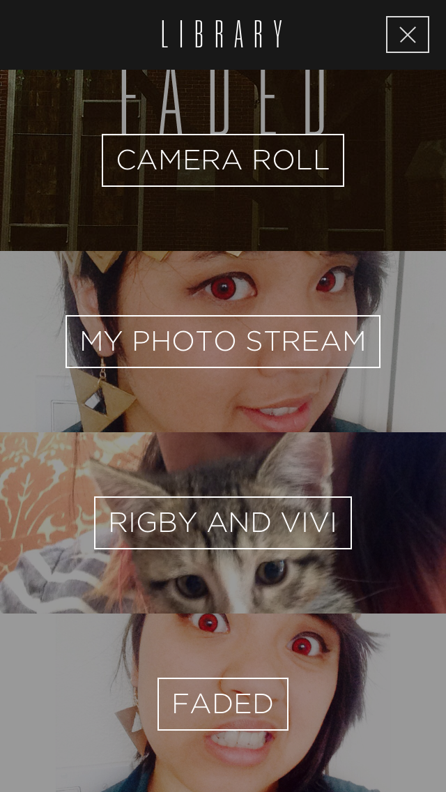
2014-03-05 21.37.37

Photo Editing

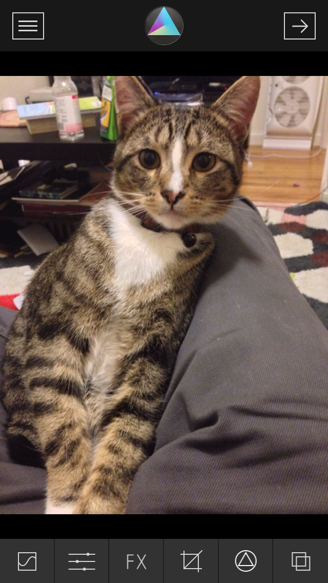
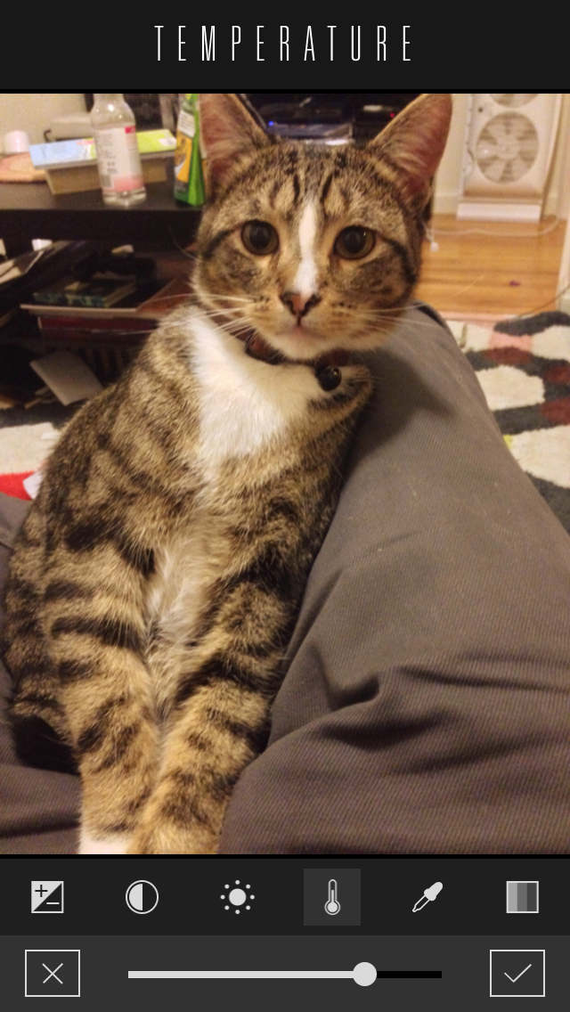
Once you select a photo to edit, you are shown a series of options on the bottom bar. While first time users may be slightly confused as to which icons give you which options, it’s friendly to use after repeated use. Each icon, when tapped, give you another row of options that you can swipe left and right to view all of the options. For example, for the sliders options, you can select different aspects of the photo to edit with sliders. It allows for really small adjustments to every aspect of the photo, which is something that many other photo editing apps lack in their own feature set.

2014-03-05 21.37.53 2014-03-05 21.38.12


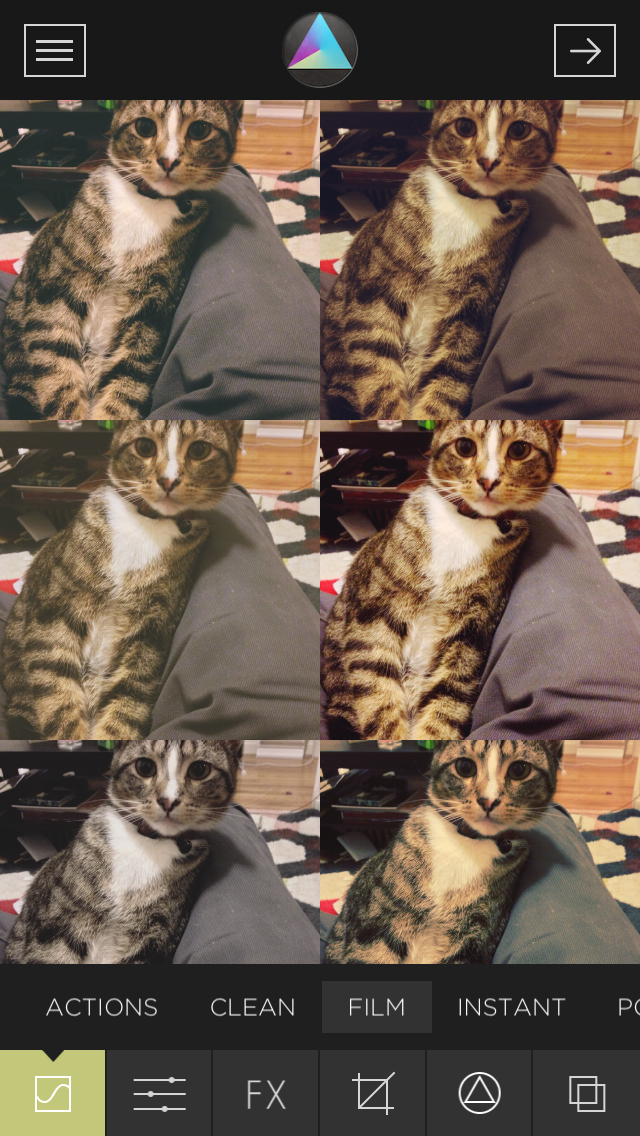
When selecting filters or overlay effects such as light leaks or dust, they change the layout to give you a full grid of the different effects they have. In comparison to an app like Instagram, which also has filters as well, you’re able to directly compare how the different filters will effect the photo. Instagram’s design only allows you to view one filter at a time, so to do comparisons you have to constantly swap back and forth between different filters.

2014-03-05 21.38.17


Finishing Up

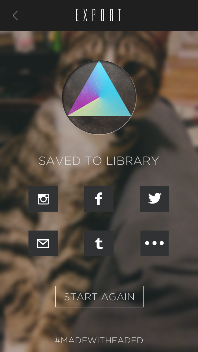
Once you’re done, you can move forward and the app then saves the photo to your phone’s Library. You then have different options to share this photo, and will take you directly to the app to share easily.

2014-03-05 21.38.27


Final Thoughts

I’ve spent a lot of time browsing and using other photo editing apps. While this one doesn’t allow for the pic stitching that some others have, it is excellent for retouching photos and enhancing them due to their ability to let you fine tune minor parts of the photo. The interface is also easy to use and is extremely visual, which is important when dealing with the photo editing process.


iShows

iShows is an iPhone app that helps you manage and keep track of your favorite TV Shows.

Introduction
There are so many great TV shows on right now that it can be hard to keep up. iShows aims to help you manage and keep track of your favorite TV shows in a simple but visual aesthetic way. Unlike “TVShow Time,” and some other show tracking apps, iShows does not require you (or offer the ability) to create an account. Also, most apps in this category contain an excessive amount of features whereas iShows focuses on providing a few features, but doing it very well.

Navigation
Basically, the app contains three sections, which act like panels and make it easy to know where you are:

1. The main panel is the one you will see when you open the app. It displays a list of shows you are following and provides the option to add new shows via the + icon. Adding a new show is just entering the title into the search field or choosing from a list of “trending” shows. The “Following” view includes two layout options – list and grid.

IMG_1122

2. You get to the second panel when clicking on one of your listed shows. It displays general information about the TV show or a specific episode. Since the app aims to be concise, only basic information such as air dates, short episode/series plots and casting is provided. For additional information, IMDB links are provided.

IMG_4799 IMG_9047

3. The third panel can be accessed by moving the second panel to the left. This is the actual management of episodes. Here, you can mark which episodes you have seen in order for iShows to tell you if you are behind on any episodes or when the next episode is up. It is as simple as tapping the eye icon on an episode or a season name to mark it as watched

IMG_1106

Customization
An extra and really cool yet simple feature in iShows is the ability to customize the UI design. As mentioned it is possible to choose between list and grit layout, between a light or dark theme, sort by episode or alphabetically, choose to display an app badge count, clear the cache, and select your notification preferences – that’s it.

IMG_8732

Parting thoughts
iShows is a good example of how an app can be designed to upstage those that are already well established. Interacting with iShows is a pleasure because of its simple focus and structure and its polished design. For me personally, the app covers a real need by tracking my TV shows since my brain gave up a long time ago.

Links

– Elin Linding Jørgensen

Skala View

Skala View

Introduction

Back in December, I was hired as a Graduate Student Researcher (GSR) by Professor Morten Hansen. A part of my responsibilities was to design an iOS app that would eventually end up being deployed to students enrolled in this Spring’s INFO 225: Managing in Information-Intensive Companies.

Being interested in behavior modification mobile technology, I was very much looking forward to the task. However, I faced the same workflow challenge I have had to confront every single time in the past I needed to design for mobile. The issue was previewing my work on an actual phone while designing it on a computer.

There simply was no convenient way to do it in real time, so over time I have developed all kinds of workarounds for the problem. For example, I would save the mockup I was working on in Photoshop, then move the saved file to My Photo Stream in iPhoto so it got synced to iCloud, and finally open the image from the Photos app on my iPhone to get the feel of how it looked and felt on an iOS device. Unfortunately, such a process is slow, cumbersome, and very easily breaks the designer’s concentration and focus.

Then, just as I was about to start working on the app for Professor Hansen, I stumbled upon Skala View, a free app which allows me to beam images from Photoshop to my mobile device in real time. Needless to say, it solved my problem and made me a happier and much more productive designer.

Skala (Pre)View

To be more precise, Skala is not a single app, but rather two interdependent apps: one for your Mac and one for your mobile device (iOS or Android). Setting everything up is very easy and straightforward.

Skala Preview is the OS X app. Once you download it from Mac App Store, all you have to do is create a remote connection in Photoshop, and just keep Skala running.

Skala Desktop

Next step is downloading Skala View for your mobile device from either Apple App Store or Google Play. Provided both your Mac and your phone are connected to the same wi-fi network, you should instantly get a live preview of whatever you are working on in Photoshop when you open the app on your phone.

Skala Mobile

Features

In addition to its main function of getting image from your Photoshop to your phone without hassle, Skala View has a few other useful features.

Multiple Connections

If there are several designers on the team but only one mobile device for previewing mockups, the team members can take turns using Skala. The mobile app will recognize all incoming desktop connections on the network and whoever is perusing the device at the moment can choose which image he/she wants streamed to the phone.

Multiple Connections

Photo Access

This feature enables you to open your photos and preview an image from the app, giving you access to Skala’s other tools, such as color blindness testing (see below). You can use this feature even when the phone is not tethered to a Mac.

Brightness

You can change brightness from within the app, thus easily identifying which UI elements are harder to interact with when the phone’s screen is dimmed.

Brightness

Color Blindness Testing

By default, the app displays the Photoshop image in full color. However, it offers additional four filters: Protanopia, Deuteranopia, Tritanopia, and Monochrome. By previewing the mockups with these on, the designer can make sure that the user experience that is being built is satisfying to everyone, including people afflicted with these common forms of color vision deficiency.

Color Blindness Testing

Sharing Options

If you are particularly proud of something you have built, you can copy it to your device’s clipboard, save it to photos, email to someone, or tweet for the whole wide world to see.

Sharing Options

Final Verdict

Skala View deserves to be an essential tool in any mobile designer’s toolkit. The app performs its primary function of bridging the workflow gap between your computer and your mobile device extremely well. Last but not the least, it is 100% free (no in-app purchases or any other such hidden “freemium” costs). I wholeheartedly recommend it.

Links