Team Members
Eungchan Kim, Taeil Kwak, Justin Wang, Qianqian Zhao
Contents
- Assignment #1: User Profiles, Hero Moments & Multi-screen Ecosystem
- Assignment #2: Recruiting Strategy, Competitive UX Analysis, Concept Sketches
- Assignment #3: User Research and Top Findings
- Assignment #4: Storyboards and App Map
- Assignment #7: Prototype Test and Top Findings
User profile
- Primary
Any group who dines together and splits the bill. This could include students, work colleagues, and more. The app needs to be useful enough to figure out the bill easily with just one person having the app. That person needs to dine in groups often enough to have the app installed.The ideal group is one that is very money-conscious. The app will split the bill fairly depending on what people ordered. This fits most students and low-income workers.
- Secondary
People who eat out and need to figure out an appropriate tip. It functions more like a normal tip calculator here.
- Secondary
People who eat out in groups and split the bill evenly. These people don’t care to split everything fairly. This generally includes people who are a little richer than the primary group or a little lazier (they don’t need to input every item).
Hero moments
- It will save the diners time by quickly calculating each persons bill and tip.
- It will split the bill fairly (e.g. someone who orders a cheaper menu item pays less)
- By taking a picture of the receipt and reading the text, it will save the diners time by autofilling all of the data.
- It will help users remember who owes whom what, in case someone does not have money at the time.
- It will use GPS coordinates to determine the tax of the location.
Multiscreen ecosystem
For this first iteration, we’ll focus on mobile phones because we believe it will be the most likely device people will have in context at the restaurant. Anyone that carries around a smartphone could have this app readily available.
We will not be supporting tablets, laptop, or desktop since those are generally not used in a restaurant context. While this could present an interesting problem in the tablet space, it is simply not practical because people don’t carry around tablets.
The mobile app will be standalone and not interact with other devices.
Competitive UX Analysis

Concept Sketches
Iteration phase #1
 |
 |
 |
Iteration phase #2
 |
 |
 |
User Research and Top Findings
The Plan
- Recruit a minimum of five prospective users via Friends & Family.
- Develop a research protocol that includes an intro, interview, concept walkthrough and closing.
- Make sure your concepts are as clear as possible in advance of your session. Consider using Sharpies and heavy card stock instead of regular printer paper.
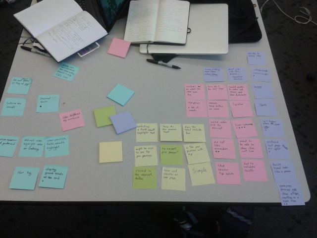
- Via affinity diagramming or team debriefs, develop a list of top findings (~10-15) from your research. Each finding doesn’t have to be more than a few sentences.
- Based on the findings above, describe how you plan to change your sketches and/or product requirements. This may also be a bulleted list with short descriptions or integrated with the findings.
—Find two people each (total of 8 user interviews)
—Record or videotape interview would be great
Concepts
We tested 3 concepts. See Iteration Phase #2 above.
Interview Script Outline
- Introduction
- Introduce what project we’re working on.
- Interview
- Do you split the bill when eating out?
- If yes, How/why do you split the bill when eating out? (eg. evenly vs. fairly)
- If no, have they done it in the past?
- Method of calculating tips? (eg. calculator, relative to tip, eyeball)
- What percentage and how did they decide that?
- Thought process?
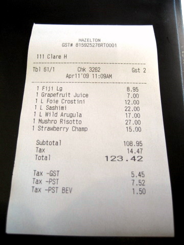
- Have a mock receipt available and ask the user how they would solve the problem.
- http://www.tangmeister.com/090411_one_restaurant/Receipt.jpg
- You got the Foie Crostini
- Max got the mushroom risotto and large fiji
- Grace got the Sashimi and grapefruit juice
- Greg got the Wild Arugula
- You shared the Strawberry Champ with Grace.
- Service was pretty good.
- Do you have any tip calculating apps on your phone?
- What do you like or not like about the app?
- When splitting fairly, is it important to be exact? (or round to dollar amounts)
- Do you split the bill when eating out?
- Concept walkthrough
- What do you think/ what are your impressions?
- Does this make sense to you?
- Closing
- Thank them.
Top Findings
- People generally are lazy and don’t want to enter so much data (every item in the receipt plus who is associated with which item).
- The more steps it takes, the more reluctant they are to use it.
- Not important to be exact; people generally estimate when they split the bill. They might split comparable items evenly, for example.
- Using a tool to calculate everybody’s portion of the bill can come off as stingy.
- Stinginess appearance is inversely proportional to speed of use.
- Many of the icons, letters, etc. in the concepts were unintuitive.
- Using letters to represent people could be confusing.
- Entering the bill and then splitting it was not intuitive. Would prefer to enter the bill according to people instead.
- Different payment dynamics, depending on who has card or cash. If all have cash, it’s easiest and everyone chips in approximately how much they owe; if one person has card, everybody pays the person with card; if all have card, they might ask the server to split the bill among the cards.
- It’s socially awkward to ask people if they paid enough.
- Some people just use the calculator app on their phone.
How we plan to change sketches/product requirements
- Possibly change the flow of to be more user-centric app (where you pass around the app with the bill) and allow each user to input their own items. Currently, the sketches we have are item-centric.
- OCR to take picture of receipt?
- NFC data exchanging among phones
Notes from our interviews can be found here: Interview Summaries
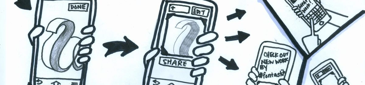
Storyboards and App Map
Prototype Test and Top Findings
Interview protocol:
- Introduction
- Introduce what project we’re working on.
- Background
- What kind of mobile device do you use?
- Do you use a tip calculator? Why or why not?
- Questions to ask for each mode
- Really show these prospective users what they’d see the first time they open your app. Ask them what they think the app does and whether or not they would continue based on their understanding.
- Ask them to narrate their thoughts as they go along.
- Was it intuitive?
- Any pain points?
- Any suggestions?
- Would you use this? Why or why not?
- The modes to test:
- simple mode
- split 1 (tip star)
- split 2
- Closing questions
- What do you think about displaying multiple tip %s vs. choosing your tip %.
- What would your ideal tip calculator be like? What parts and features would you like?
- How did the various versions compare with each other?
From our findings, here are the top 10 modifications for our final prototype:
- Display grand totals on the final page. Users would like to be able to check their total without having to go back to a previous screen.
- Replace “Next person” on keyboard with “.” People never clicked “Next Person” anyway, and some preferred to have the decimal.
- Color code more of the results on the final screen.
- Add a Delete Item function. Requested by users during testing.
- Change Add Item to New Item button. Some users attempted to hit Add Item before entering an item.
- Fix focus-field highlighting bug.
- Implement shared item page.
- Results page legend person icon misleading – correct. Users were confused by its similarity to each user’s icon.
- Theme split.html with colors – users enjoyed the colorfulness of the app version we themed
- Same final page for simple and split mode