Assignment 1 – Graffiti
Assignment 2 – Concept Sketches
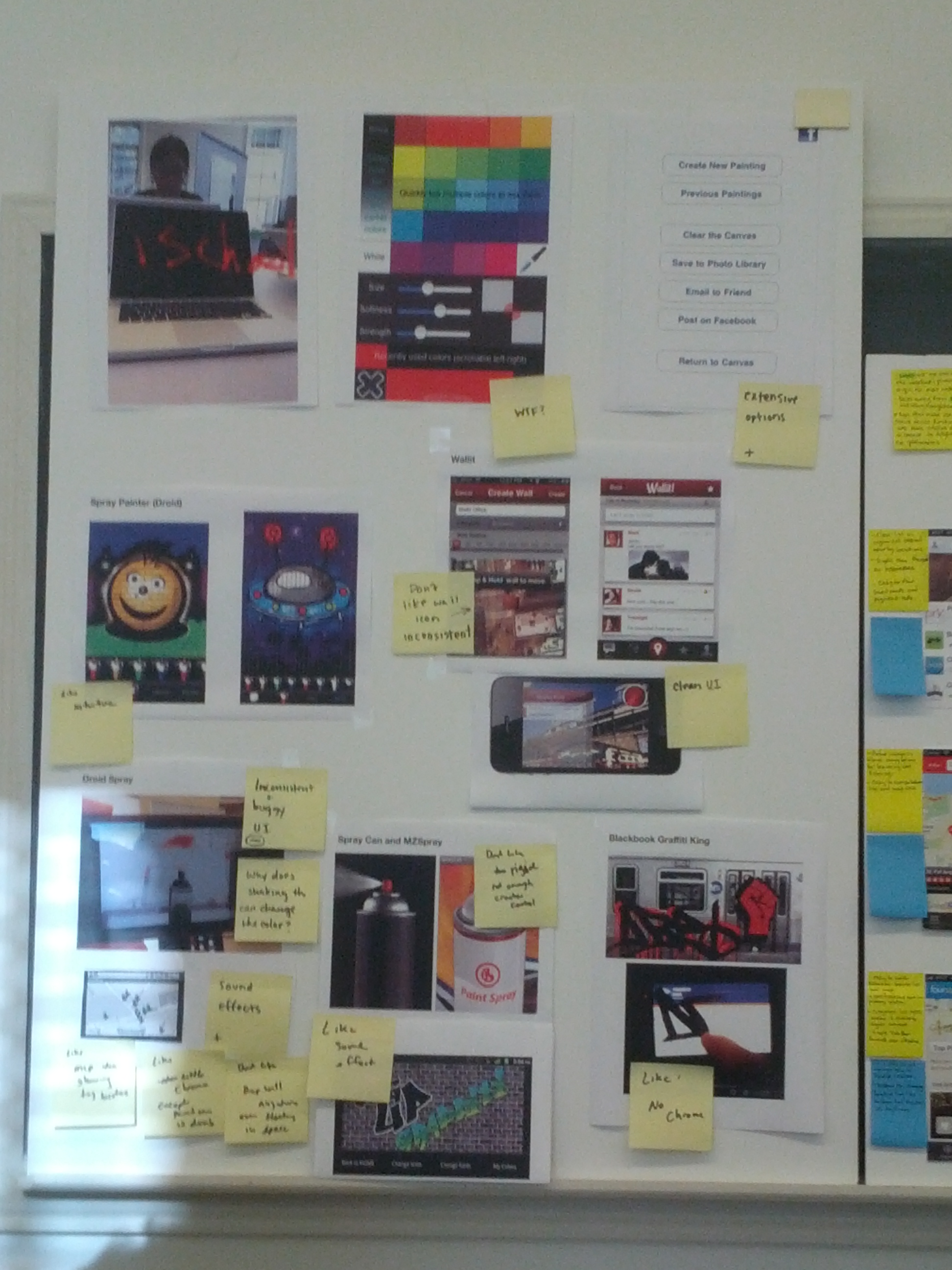
Competitive analysis
Assignment 3
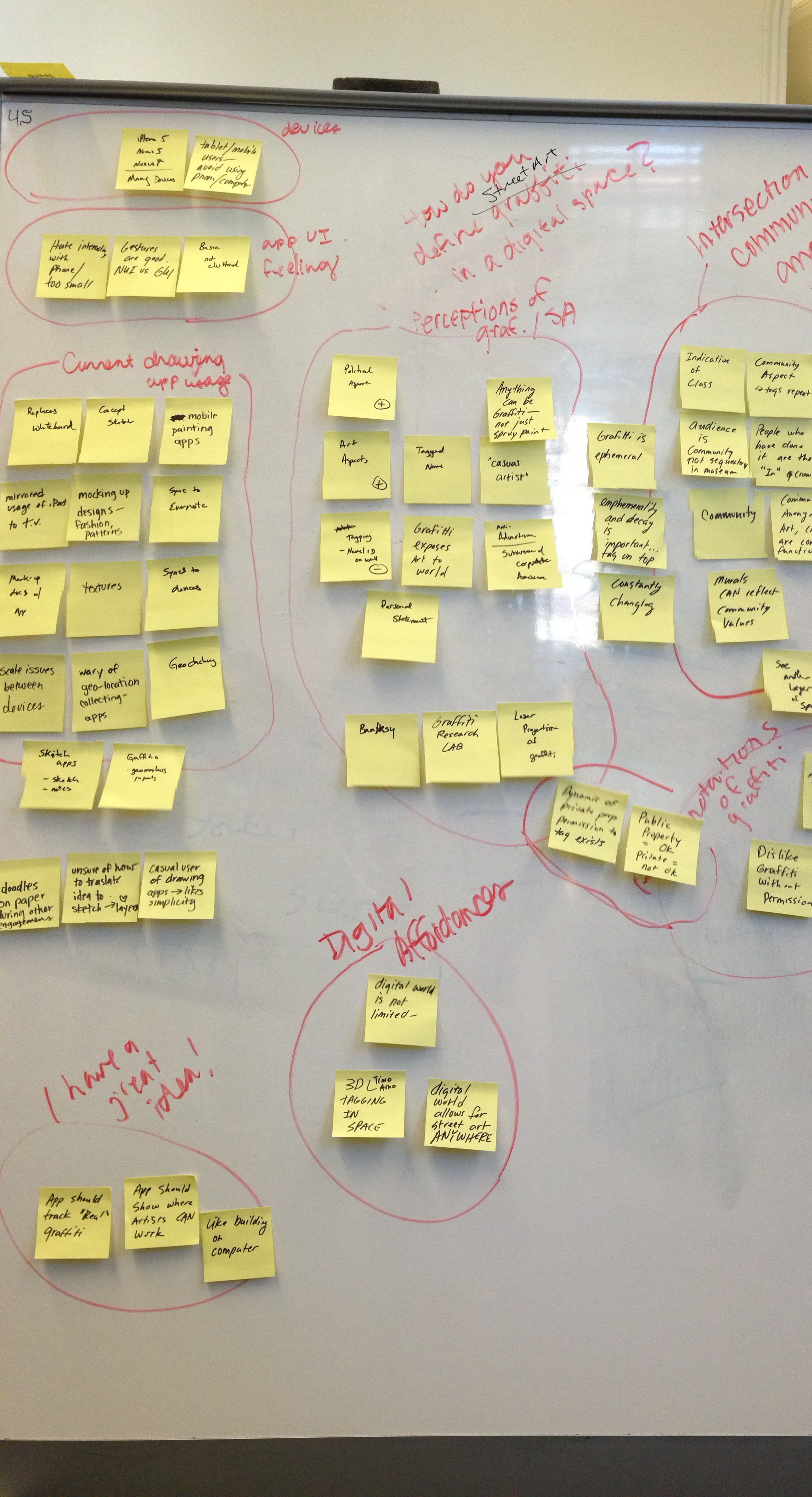
User Research Findings
Assignment 4
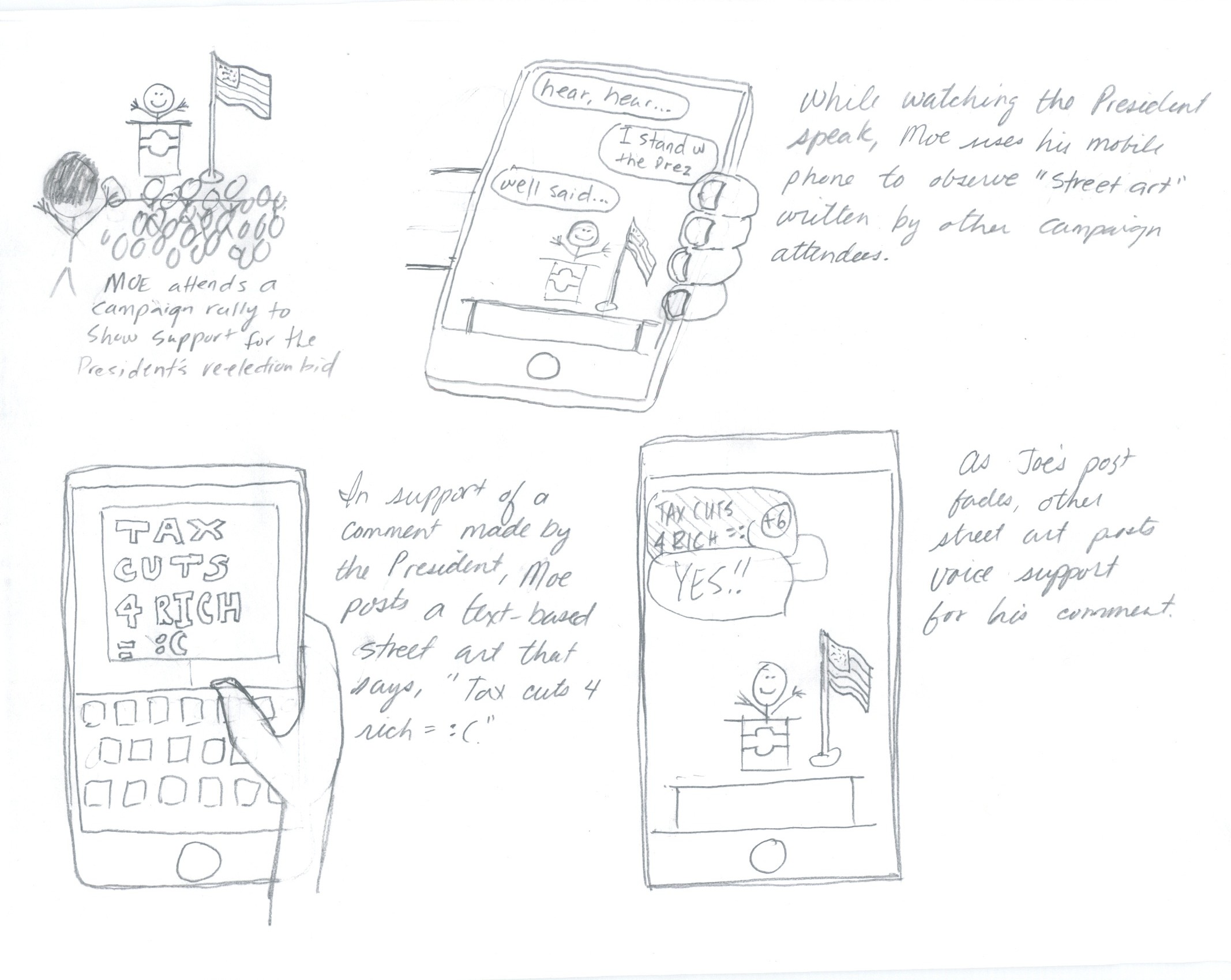
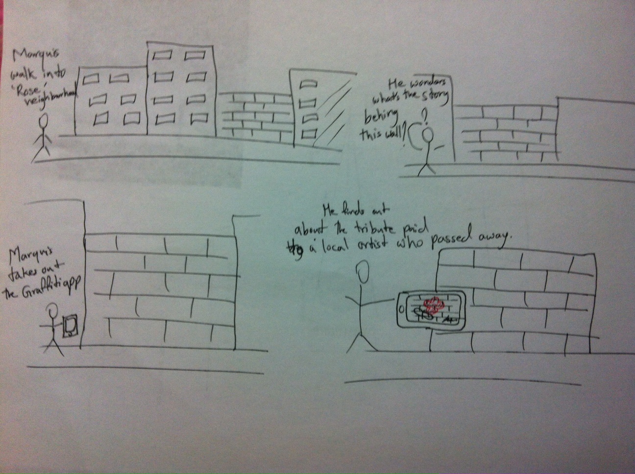
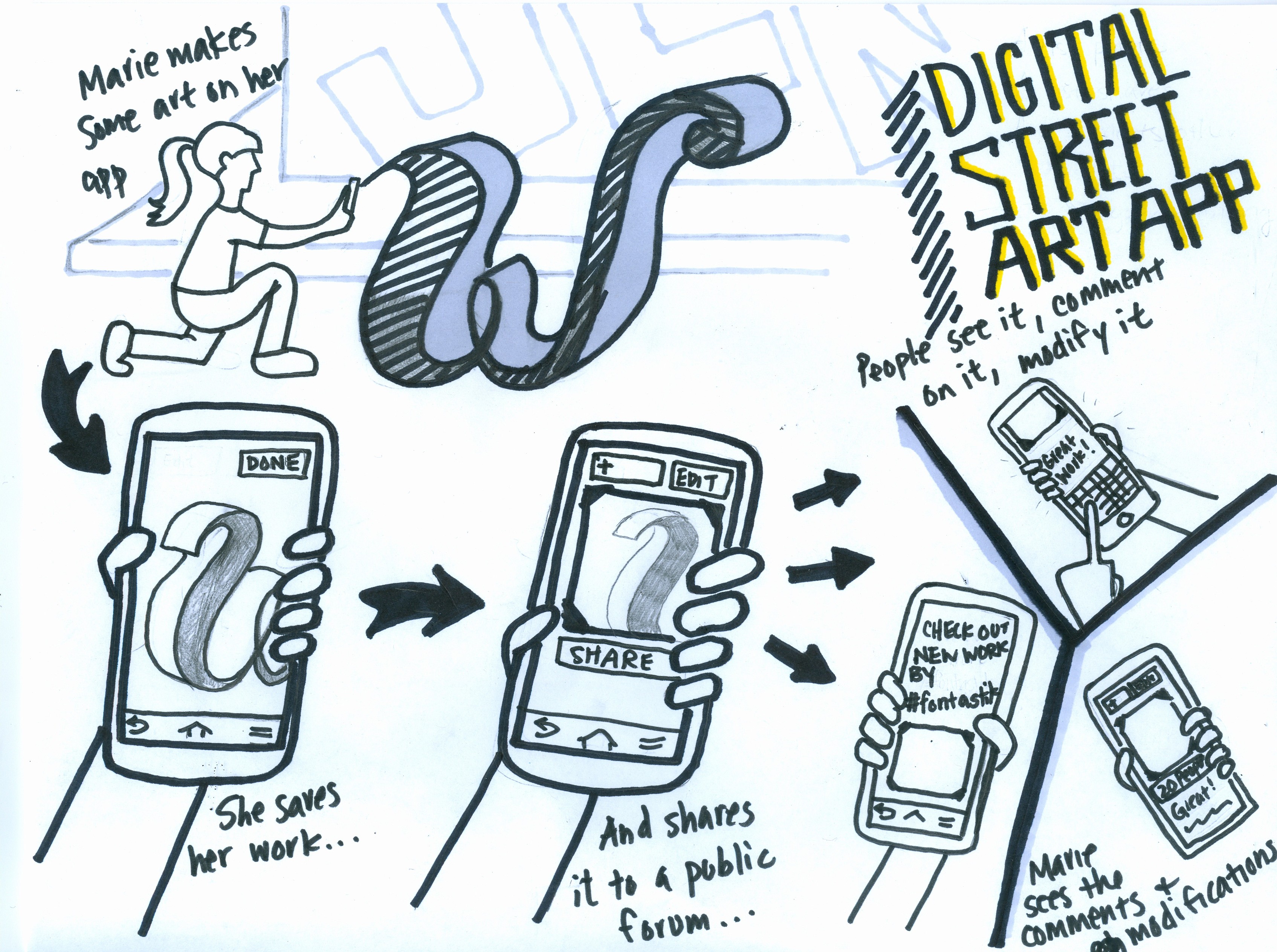
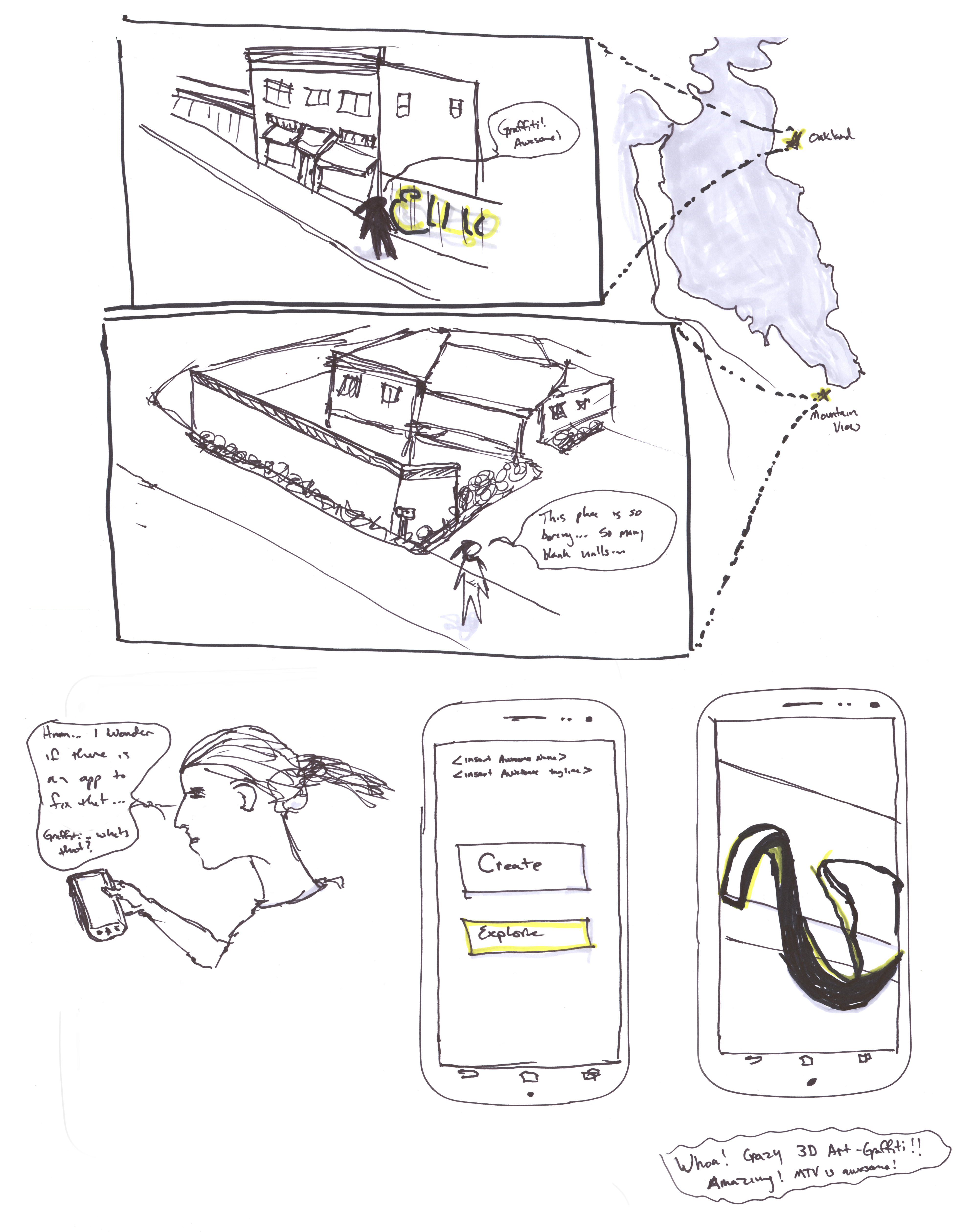
Scenarios
Storyboards
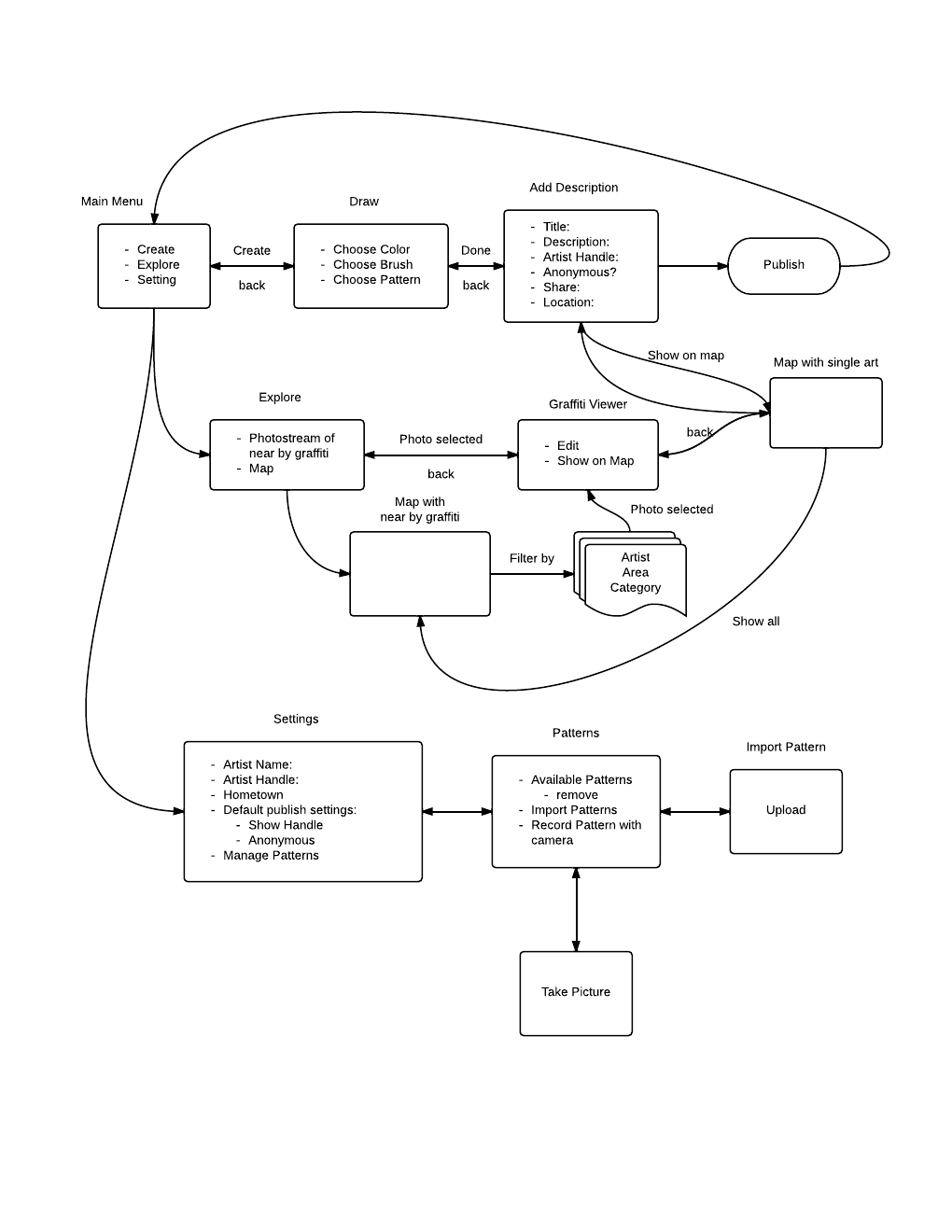
App Map
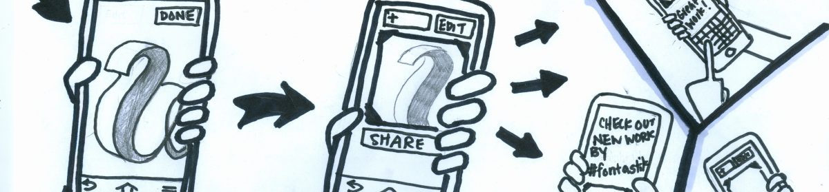
iPhone Prototype
http://people.ischool.berkeley.edu/~elliot/Graffiti_iPhone/start.html
This first prototype shows a homescreen once you log in showing images near you. You can add filters to search, view a map, or view the drawing. You can also create a new drawing which walks you through the process from drawing, to adding metadata, and publishing. Starting to add swipe interactions. From the Explore screen, swiping from the right takes you to create, from the left to the viewer
As for landscape, most features of the phone will probably remain the same, just be wider. The actual drawing interface will not be affected.
Assignment 7
New Visually Enhanced Prototype
User #1: 34, Female, Graphic Designer
User #2: 29, Female, Academic Technology Assistant / Artist
User #3: 31, female, self-employed
User #4, 30, female, Building Scientist, iPhone user
User #5, 33, female, bureaucrat, Android user
Scenario #1: Explore your neighborhood
Use the app to locate street art sites on a map and discover a new, hidden community in the neighborhood.
Scenario #2: Try a new artistic medium in your neighborhood.
Use the app to create street art in your local neighborhood.
Link to Research Protocol Template
Top Findings
1) Users really like the app’s visual design.
2) The typeface was particularly commented on
3) Users generally have a good understanding of what the app does after viewing the first page.
4) The language of the app is appealing to some users and seems appropriate for an app that is focused on street art or graffiti (see ‘bragging’). Others found it confusing and prefered more normal terminology
5) Users did not immediately understand how to navigate through the app with the swiping action of the arrow buttons. However, once they figured out the swiping/direction action, they liked it.
6) Users liked the app and would use it if it existed!
7) In the draw section, the Save buttons on the brag and color panels were confusing.
8) Terminology through the draw section could be improved
9) Lack of animations hindered understanding
10) Map could better locate user in relation to the art
11) Filters to limit gallery and map results are desired
12) Some users expressed the desire for more social components
Recommendations
1) Find a way to make the arrow button swiping action more intuitive to users. While people generally liked this feature once they figured it out, it seems that most people didn’t figure it out right away. One approach would be to flash a one-time screen that gives users instructions on how the swiping action works. Another approach might be to enhance the visual design of the buttons in a way that suggests the correct motion.
2) Reassess the locations of the Save buttons (and term) in the draw section. Really emphasizing that the Save button is for the drawing and not other choices is important.
3) Animations would help further understanding of the swipes. Kinda a no duh, but helps the user’s understanding of the page flows which is currently missing in the prototype.
4) Add filters to Gallery and Map
Final Presentation
Final Presentation
Final Submission
Final Prototype
Also, all static screens can be found at the end of the final presentation.

Scenarios:
Scenario #1: Explore your neighborhood
Download the app and use it to locate nearby “street art”. Use the map to guide yourself to the location. When nearby, view the art in the viewer
Scenario #2: Try a new artistic medium in your neighborhood.
Create a login, find a site, and draw. Use multiple colors/brushes and include metadata about your creation