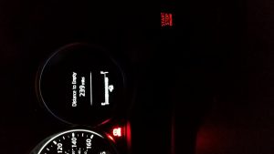
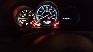
The Pousman and Stasko reading took me back to thinking about my car’s dashboard along the design dimensions of information capacity, notification level, representational fidelity and aesthetic emphasis (Posuman et al:69). It has a high information capacity displaying between 15-20 nuggets of information including the status of doors, seat belts, fuel tank, air pressure, next service due date etc. However, excellent execution along the dimensions of notification level, representational fidelity and to some extent aesthetic emphasis make the TUI very intuitive and pleasant to use.
The Notification Levels of the fuel tank are a very good example of this excellent execution. It visually indicates the amount of fuel in the fuel tank and the number of miles remaining in an unobtrusive way. When the fuel level starts falling below a certain level, the display of icon of the fuel tank turns yellow. If not refueled after a certain point the yellow fuel tank icon starts blinking and if continued unfueled, it turns red and adds a beep to grab my attention. The iconic fuel tank and the scale metaphor that displays fuel status make for a good Representational Fidelity. On the final dimension i.e. Aesthetic Emphasis, I think the TUI is more functional while still looking decent but might not score too high on artistic measures.
Last but not the least, I would have liked a well designed ambient system to monitor speed wherein, it would alert me in an attention grabbing style if I were going over or under the required speed limit of the road I am driving on. Additionally, it could make me aware in an unobtrusive way of the average speed of the general traffic on the road at that time. I think of all the dimensions of the ambient system design, the combination of notification level and representational fidelity requires the most thought from the designer to differentiate the functional smoothness of a TUI.


