
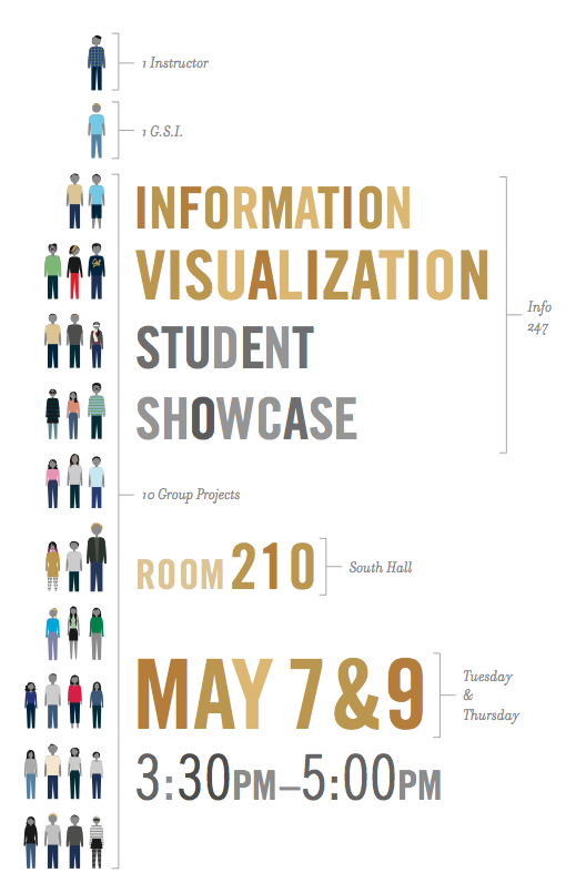
[twocol_one]The 10 group projects represent a variety of topics and audiences and are the culminating work of the students over the semester.
Projects
A Historical Perspective of GDP: A Focus on Population and Production
We visualized GDP growth of multiple countries by using population and production per capita. Our visualization is geared towards people with no prior experience in economics. Team: Alec, Andrew, Kelly and Taek. View >>
Movies in Theaters
A exploratory visualization for movie watchers. The visualization helps you explore movies that are currently in theaters based on different criteria. Team: Karthik and Taeil. View >>
Little Town in the Desert: Israeli Settlement Growth in the Palestinian Territories
The visualization looks at the changes in Israeli settlements and their population in the West Bank since World War II. We show for connections between periods of settlement expansion and historical events. Team: Vimal, Gaurav and Jen. View >>
Visualizing Usage of Avaaj Otalo
Avaaj Otalo (literally, “voice stoop”) is an interactive phone application for small-scale farmers in Gujarat, India. The goal of our visualization is to help the founders and researchers of Avaaj Otalo to visually explore the usage of the application by farmers. Team: Seema, Priya and Julia. View >>
Food for Thought
A look at how Americans spend money on food, and how spending patterns differ by demographics. Team: Sara, Chris, Suhani and Aksel. View >>
MOOC Dashboard
Massive Open Online Courses (MOOCs) can have 100,000s of students, which means orders of magnitude more student data that the instructor needs to sort through. Our visualization is a dashboard that shows the instructor what is going on in the current week of the course. Team: Kristin, Divya K, Kiran and Kate. View >>
Ravelry Designers
Our project displays knitting patterns by 5 popular designers on Ravelry. Avid Ravelry users would use the visualization to explore patterns and be inspired to create. Team: Morgan, Sandra and Sonny. View >>
Doctor Dashboard
We’re making a visualization that hopefully offers a doctor a useful snapshot of the state of his/her practice, with the ability to see activity both at the practice and individual patient level. Team: David, Christina and Jacob. View >>
San Francisco Transit History
This visualization tells the history of San Francisco transit through an exploratory map that highlights important events as well as the diverse fleets in the system. Team: Fred, Raymon and Charles. View >>
BeerViz
BeerViz provides a fun gateway through which someone who is interested in beer can explore various beer styles based on user reviews and figure out which beer to try. Team: Divya A, Evie, Shreyas and Sonali. View >>[/twocol_one]
[twocol_one_last]
[/twocol_one_last]