 http://www.flickr.com/photos/nvh/sets/72157626622290640/
Since people said it would have been nice to have more discussion of photos — and there won’t be time on Wed since we’ll be doing presentations:
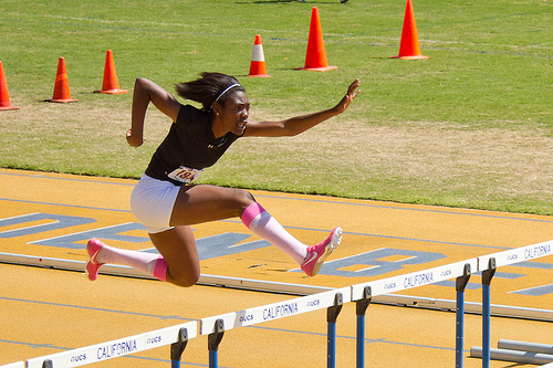
I went to this track meet on campus this weekend specifically to photograph it. I didn’t carry my longest lens, so many of these are cropped from larger pictures. These show the value of having MORE megapixels: you can crop and still have an fairly good image. A couple of images are online in more and less cropped versions; I cropped them further in response to feedback from a photographer friend. I think you can see how cropping out the extra strengthens the image.
To make such images interesting, I was trying to capture expressions or gestures — my favorites among these are the hurdles.
I was also trying for layers — where there’s more going on in the image than just the main subject. There needs to be some relationship between the elements of the image, either in content or composition (geometry and color). In a fast-moving situation like a track meet, this is often a matter of luck and of seeing the moment and grabbing it. I think the best of these is #14. #3 is getting there, with the interaction between the boy and the man, but the man is falling off the edge of the image and has too much stuff around him. #15 is OK but not great — loved the expression on the runner, and it’s contrasted to the kids on the bench.
What you don’t see are all the many, many images where there’s too much STUFF. There were people and things (benches, garbage cans) in the infield, which messed up the backgrounds of a lot of the images. The image with this post would be much better without the orange cones. #12 is cropped to a square because there was no way to get all of the runner and none of the junk.
Note that sometimes you want only parts of what might seem to be the obvious or default image: #5 is cropped to show what I thought was most interesting for both subject and composition.
The light was terrible — midday light with high contrast, and from the wrong angle so that faces were often in shadow. One of my mentors says, if you’ve got strong shadows, consider making the shadow the subject. Hence #4 and #5.
A track meet is about *motion* — #19 and #20 are frozen motion, #4 is movement. I was generally using a VERY fast shutter — 1/320th or so. I was also over-exposing by 2/3 of a stop but still had to brighten these up in Lightroom — because the faces were often in shadow, and the skin tones were medium to dark, while the background was pretty light. (The event was sponsored by a group called 100 Black Men and almost all the participants were African-American.)
I moved around a lot, trying different locations and perspectives — near miss #2 is from high up in the stands.
I uploaded some near-misses and explain in Flickr why they don’t make it. Near miss #2 also shows the problems with that kind of light — it’s coming from the wrong direction.
What you don’t see are the hundreds of images — literally — that I took and trashed. A repetitive event is a great photo subject. The track meet:
- the same thing happened again and again: kids lining up and running;
- it was 2 days, so I could go home Saturday and look at my images, then go back Sunday to try to do better!
I looked through the photos the first time, but completely focused on the actions of the runners, as opposed to the background and other things going on in the image. It became an I Spy game for me, looking for the extra meaning you put in the image.
Which camera did you use? I found after years of taking pictures with a point and shoot, an SLR with a long lens is way better for isolating the athletes from everything else that is going on. The only problem with that is when you focus on the background!
I agree, the lighting was very harsh, I wonder how it would be different if the track was a darker color, say red, against the darker skin tones of the athletes.
I really like the motion blurred background of “photo finish”, it is one thing you can easily do with a rangefinder camera, but a little harder with an SLR
The photos of the runners shadows works really well for me. It made for an interesting composition, even though the runner was cut off.
It is really much better to get down on the track itself to take the pictures. Ill see if I can upload some of my track images to the site. If you’re interested Nancy, I could get you a photo pass for one of the home track meets next year
Used my Canon 7D with 18-85 lens. It wasn’t as long as I would have liked for some of the shots but my back was in pretty bad shape and I didn’t want to carry the extra weight of a longer lens as well. So compromised with my intermediate lens. enough for much of the action, which is why I cropped.
Not hard at all to do blurred photo finish — even at 1/160th sec. f14.
Panning along with the runners.
I deliberately cut the runner out of the image of the shadow — that’s what I wanted, the shadow.
Please do upload some of your photos! I was envying the guy wandering the track with his credential and his photo vest — I have the vest, maybe I should have tried to fake the credentials. Though I didn’t exactly blend in at an event sponsored by a group called 100 Black Men.
Re the harsh midday light: traveling with one of my mentors, Nevada Weir (http://www.nevadawier.com), we were usually out of the hotel by 5 am for the sunrise and morning light, and never had dinner before 8 or 9 pm because we were shooting evening light. When I asked what one could photograph midday, her answer was: “indoors.”
Less value differential between people and track wouldn’t make up for the faces often being shadowed and the overall high contrast between sun and shadows.